EB Flex Container is a lightweight, responsive layout design block from Essential Blocks for Gutenberg. It uses a modern Flex container layout in Gutenberg, allowing you to align, space and organize content with precision. Ideal for creating flexible, mobile-friendly layouts directly in the WordPress block editor.
Learn how to create flexible layouts with Flex CSS properties for responsive design in Gutenberg using the EB Flex Container block.
How to Activate the EB Flex Container Block? #
To activate the Flex Container, navigate to Essential Blocks → Blocks. Then, from the Layout Blocks section, toggle to enable the block as shown below.
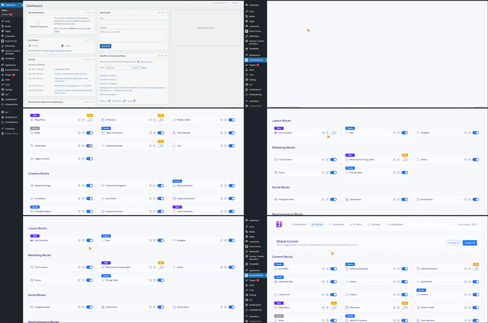
Note: Flex container is a free block. To use this, you will just need to install and activate the Essential Blocks plugin on your website.
How To Configure The Flex Container In Gutenberg? #
Open the page or post where you want to display your flex container, then add the EB Flex Container block to that section. Search for the ‘Flex Container’ block and insert it into the desired section.
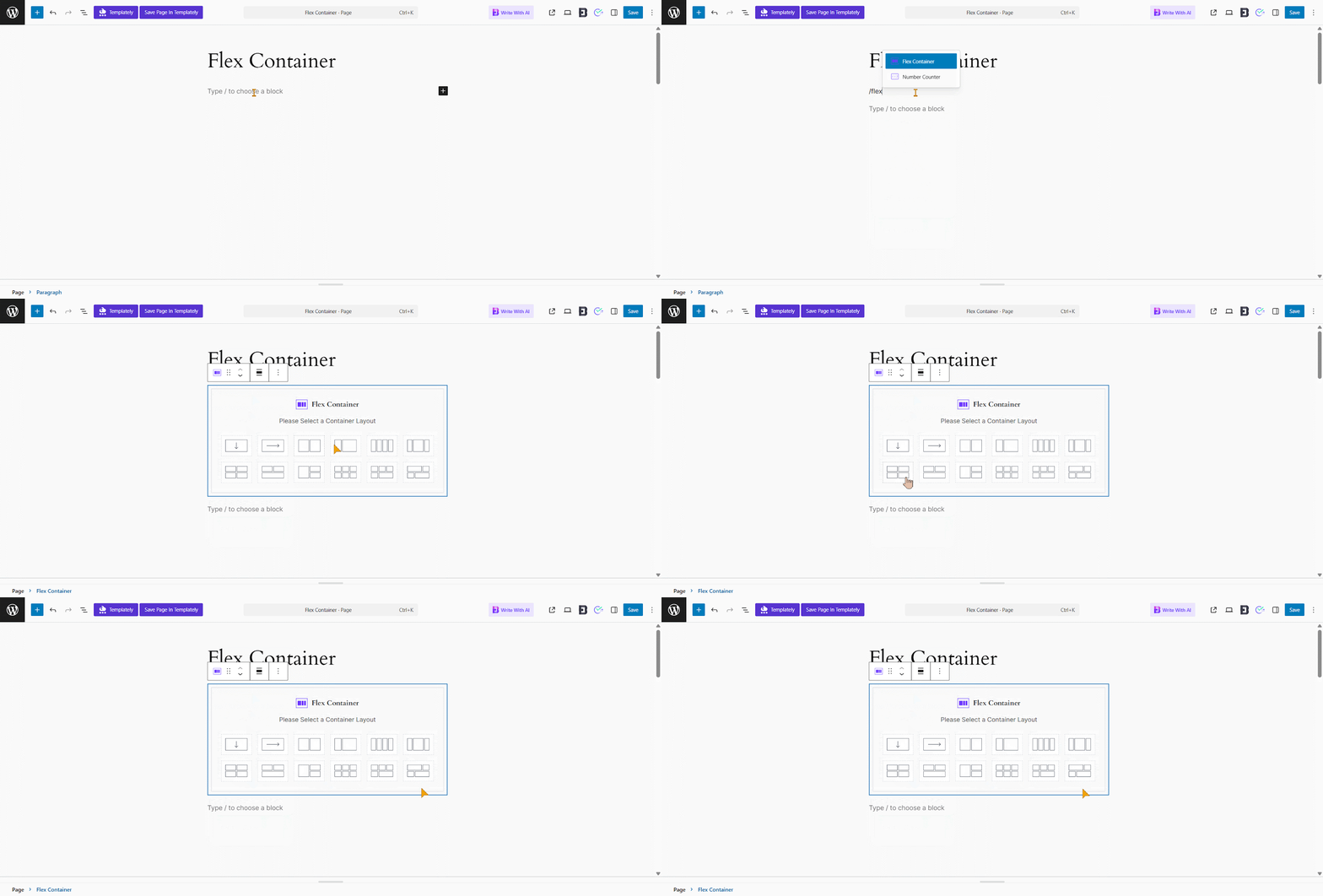
After inserting the block, you’ll find 12 container layout options. Each layout offers a different row-column structure. Choose the one that best fits your design and content needs. For example, we’re selecting the Asymmetric Grid layout.
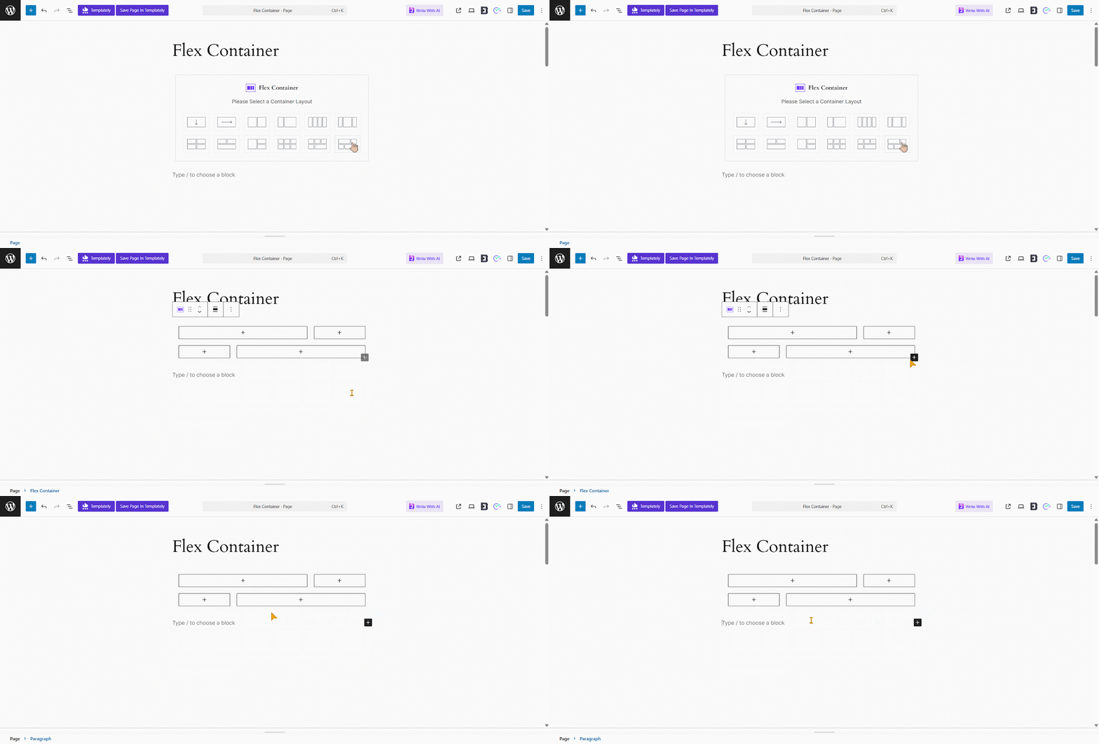
However, if you want to fine-tune the layout or enhance the design, you can customize each part’s structure for the following options.
General #
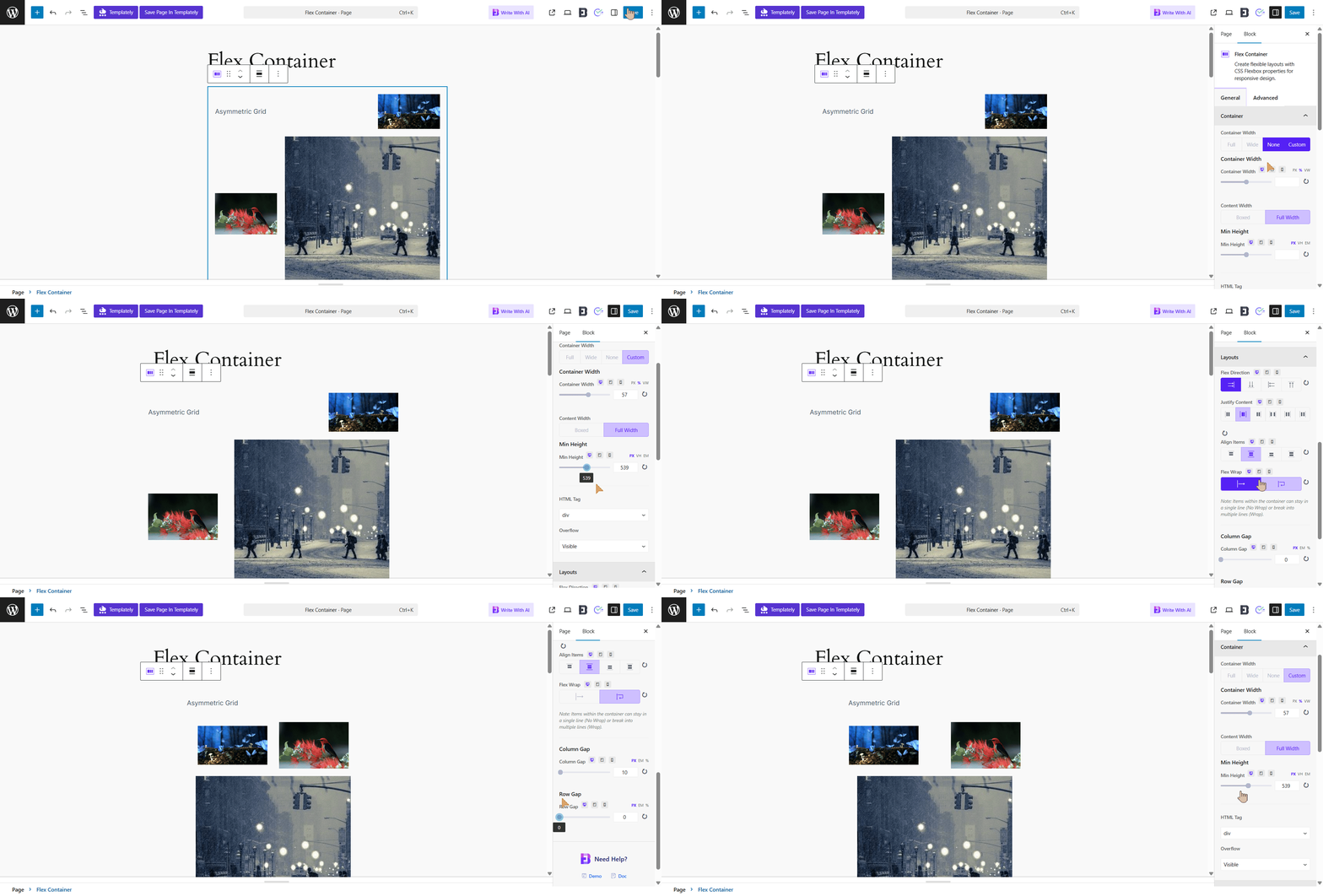
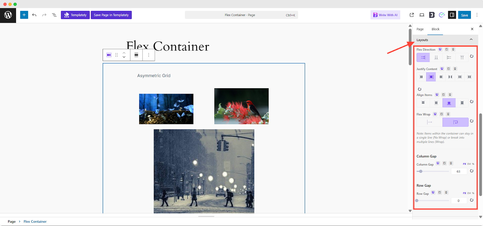
Once you’ve selected your preferred container structure, navigate to the block settings in the right sidebar. Use the Layout tab to configure the container. Each column can be styled and configured independently. Below are the available settings:
Container #
Container settings help you control the layout and design of Group, Columns or Container blocks.
Container Width: Sets how wide the container is.
- Full Width: Stretches across the entire screen.
- None: No fixed width, uses default spacing.
- Custom: You can enter your own width value.
Content Width: Controls how wide the content inside the container is.
- Boxed: Keeps content within a set width (you can define it).
- Full Width: Lets content fill the entire container.
- Custom Width: Lets you set a specific width manually.
Minimum Height: Sets the least amount of vertical space the container should take, helping keep layouts consistent.
Layout Settings #
Customize layout behavior using the following Flexbox properties:
Flex Direction: Set the direction of content flow: row, column, row-reverse, or column-reverse.
Justify Content: Control horizontal alignment: flex-start, center, flex-end, space-between, space-around or space-evenly.
Align Items: Adjust vertical alignment: flex-start, center, flex-end or stretch.
Flex Wrap: Choose how items wrap within the container:
- No Wrap: Items stay in a single line.
- Wrap: Items break into multiple lines as needed.
Advanced #
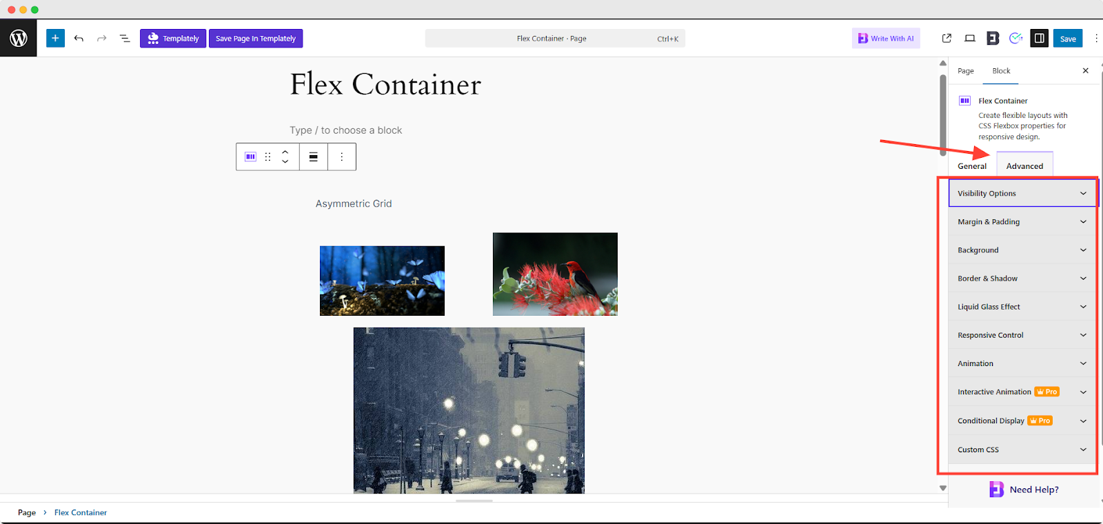
In the Advanced tab, you can easily access and customize a wide range of options to fine-tune your block’s appearance and behavior.
This includes Visibility Options, Margin & Padding, Background, Border & Shadow, Liquid Glass Effect, Responsive Control, Animation, Interactive Animation and Conditional Display.
The Advanced Styling Panel allows you to fine-tune the appearance and behavior of individual elements with precision.
- Visibility Options: Control when and where elements appear, often based on user roles or device types.
- Margin & Padding: Adjust spacing on all four sides using px, em or %.
- Responsive Control: Tailor design for mobile, tablet, and desktop.
- Background: Add colors, gradients, images, borders or shadows for depth and visual interest.
- Animation: Apply entrance effects or transitions for more engaging layouts.
- Conditional Display: Show or hide elements based on conditions (visible on frontend, not in editor).
- Custom CSS: Add custom styling rules for full design flexibility.
Final Outcome #
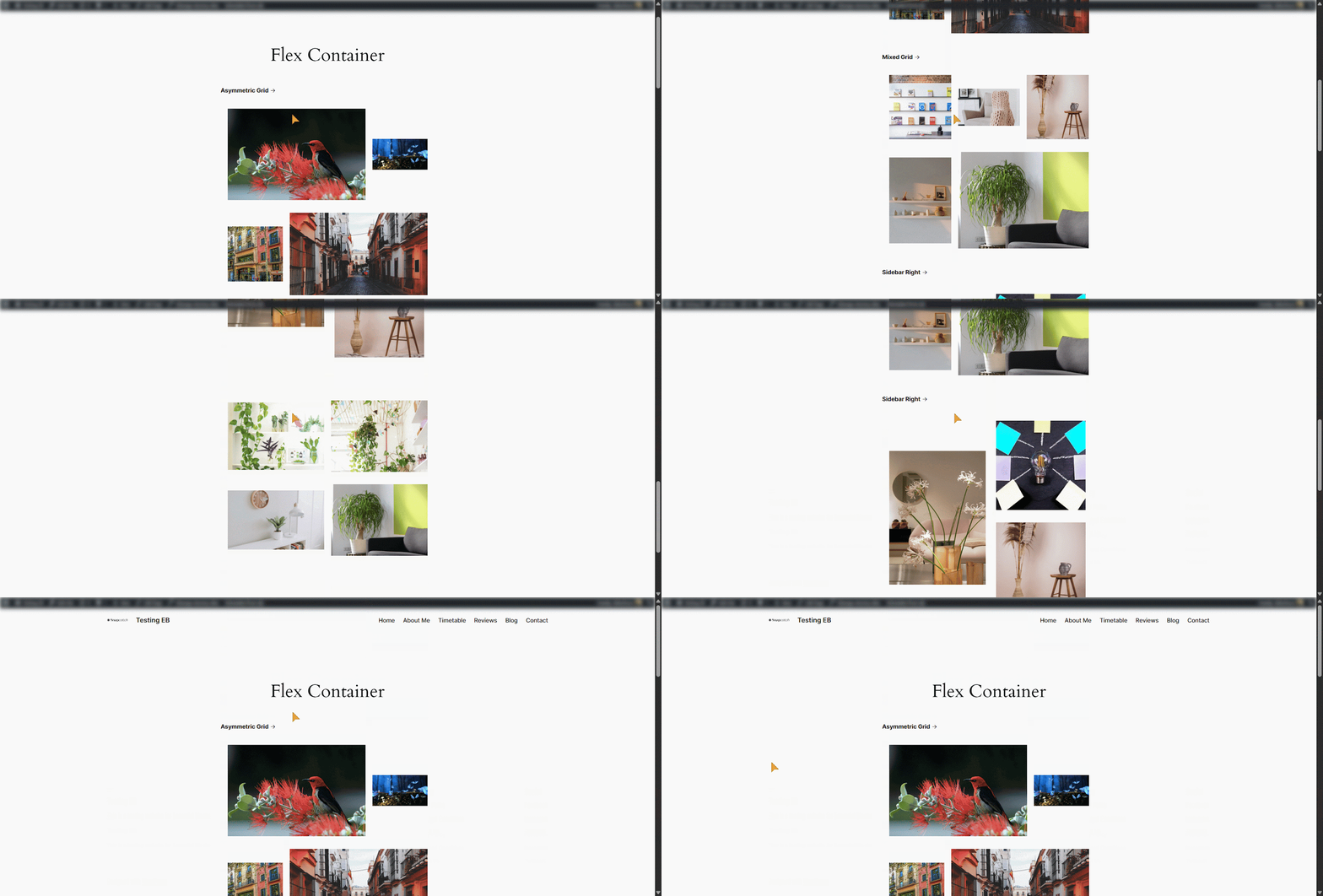
By following this guide, you’ve successfully learned how to add and configure a Flex Container block in the Gutenberg Page Builder. This allows you to create fully custom layouts by controlling alignment, spacing, and responsiveness using Flexbox properties.
That’s it! You can now easily add and use a Flex Container block to create custom layouts in the Gutenberg Page Builder. Getting stuck? Feel free to Contact Our Support for further assistance.


