With the EB Popup block, you can easily run marketing campaigns, collect email subscribers, design stunning notification bars, and much more. This advanced Gutenberg block from Essential Blocks allows you to have full control over trigger styles, previewing popups, and more.
Follow the step-by-step guidelines to add Essential Blocks Popup using Essential Blocks For Gutenberg.
How To Activate Essential Blocks Popup? #
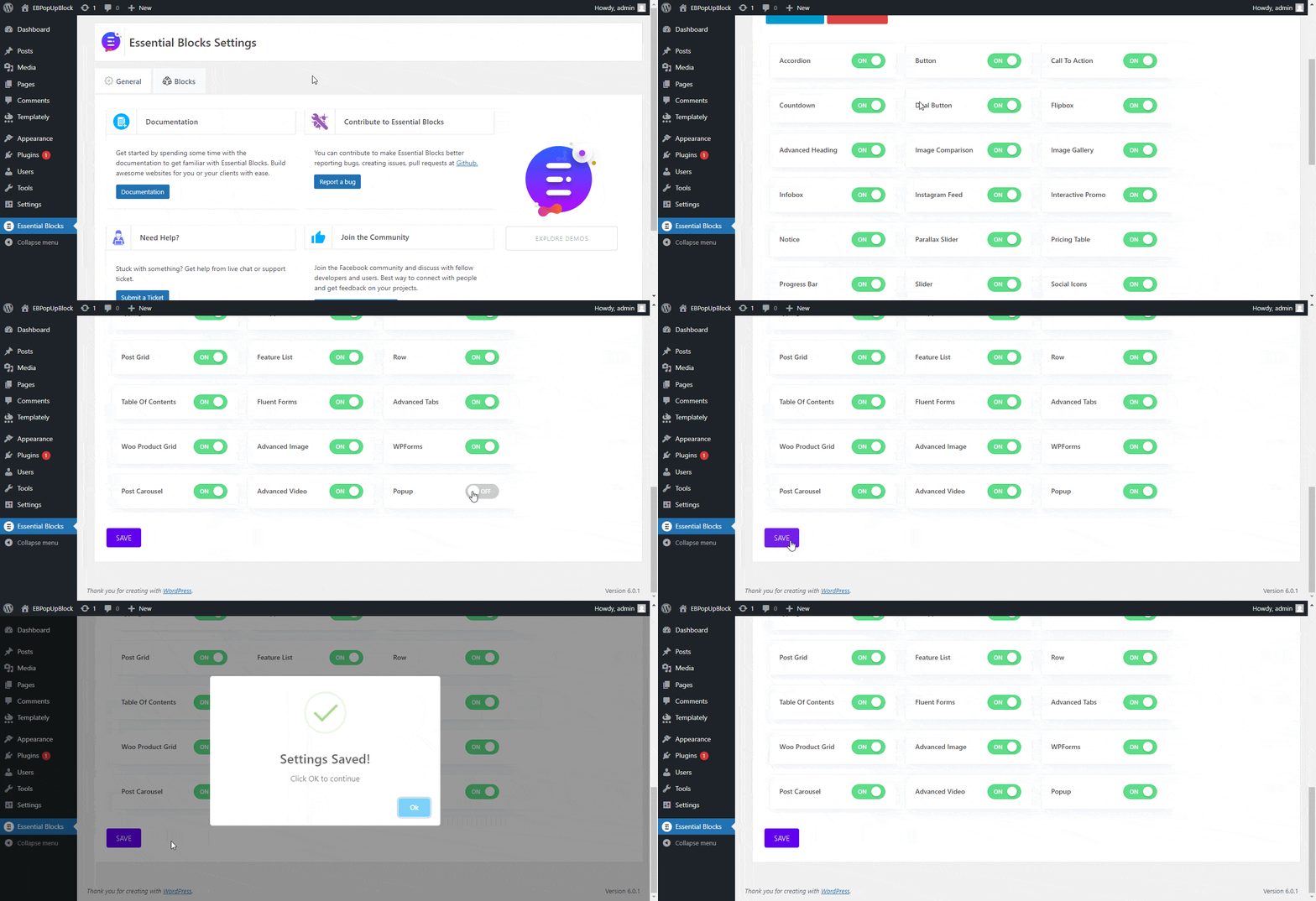
To activate EB Popup, navigate to ‘Essential Blocks → ‘Blocks’ from the WordPress dashboard. Then, toggle to enable this ‘Popup’ block. After that, click on the ‘Save’ button.
[Note: By default, the popup block stays enabled/activated. But if not, the user can follow the instruction given]
How To Configure Essential Blocks Popup? #
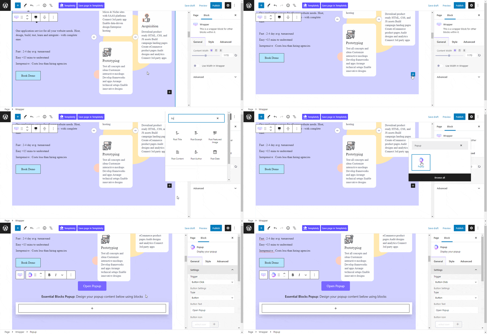
First, navigate to WordPress dashboard Page → ‘Add New’ and create a new one or select the page if you already have a created one where you want to add Popup.
To add a Popup block, click on the ‘+’ icon. Find Essential Blocks ‘Popup’ block from the search bar, as shown below. Simply click on the block and it will be added instantly.
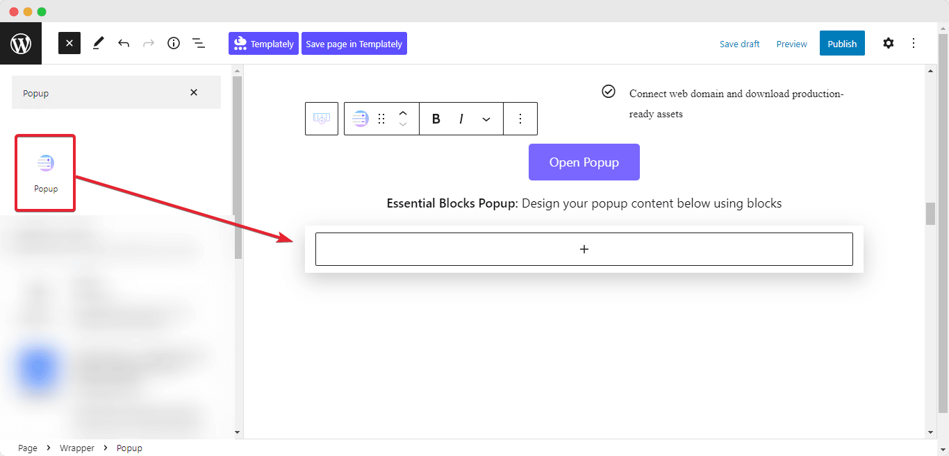
Alternatively, you can click on the ‘+’ icon, look for ‘Popup’ at the search bar and you will get the block. Simply drag and drop the block as shown.
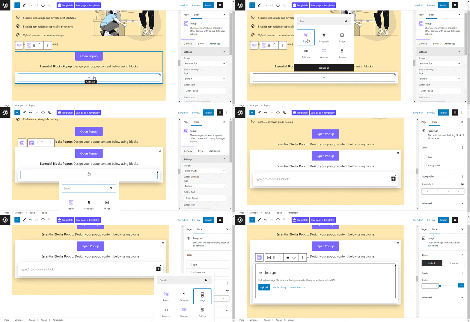
Inside the EB Popup block, you can add any Gutenberg block you want. You can also fully customize them with endless layout options. All you have to do is click the ‘+’ icon that appears after the Popup block is inserted into the page and afterward, you can add any Gutenberg blocks inside.
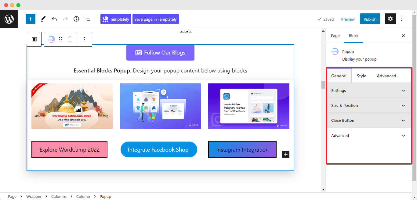
Now, click on the ‘Settings’ icon. A side panel will appear on the right side of your page. From here you can configure and personalize the content as well as the appearance of the EB Popup block.
General #
Go to the ‘General’ tab to customize the content. You can easily personalize the ‘Settings’, ‘Size & Position’, ‘Close Button’, and more.
You can configure the Popup preview by clicking the button, page load, or by clicking on other blocks from the ‘Trigger’ tab, as explained below.
- Button Click
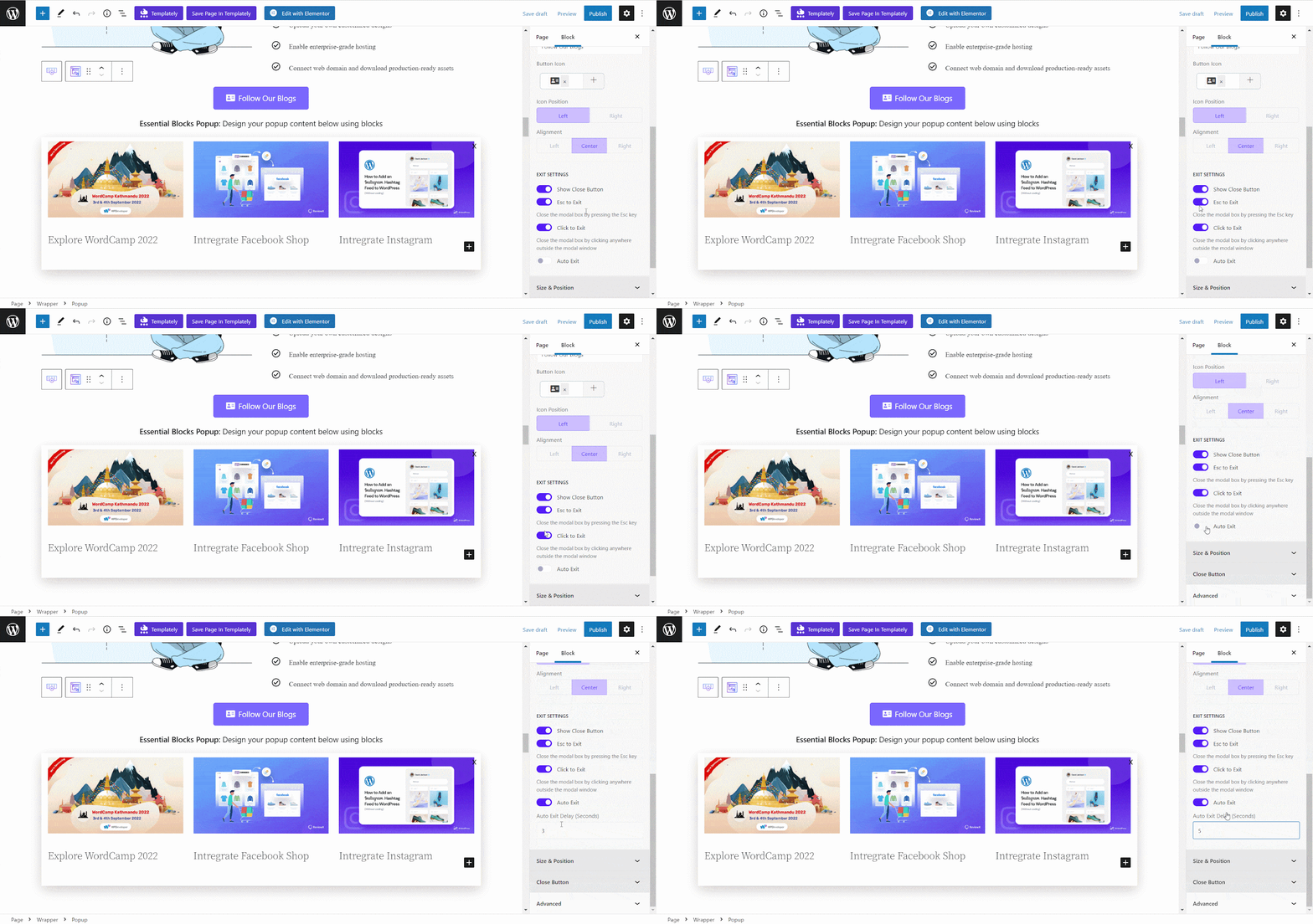
If you pick the ‘Button Click’ option then your popup will open with a button or icon click. You can easily change your ‘Button Type’ and ‘Button Text’ to give your popup block clear visibility. You can place your icon at any position with suitable alignment. Although, you will have many ‘Button Icon’ options to choose from and properly place your button icon with the right alignment.

Enable ‘Show Close Button’ to insert a ‘Cross’ on your popup block, at the top. Toggle on ‘Esc To Exit’ to exit your popup screen while pressing the Esc button from your keyboard or you can go for the ‘Click To Exit’ option to quit your popup by clicking anywhere on the screen. Enable ‘Auto Exit’ and set ‘Auto Exit Delay’ time in seconds there.
- Page Load
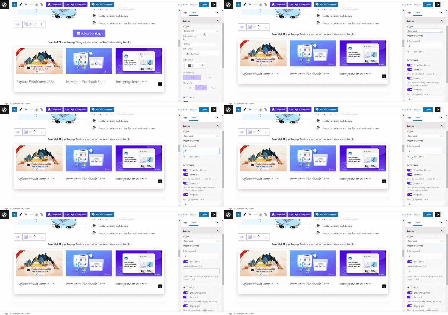
Now if you choose ‘Page Load’ as your trigger option your popup will load automatically after a certain time on the page.
You can set your popup previewing delay time from the ‘Delay(Seconds)’ tab. Now, toggle on the ‘Use Cookies’ option to pause showing the popup for a single session to your visitors. Set how many days you want to pause showing the popup once after it is closed by your visitor. The ‘Exit Settings’ tabs work the same as described before.
- External Element
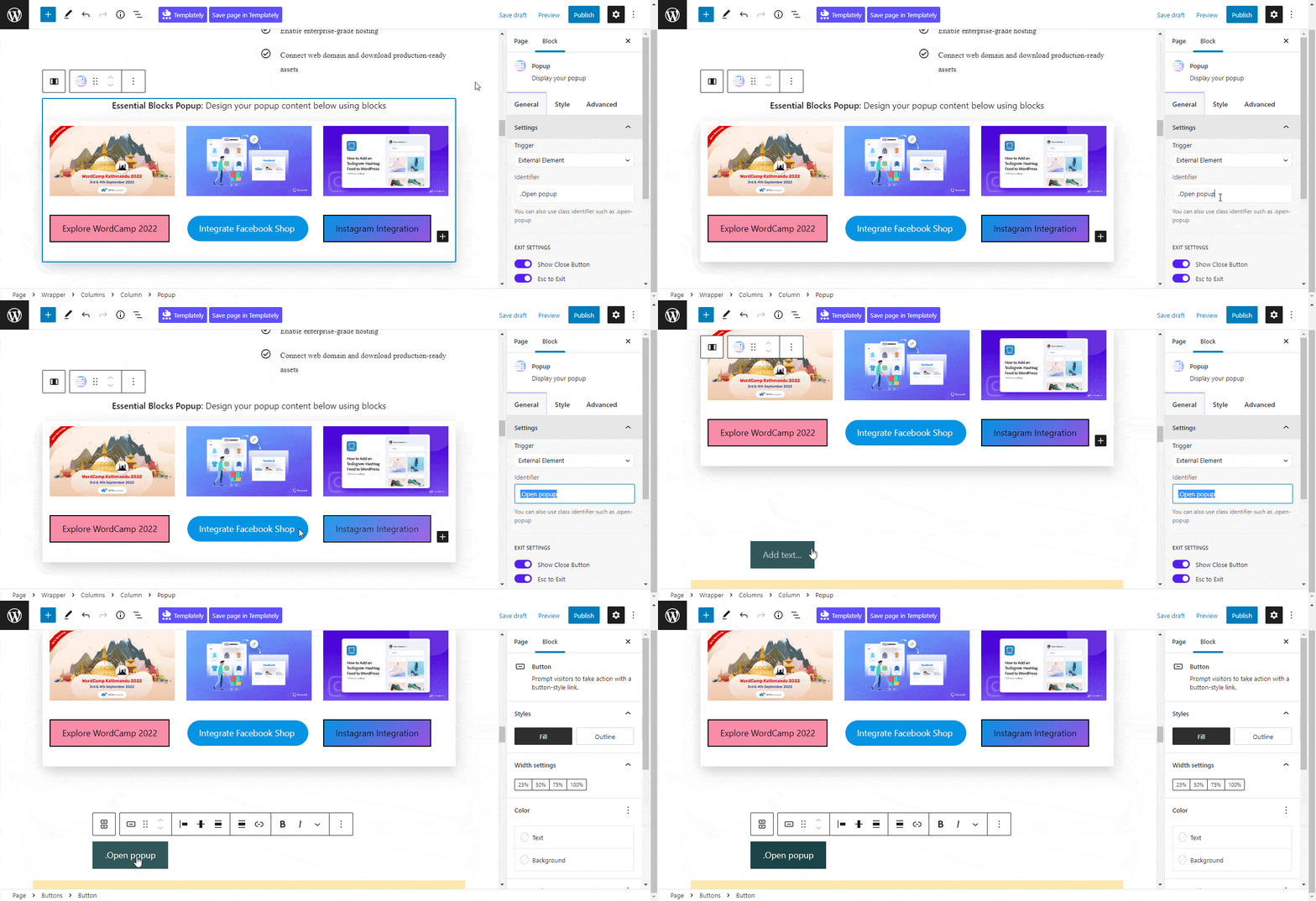
For the ‘External Element’ trigger option you can add the popup in text, image, or any other blocks. You can also use a class identifier as your external element if you wish.
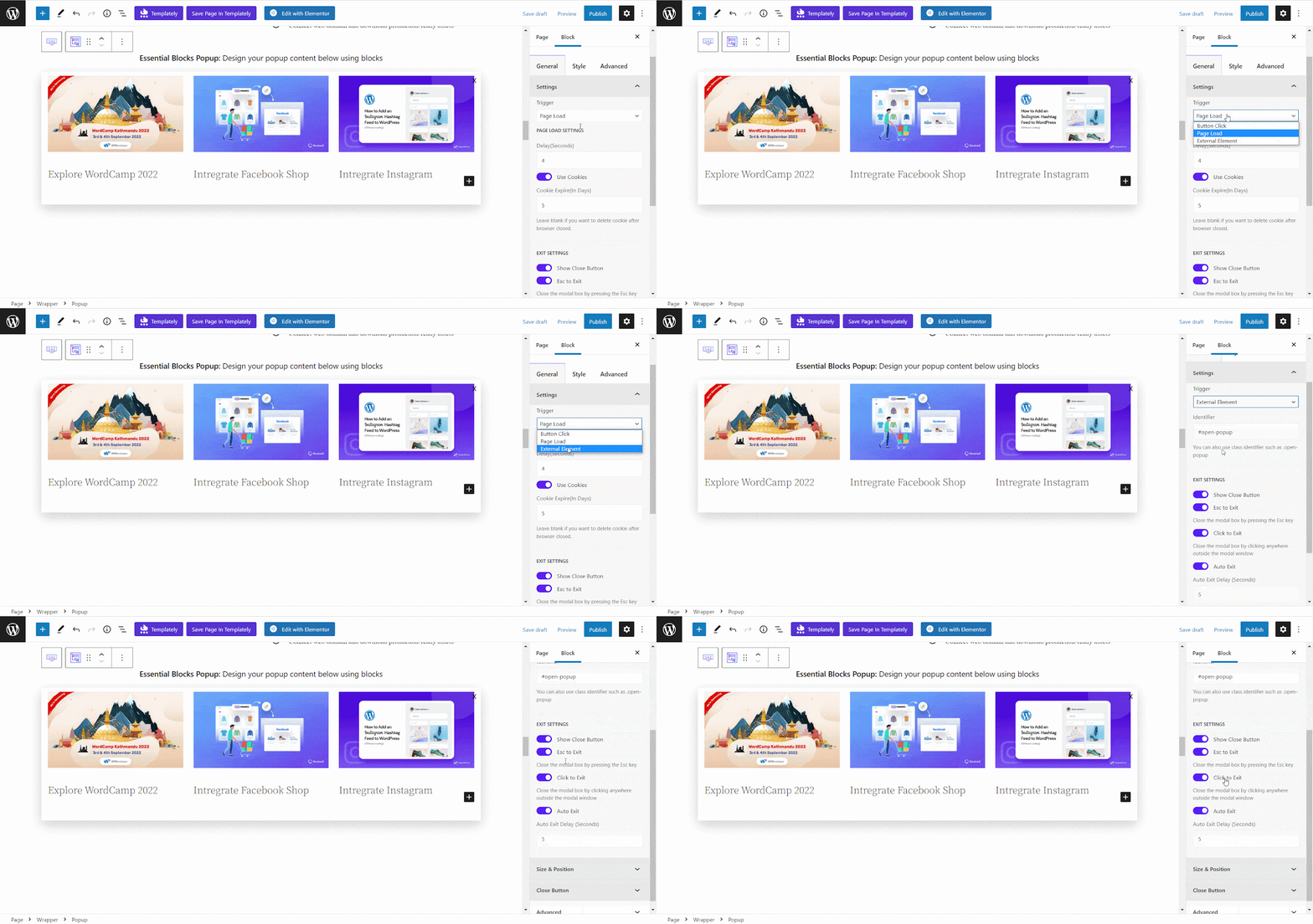
First, copy the identifier text from the block where you want to add Popup. Then paste it into the Popup block ‘Identifier’ field. So, whenever you will click on the external element your popup block will appear on your page.
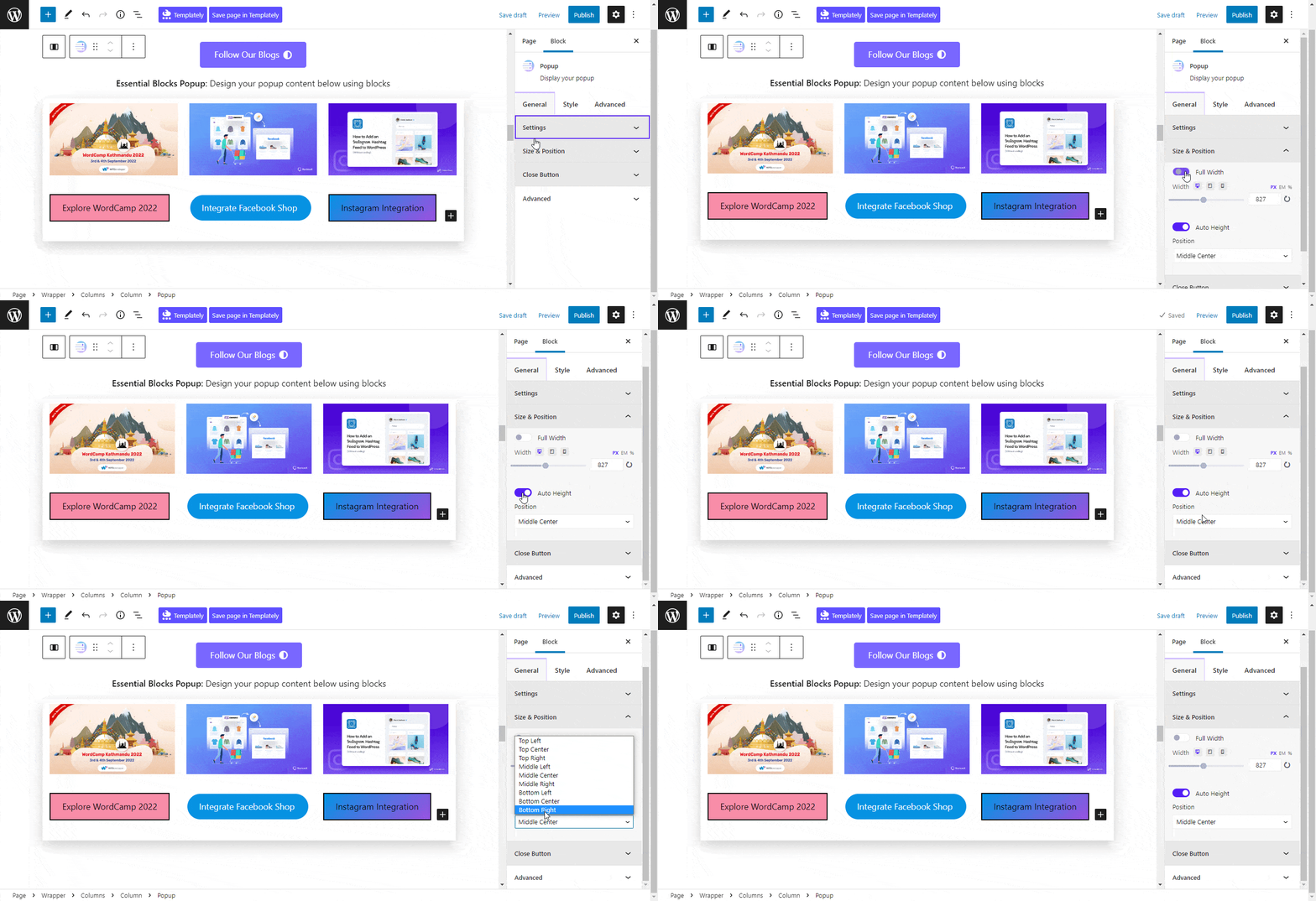
After you have customized the ‘Settings’ option, under the ‘Size & Position’ tab, you can enable the ‘Full Width’ option for your popup. Apply proper ‘Width’ and enable the ‘Auto Height’ option for automatic measurement. Choose your popup ‘Position’ from several options easily.
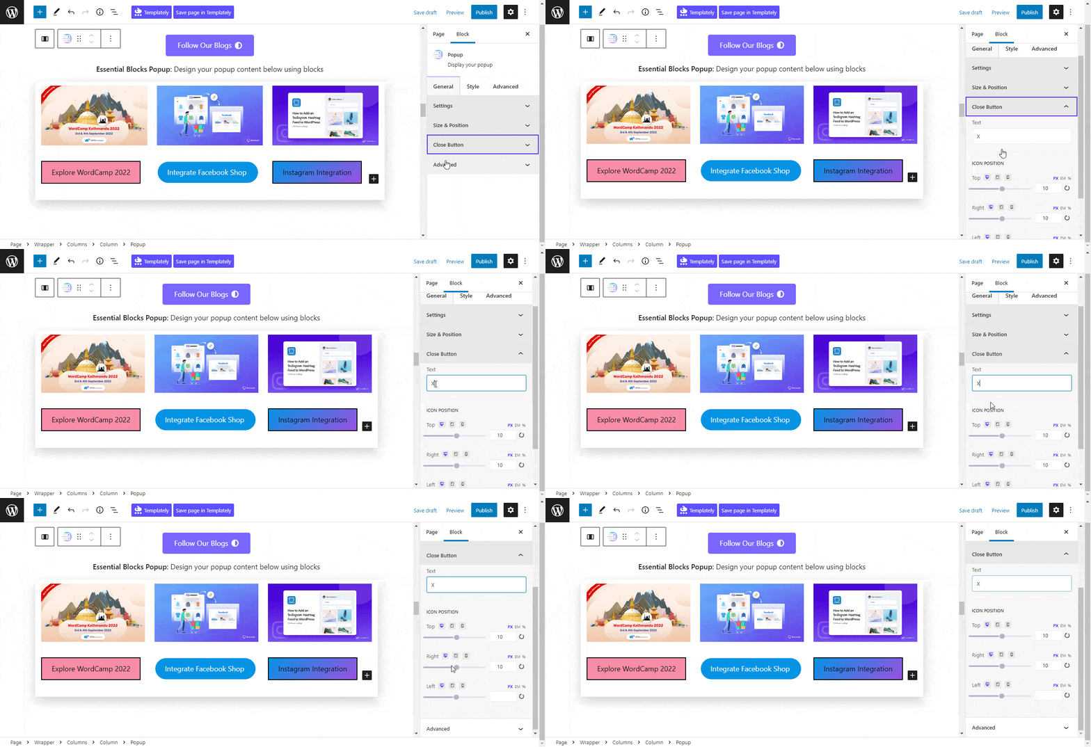
To customize your popup closing functionality, go to the ‘Close Button’ tab and there you can easily align ‘Icon Position’ as per your liking.
Styles #
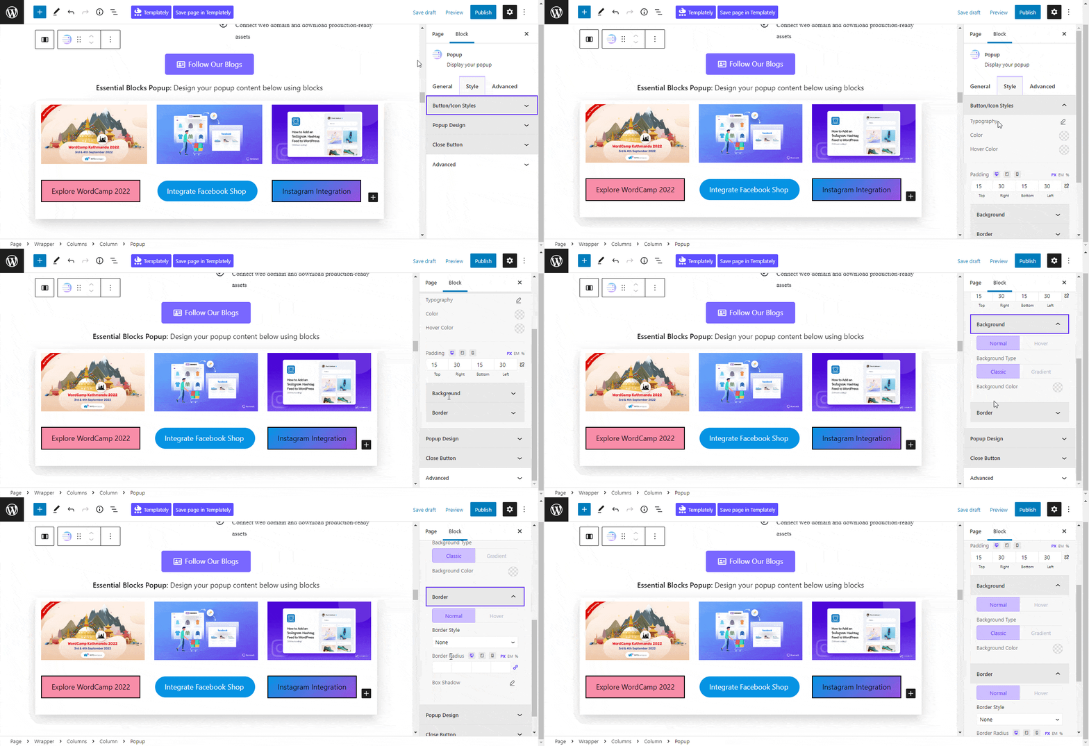
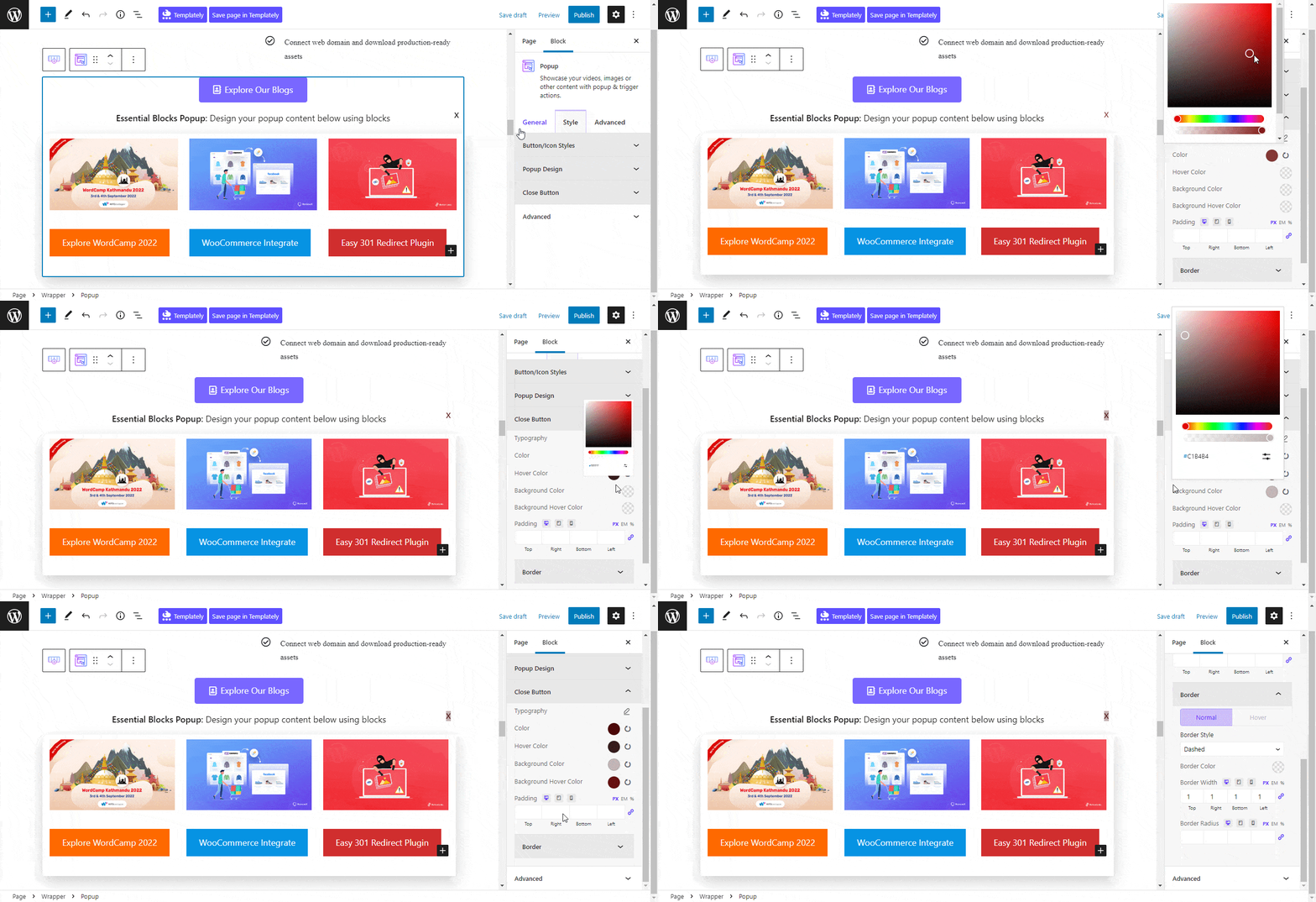
From the ‘Styles’ tab, personalize the Popup block appearance. From the ‘Button/Icon Styles’ tab pick any ‘Typography’ with attractive button ‘Color’ and ‘Hover Color’ palettes. Customize the button ‘Padding’, change the ‘Background type’, ‘Background Color’, and many more. Pick any ‘Border Style’ you want with accurate ‘Border Radius’ and ‘Border Shadow’ customization.
Customize your popup ‘Margin & Padding’ from this tab as well. Also, customize the ‘Background Type’, ‘Background Color’, beautiful ‘Background Image’ etc. You can also add the ‘Enable Overlay’ option to give your popup an appealing look.

To customize your ‘Close Button’ appearance you can choose your preferred ‘Typography’, ‘Color’, ‘Hover Color’, etc. Pick any button ‘Border’ style with the chosen ‘Border Radius’ from this tab as well.
Advanced #
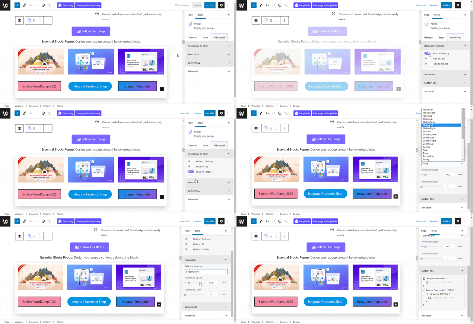
From the ‘Advanced’ tab, you will have many options for advanced customization. Here, you can customize Background type, Responsive Control, Animation, Custom CSS, etc. Multiple advanced block design customization options are also available there.
Final Outcome #
After making all the changes press the ‘Publish’ button and you can see your EB Popup block. By following the simple and easy steps, you can add the EB Popup block and style it in Gutenberg.
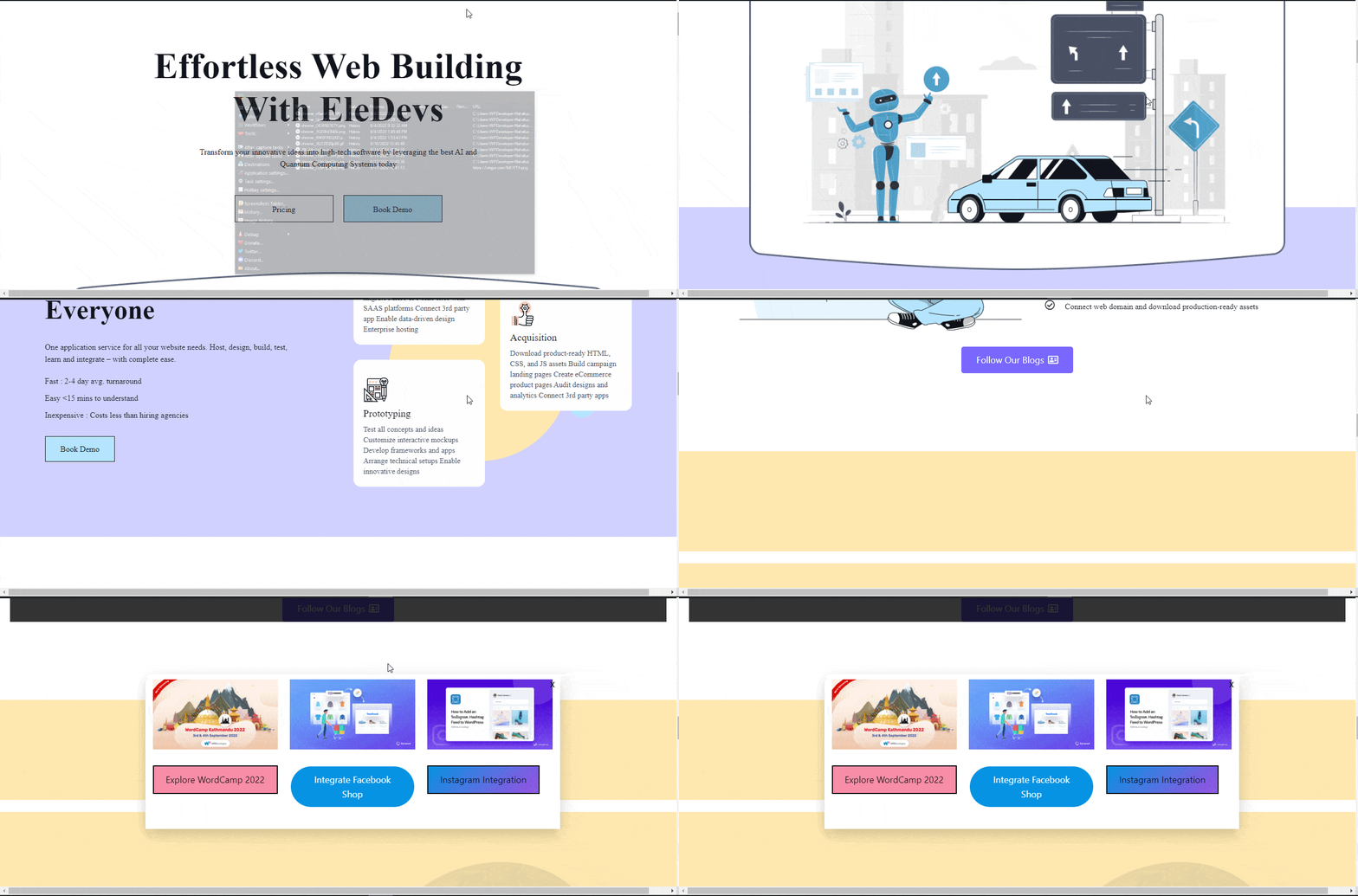
Here’s how you can easily set and design your EB Popup in Gutenberg.
Got stuck? Feel free to contact our support for further assistance.


