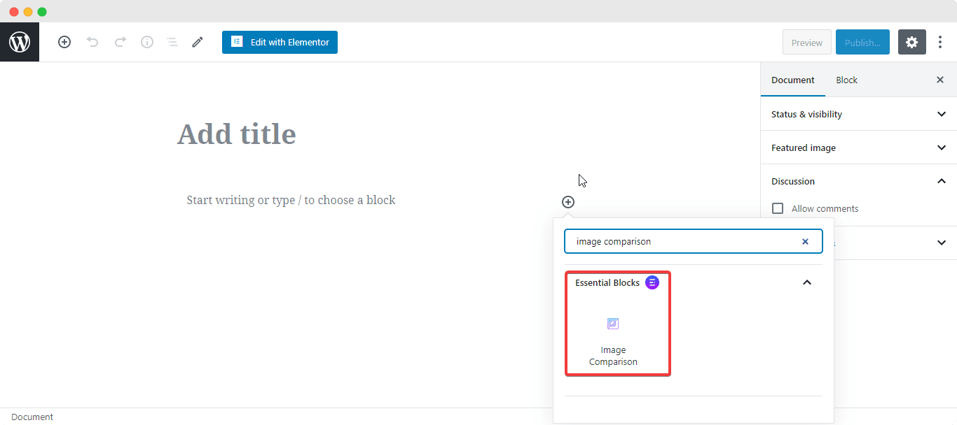
EB Image Comparison gives you the opportunity to highlight the differences between two images in an amazing way. This block from Essential Blocks makes it easy for your viewers to spot differences between 2 images through a slider. For instance, you can put an old and a new product side by side and let your visitors see what has changed.

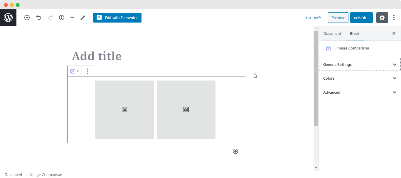
After you are done with this step, this is the default layout you are going to see.

How to Configure the General Settings #
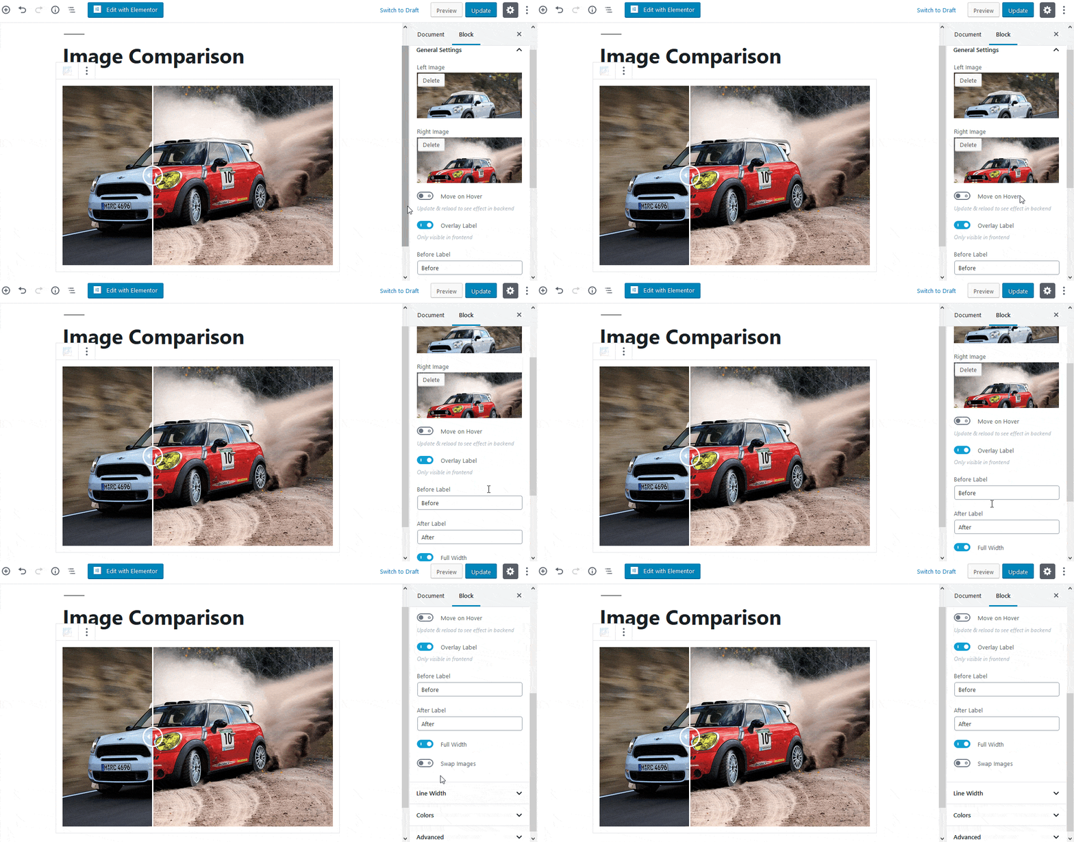
From the ‘General Settings’ section, you have the freedom to pick your preferred images- Right & Left Image. By default, the Image Comparison is set so that visitors have to manually move the slider with their mouse.
However, if you enable the ‘Move on Hover’ effect, then the slider will move when you hover your mouse on the images. You are able to add an Overlay Label as well. You can change both Before and After labels.

Besides this, you can use the toggle to enable Full Width for the Image Comparison. If disabled, you can change the width of the images. Moreover, you are able to swap the Right Image with Left Image as well.
How to Style Image Comparison #
EB Image Comparison allows you to change the Line Width of the slider. It is set to 3px by deafult. Besides, you are able to change the color of Line & Arrow as well.

Final Outcome #
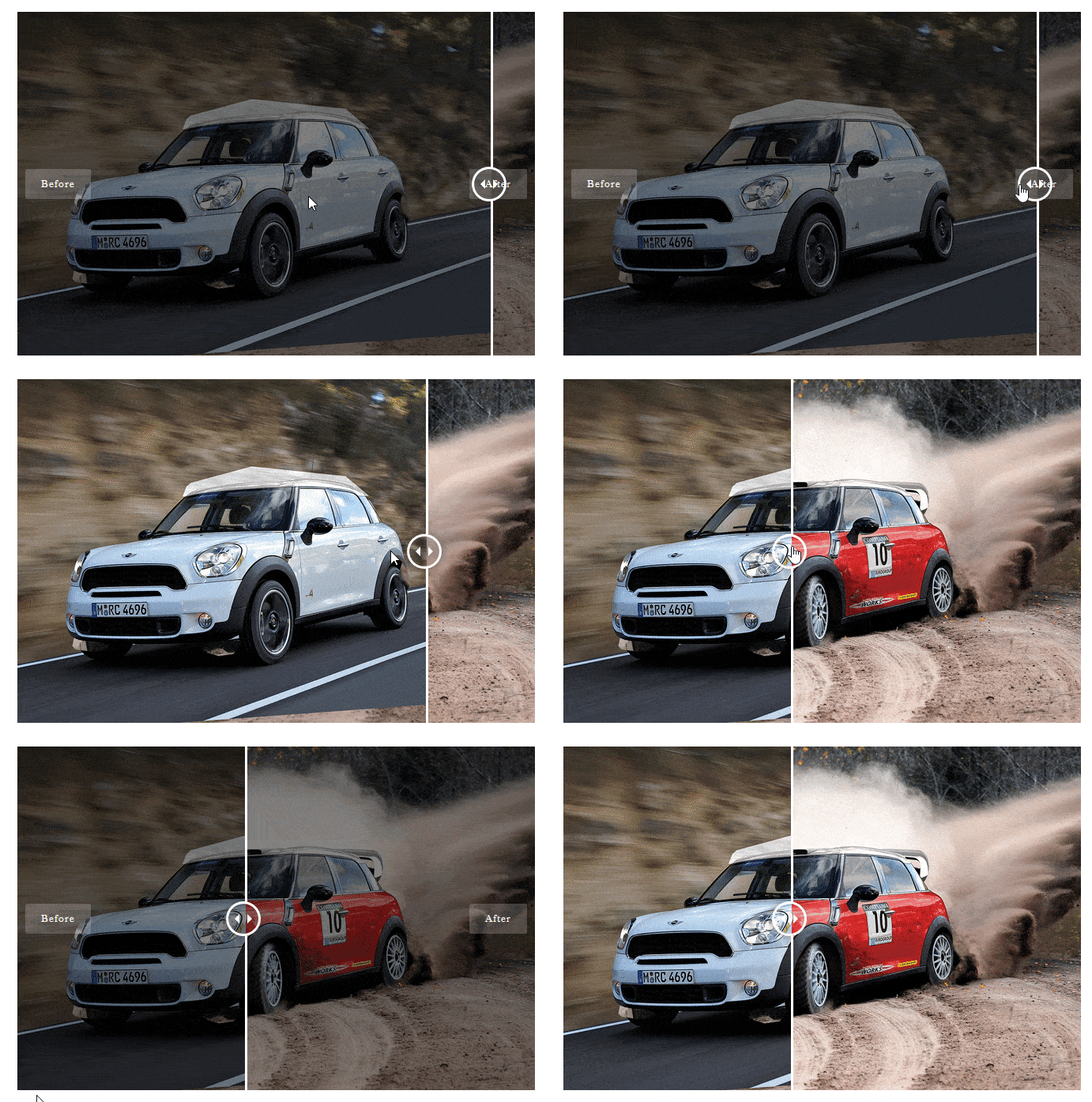
By following the basic steps and a bit more modifying, you can style your Image Comparison however you want and get your expected outcome.

By using EB Image Comparison, this is how you can highlight the differences between two products and make it look appealing to your visitors.
Getting stuck? Feel free to Contact Our Support for further assistance.


