With EB Toggle Content block, you can display multiple contents together and seamlessly switch between them. This interactive block will also help you to reduce scroll time and improve site engagement. Essential Blocks offers a wide range of customization options, flexible styling, and many more.
Follow this step-by-step guide to design website content using the EB Toggle Content block in Gutenberg.
How To Activate EB Toggle Content Block? #
First, install and activate the Essential Blocks for Gutenberg plugin in your WordPress dashboard. Essential Blocks comes with modular control which gives you the freedom to enable only using blocks.
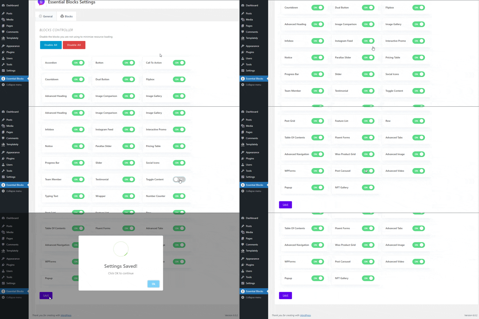
To activate EB Toggle Content, navigate to Essential Blocks → Blocks. Then, toggle to enable this ‘Toggle Content’ block. After that, click on the ‘Save’ button.
How To Configure EB Toggle Content In Gutenberg? #
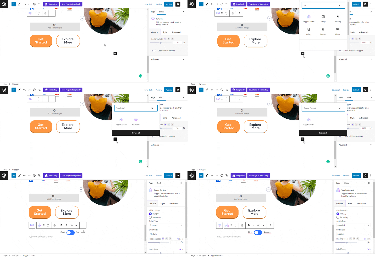
Here, open a new page where you want to add a Toggle switch. Then click on the ‘+’ icon and search for Toggle Content. Afterward, click on ‘Toggle Content’ and the block will be added instantly to your webpage.
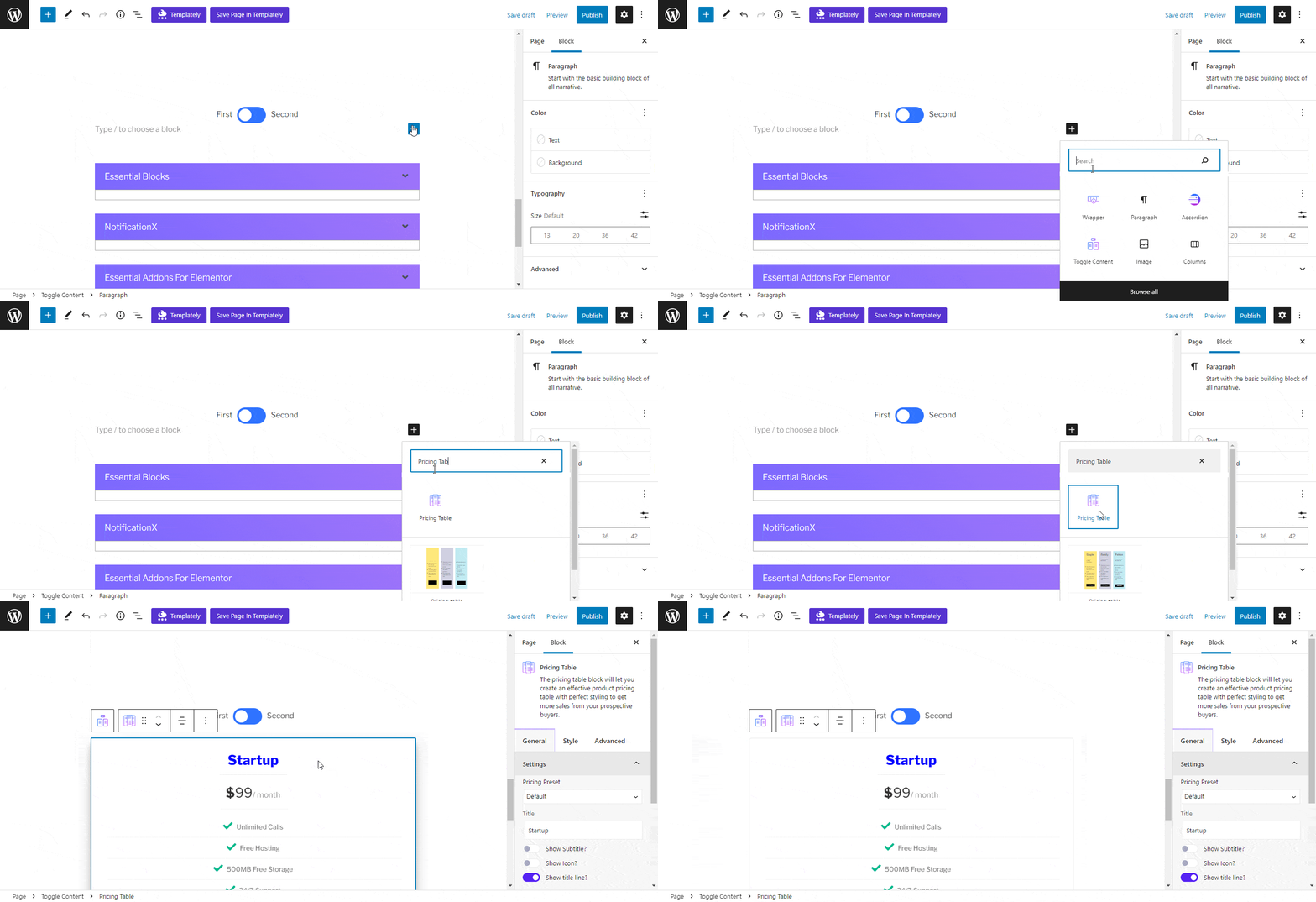
Now, time to add content under Toggle switches. Again click on the ‘+’ icon under the First switch. Search for a block and add it accordingly. In the same way, add another block of content under the Second switch.
General #
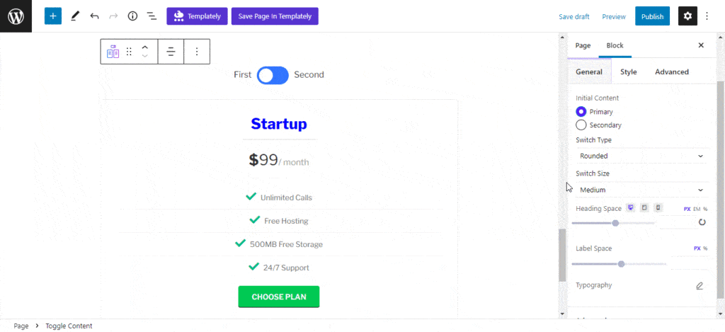
The next step is to customize content under the Toggle block. Click on the ‘Settings’ option from the top, then go to the Block → General tab. You can make the ‘Initial Content’ either Primary or Secondary.
From the ‘Switch Type’ option, you can change the type of the toggle switch. You can choose between Rectangle, Rounded, and Toggle types.
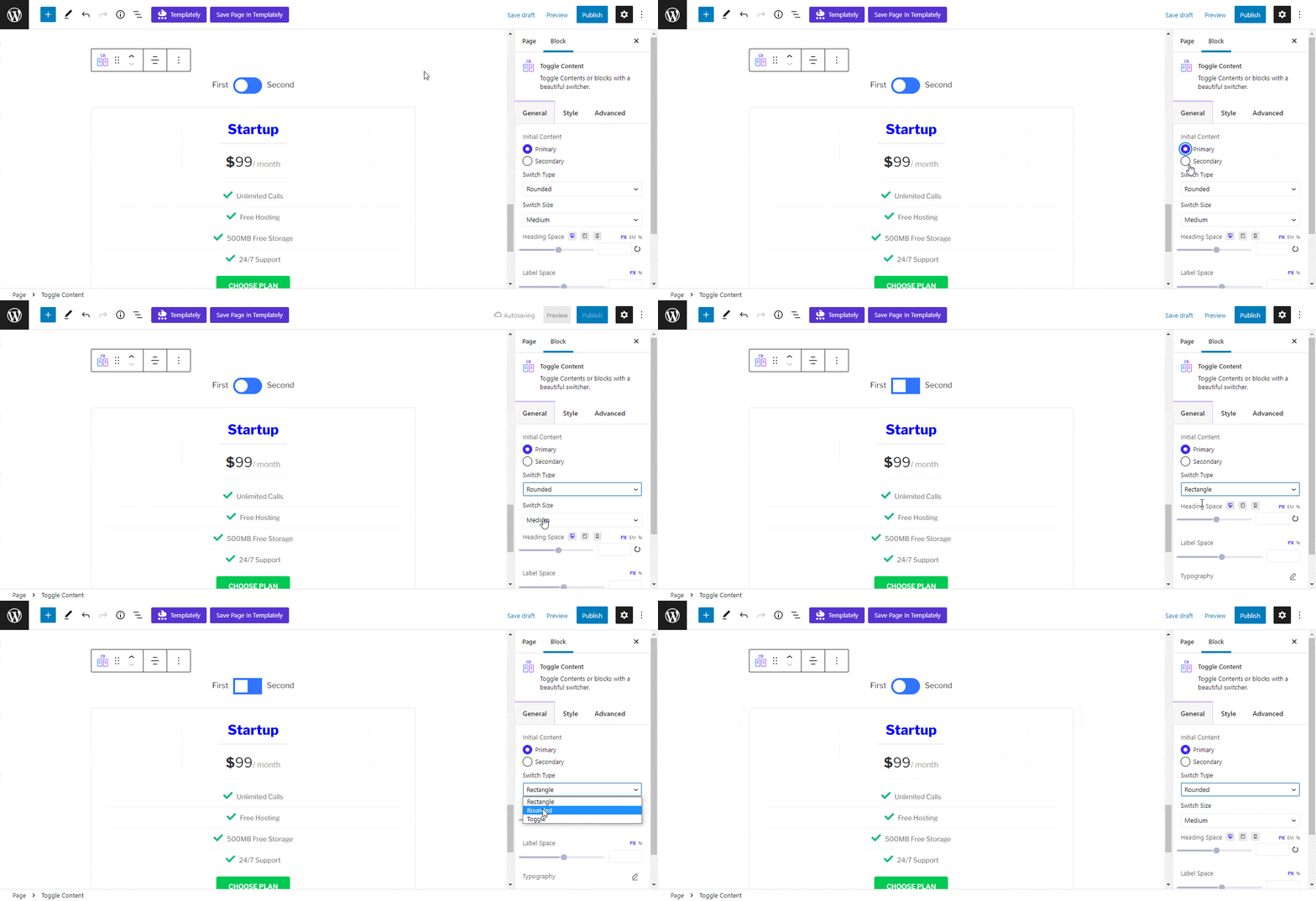
Besides, you can also customize the toggle switch Button Height, Button Width, Heading Space, and so on. From the Typography section, you can change Font Size, Font Weight, Letter Spacing, Line Heights, etc.
Style #
In EB Toggle Content, you can change the color of Primary Text, Secondary Text, and Active Text from the ‘Label Color‘ option. From the color customizer, you can choose colors apart from the preset ones.

From the ‘Switch Background‘ option, you can choose solid colors or gradients for your Toggle switch background.
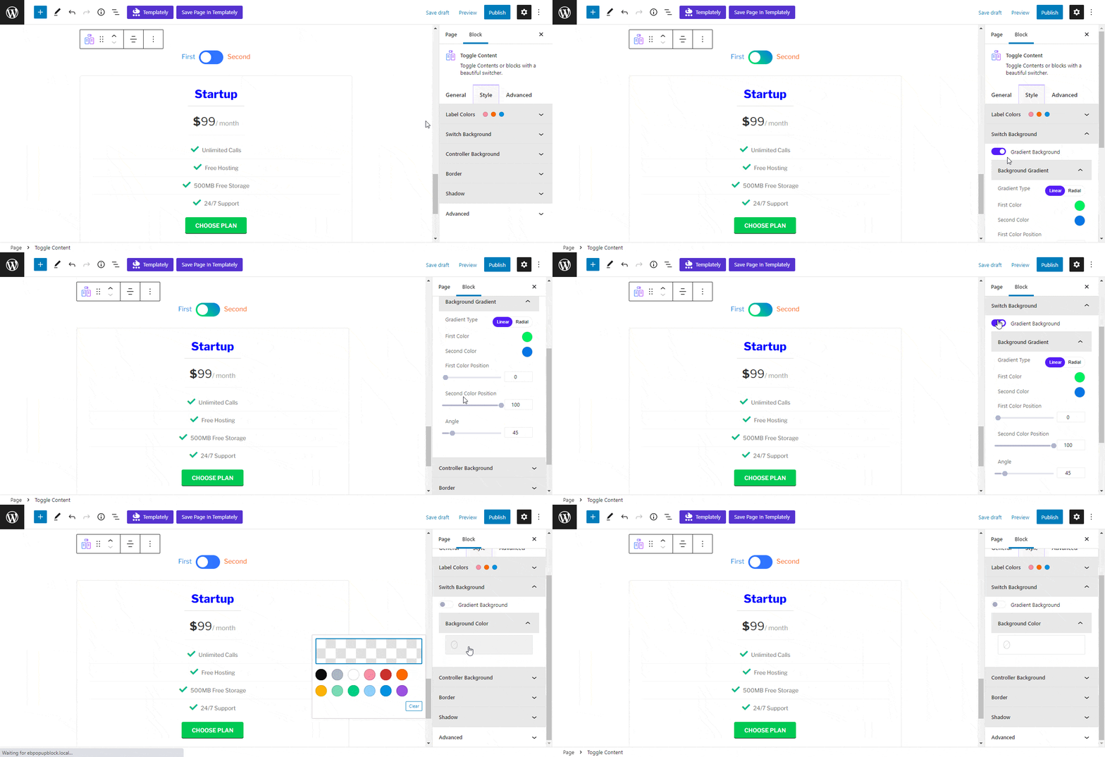
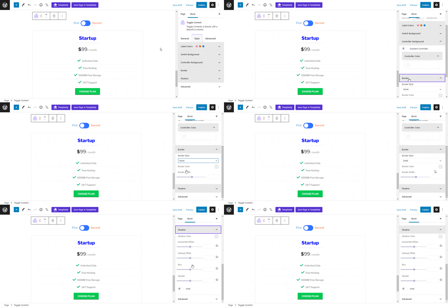
From the ‘Controller Background‘, you can turn the toggle switch in gradients or choose solid color. Similarly, you can customize the Toggle Switch Border, Shadow, etc smoothly.
Advanced #
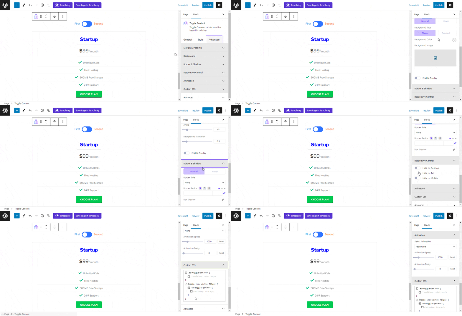
From the ‘Advanced’ tab, you can make the Toggle switch appearance more interactive and soothing. Here, you can change the Toggle Content Margin, Padding, Background color and image, Border & Shadow, etc. All advanced block design customization options are available there.
Final Outcome #
After making all the changes, click on the ‘Publish’ button to make your page live. Check out how the Toggle Content will appear on your website.
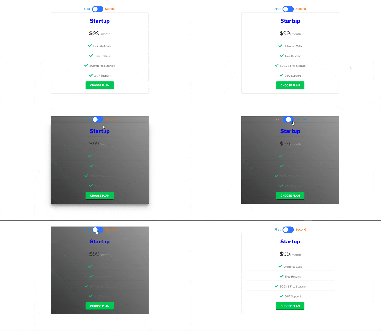
How To Include Multiple Content Blocks In Toggle Content? #
By default, you can only add one block under each switch of Toggle Content. But the good news is, with EB Wrapper you can easily keep multiple blocks under the switch of Toggle Content. First, add the Toggle Content on the Gutenberg editor. Then click on the ‘+’ icon, search for Wrapper and insert it.
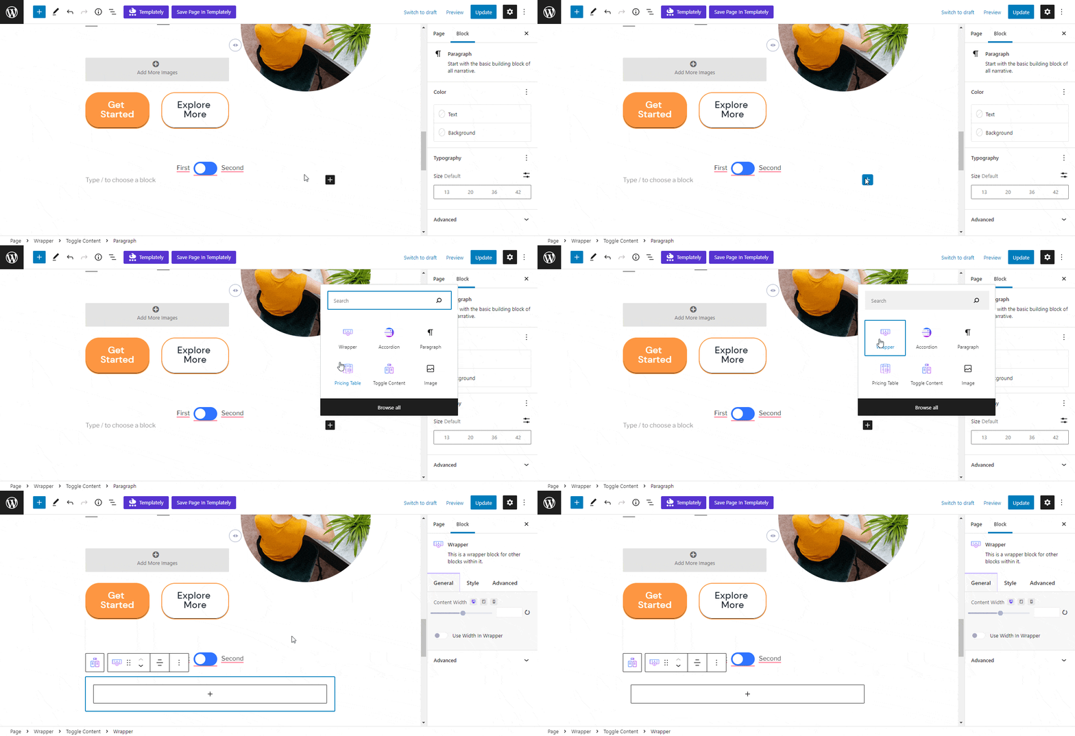
Now in the Wrapper container, you can add an image block, text block, button block, pricing block, or any blocks you want. Here is a final look after adding the Wrapper in the Toggle switch. For a more detailed guideline, follow EB Wrapper documentation.
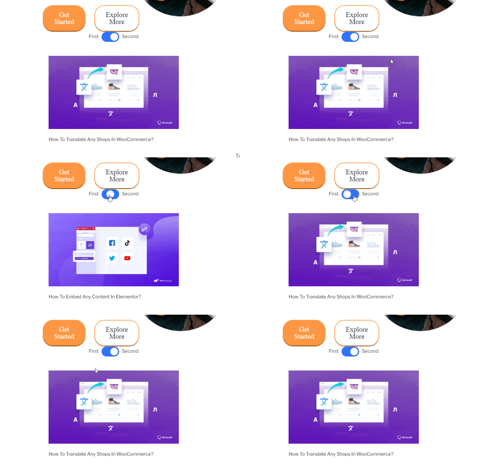
This is how you can design an EB Toggle Content block in Gutenberg easily.
Getting Stuck? Feel free to contact our support team for further assistance.


