Essential Blocks provides the capability to customize the styling of blocks for tablet and mobile screens separately. Columns used on the website can be collapsed or rearranged based on whether they are viewed on a tablet or mobile device. These distinctions are determined by what are known as Responsive Breakpoints. This responsiveness customization is a free feature in Essential Blocks.
By default, Essential Blocks uses the following breakpoints:
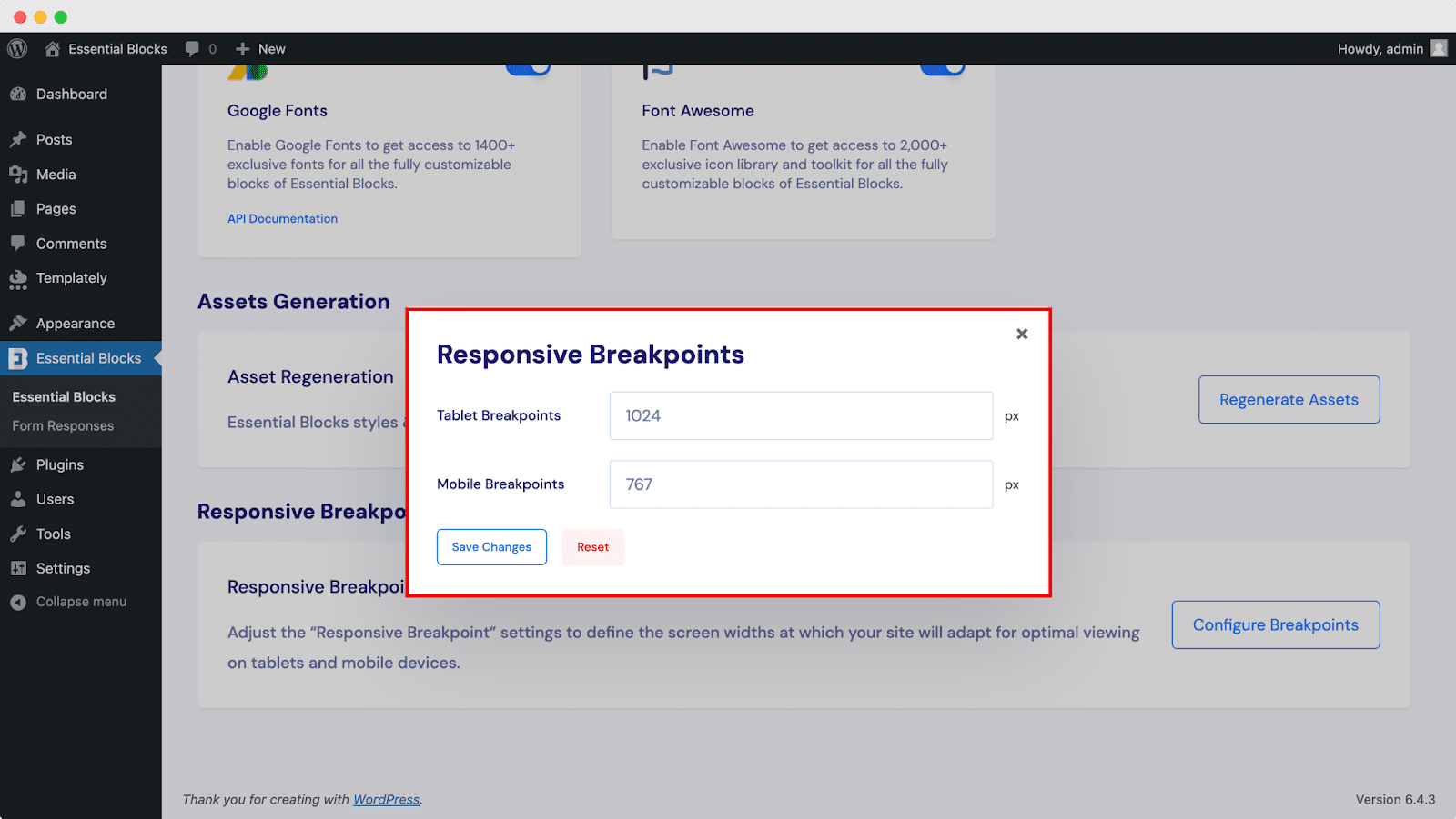
- Tablet: 1024px
- Mobile: 767px
These values denote the screen widths at which the design and functionality adjustments occur. However, Essential Blocks offers the flexibility to modify these breakpoints according to specific preferences or project requirements.
Where To Locate Responsive Breakpoints In Essential Blocks? #
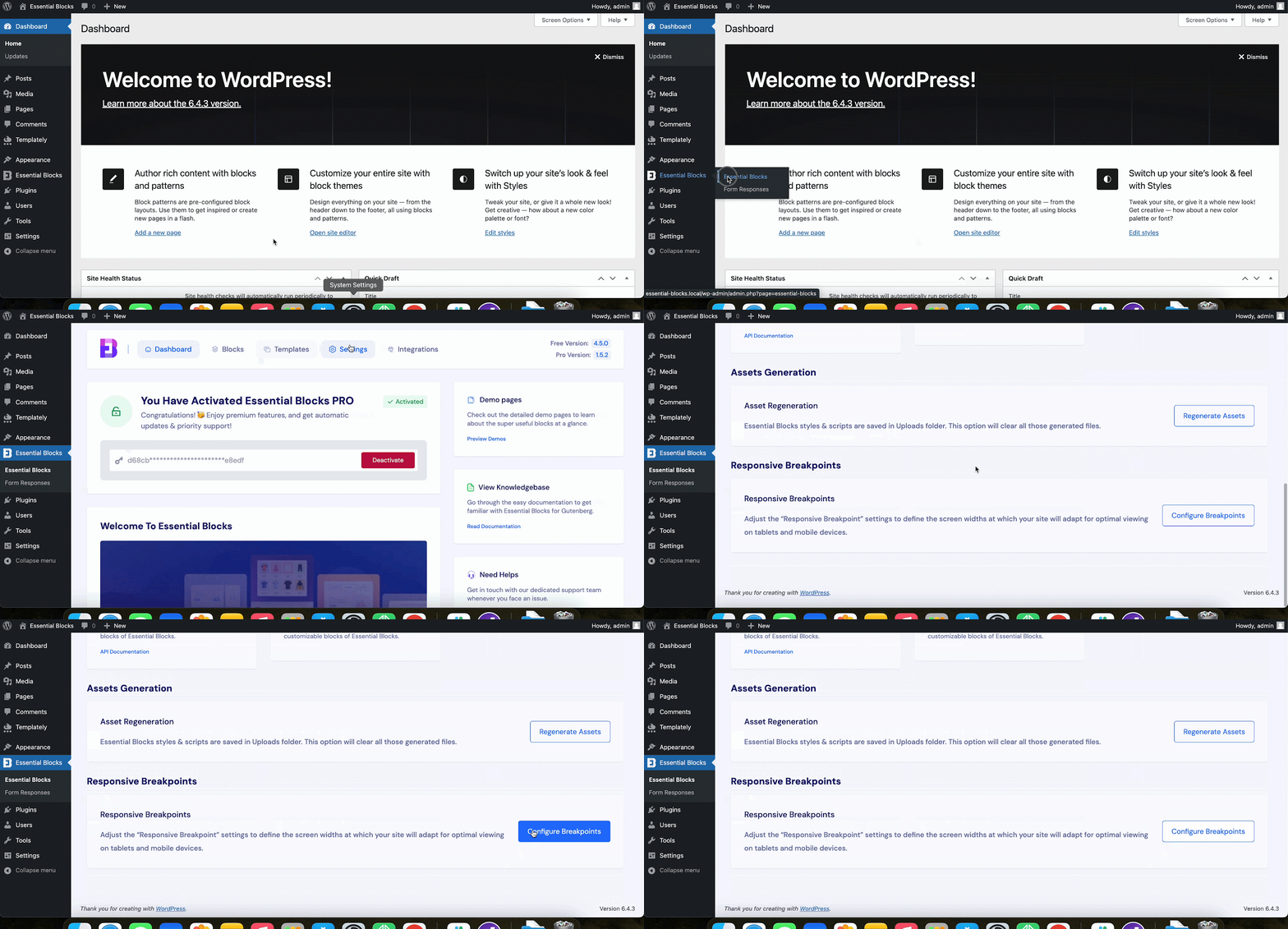
Go to your WordPress dashboard and navigate to Essential Blocks → Settings. Scroll down a bit, find the section named ‘Responsive Breakpoints’ & click on ‘Configure Breakpoints.’

How To Configure Responsive Breakpoints In Essential Blocks? #
After clicking on the option, you’ll get a pop-up screen. Now update with new values in pixels in the specific fields & click on ‘Save Changes.’

This is how you can customize responsive breakpoints for mobile and tab views of your website seamlessly with Essential Blocks.
Got Stuck? Feel free to contact our support team for further assistance.


