The laws of UX are proven user experience design principles that explain how people perceive, process and interact with interfaces. If you have ever wondered what are the laws of UX and why some websites feel effortless while others feel frustrating, the answer usually comes down to a few predictable patterns in human behavior. Once you understand those patterns, you can make smarter decisions about navigation, content layout, calls to action, mobile responsiveness, and overall website usability.
This guide breaks the most important UX laws into plain language, then shows you how to apply them on a real website. Whether you manage a business site, a blog, an agency portfolio, a WooCommerce store, or a content-heavy WordPress site, you will find practical tips you can use right away. Along the way, you will also see where Gutenberg-friendly tools such as Essential Blocks can help you apply UX best practices without custom code.
TL;DR
Too long? Didn’t read. Here’s a quick summary of the blog post.
| UX law | Simple meaning | Best website use case | Likely outcome |
| Jakob’s Law | Users prefer familiar patterns | Navigation, forms, layouts and account pages | Less confusion and faster learning |
| Hick’s Law | Too many choices slow decisions | Menus, pricing pages, category pages | More focus and better conversion |
| Fitts’s Law | Large, nearby targets are easier to click | Buttons, mobile menus, forms | More interactions and fewer misclicks |
| Miller’s Law | People can handle limited information at a time | Long-form content, feature pages and onboarding | Better comprehension and scannability |
| Aesthetic-Usability Effect | Beautiful design feels easier to use | Landing pages, portfolios, homepages | More trust and lower perceived effort |
| Law of Proximity | Related items should appear together | Feature groups, pricing, FAQs | Clearer structure and easier reading |
| Tesler’s Law | Every system has unavoidable complexity | Checkout, search, dashboards, forms | Less friction in critical flows |
| Doherty Threshold | Fast feedback improves experience | Page load, filters, search, popups | Lower bounce and better engagement |
| Peak-End Rule | People remember the first and last moments | Landing pages, CTAs, thank-you pages | Stronger brand recall and conversion lift |
What Are the Laws of UX?
The laws of UX are practical principles drawn from psychology, behavior science and interface design. They help explain how people scan pages, choose between options, click buttons, interpret visual relationships and remember digital experiences. In other words, they translate human behavior into design decisions.
You do not need to be a trained UX researcher to use them. If you run a website, write content, build pages in Gutenberg, or optimize funnels, these UX design principles can help you create a smoother experience for real users instead of designing based on guesswork. Here are some of the reasons why you should know the laws of UX in modern web design.
Reduce the Learning Curve
When your site follows familiar patterns, visitors do not need to stop and decode the interface. They can recognize the menu, understand the layout and take the next step faster. That matters because most visitors do not arrive with patience to spare.
Improve Trust at First Glance
Modern website design is judged in seconds. Clean spacing, obvious headings, logical grouping and consistent buttons make a site feel credible. That first impression affects whether users stay, browse, subscribe, or leave.
Make Navigation Easier
Many website usability issues are really decision-making problems. Too many menu items, too many call-to-action buttons, or too many competing visuals increase mental effort. UX principles for websites help you remove that friction.
Support Better Mobile Experiences
Mobile friendly ux is now a baseline expectation. UX laws help you prioritize larger tap targets, shorter forms, collapsible sections, readable typography and clear content hierarchy for smaller screens.
Improve Performance, Conversions And Retention
A smoother experience often leads to better engagement metrics: longer time on page, more pages per session, more form completions, more purchases and fewer drop-offs. Good user experience design is not only about aesthetics. It directly supports business goals.
How UX Principles Improve User Behavior & Conversions
People convert when the path feels obvious, relevant and low effort. UX laws improve that path in practical ways. Here, we will discuss the core UX laws that can be implemented on a website for different purposes. For example, Jakob’s Law helps users feel instantly comfortable. Hick’s Law reduces hesitation. Fitts’s Law makes interaction easier. Miller’s Law makes content digestible. The Doherty Threshold keeps momentum high. Combined, these small improvements build trust and reduce abandonment.
Imagine a service business homepage. A familiar hero section with one clear CTA, a short benefit list, a trust-building testimonial area and a simple contact form will usually outperform a page packed with sliders, competing buttons, dense copy, and popups firing too early. The difference is not luck. It is an aligned website UX.
Common UX Mistakes Website Owners Make
Many site owners unknowingly create friction because they design for internal preferences instead of user behavior. The most common mistakes include:
- Using unconventional navigation labels that sound clever but hide meaning
- Adding too many menu items, homepage sections, or CTA buttons
- Making buttons too small or placing them too far from supporting content
- Publishing long walls of text with no hierarchy, summaries, or visual breaks
- Over-designing pages with excessive animations, effects, and inconsistent spacing
- Ignoring mobile layouts until after the desktop version is finished
- Using slow plugins, heavy media, and unoptimized scripts that hurt perceived speed
Now, let us look at the most practical UX laws one by one and connect them to real website decisions.
Jakob’s Law – Users Prefer Familiar Interfaces
Jakob’s Law says users spend most of their time on other websites, so they prefer your site to work in ways they already understand. According to a study, First-time users complete tasks successfully more than 95% of the time when interfaces follow familiar patterns, while novel interaction models typically achieve only a 40%–60% success rate. That does not mean your design must be generic. It means the underlying patterns should feel recognizable.
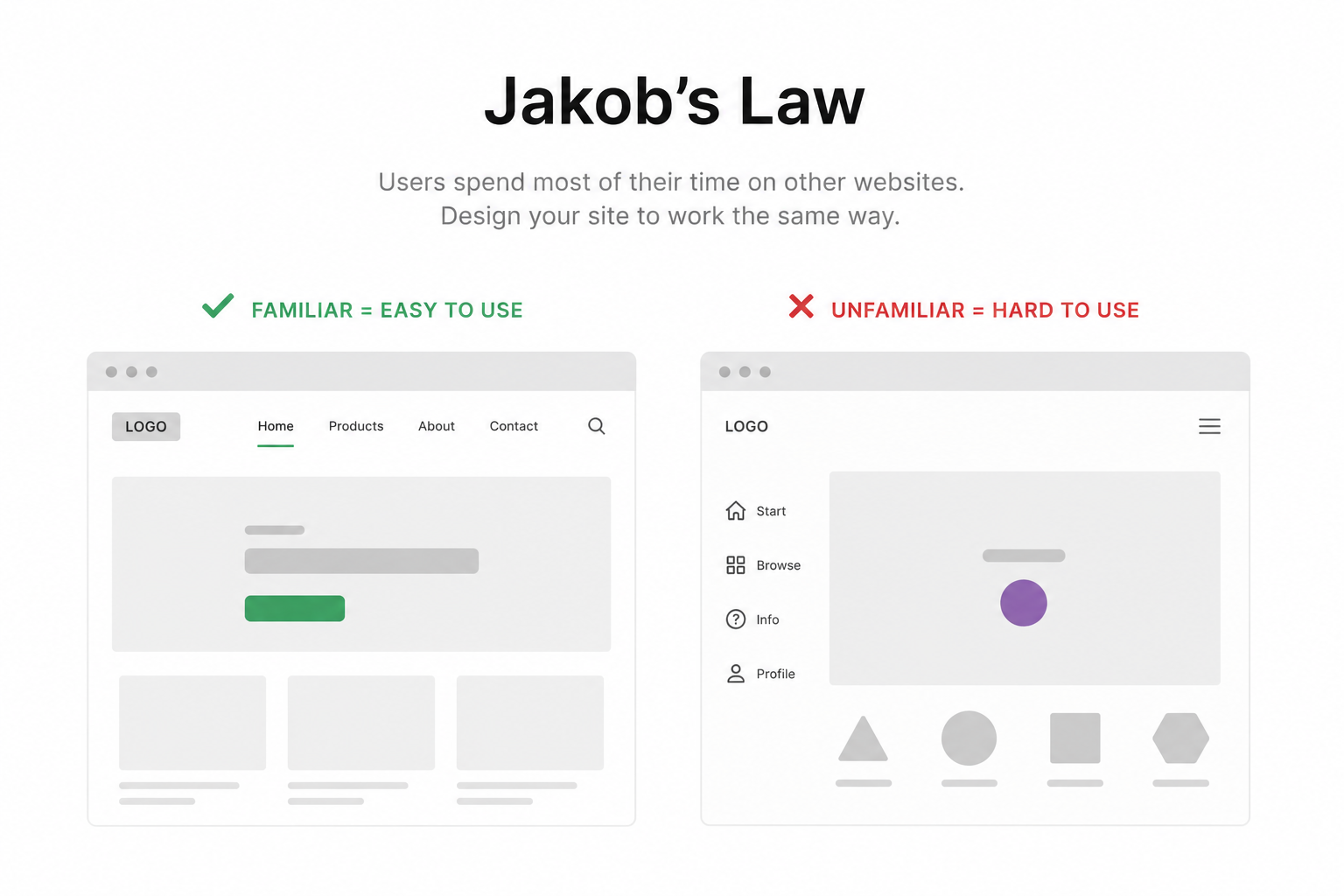
People expect the logo to lead to the homepage, the main menu near the top, the cart icon in a familiar location, tabs to switch content and accordions to expand answers. When your site breaks these expectations without a clear reason, users hesitate or get lost.
Examples of Jakob’s Law in Popular Websites
Think about how Amazon, Airbnb, Google and YouTube work. Each brand feels distinct, but its core interaction patterns are familiar:
- Search is easy to find and works as expected.
- Navigation appears in predictable locations.
- Cards, filters, and category labels follow recognizable patterns.
- Account, cart, and sign-in actions sit where users already look for them.
That familiarity lowers effort. Visitors can focus on content or products instead of figuring out the interface.
How to Implement Jakob’s Law on Your Website
Start by reviewing your most important pages with one question: would a first-time visitor instantly understand what to do here? On a homepage, that usually means a clear hero section, a visible navigation menu, short supporting text, trust signals and a next-step CTA. On a blog post, it means readable headings, easy scrolling, related posts and a consistent sidebar or inline structure.
For WordPress websites, familiar patterns matter even more because users often browse multiple sites built on similar ecosystems. If your pricing section, FAQ section, table of contents, or content tabs behave the way people expect, your content feels easier to use. That is a direct website usability win.
- Use standard labels such as Pricing, About, Contact, Blog, or Services instead of vague menu terms.
- Keep logo placement, header behavior, search, and footer links consistent across the site.
- Use recognizable form fields, breadcrumbs, tabs, FAQ accordions, and product cards.
- Reserve unconventional interactions for true brand moments, not essential tasks.
Essential Blocks Features That Help
If you use Gutenberg, Essential Blocks can help implement familiar interaction models without extra development work. Blocks such as Advanced Tabs, Accordion, navigation or menu-related layouts, and Content Toggle map well to patterns users already understand.
For example, Advanced Tabs can organize pricing, service tiers, or feature comparisons in a familiar tabbed layout. Accordion works well for FAQs, product details, and policy content. Content Toggle is useful when visitors need to switch between monthly and yearly pricing or compare two related content states. Familiar layouts improve usability because users can predict the result of each action before they click.
| Pro tip: audit for familiarity |
| – Open your homepage, pricing page, blog post template, and contact page on mobile and desktop. – Check whether key actions appear where users expect them. – If a section requires explanation, the layout may be fighting Jakob’s Law. |
Quick implementation checklist:
- Use conventional navigation and CTA placement.
- Make labels descriptive instead of clever.
- Reuse consistent design patterns across templates.
- Test first-time understanding with a few real users.
Hick’s Law – Too Many Choices Reduce Decision Making
Hick’s Law explains that the more choices people face, the longer it takes them to decide. On websites, this shows up everywhere: bloated navigation menus, crowded homepages, overstuffed sidebars, endless filter options and multiple CTAs fighting for attention.
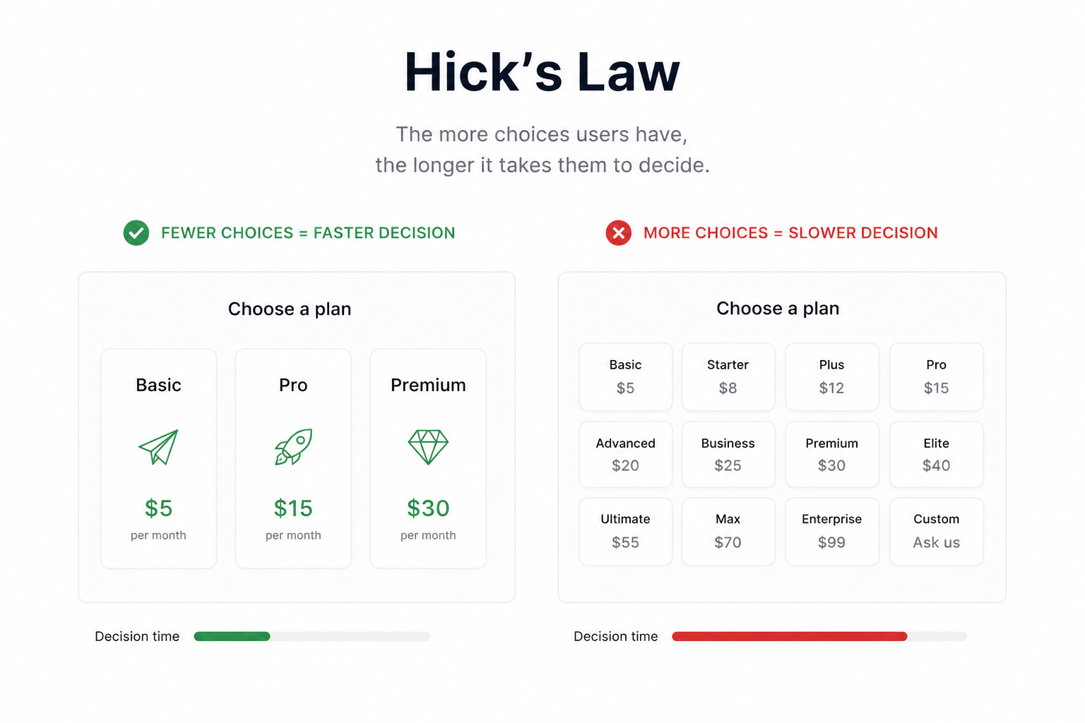
More options do not automatically create more freedom. Often, they create hesitation. When users are unsure which path is best, many choose none at all.
Why Overwhelming Visitors Hurts Conversions
Imagine a landing page with eight buttons above the fold: Learn More, View Demo, Explore Features, Read Blog, Compare Plans, Contact Sales, Start Free Trial, and Watch Video. Even if all of them are useful, the page lacks priority. The user must do extra mental work to decide what matters most.
This is a common conversion killer. High-performing pages usually have one primary action, one optional secondary action and a very clear information hierarchy. Reducing choices helps users commit.
How to Simplify Website Navigation
Your navigation is one of the easiest places to apply Hick’s Law. Keep top-level menus short, group related items under sensible labels, and move lower-priority links to the footer. If you run a large site, add search and descriptive category pages rather than expanding the main menu endlessly.
- Limit the main navigation to the most important destinations.
- Highlight a single primary CTA in the header.
- Use dropdowns carefully and only when they improve clarity.
- On mobile, collapse complex navigation into well-labeled sections.
Reducing Cognitive Load with Better Content Structure
Hick’s Law also applies to content-heavy pages. Break long pages into sections, use jump links, cluster related information and show the right amount of detail at the right moment. For example, a SaaS features page can introduce categories first, then let users expand details only when they are interested.
That approach keeps website readability high while still serving advanced users who want depth.
Essential Blocks to Apply Hick’s Law
Essential Blocks offers several Gutenberg blocks that help organize information cleanly. Advanced Accordion is useful for collapsing details until users need them. Filterable Gallery can reduce clutter in portfolio or product collections. Post Grid helps structure blog or resource archives into scannable cards. Content Ticker can surface timely updates without overwhelming the main content area and Interactive Promo can spotlight one important action instead of making every section shout equally.
Used well, these blocks support a cleaner information architecture, which is one of the core ux best practices for websites.
| Overloaded page | Simplified page |
| 12 menu items, 5 CTA buttons, full product specs visible at once | 5 main menu items, 1 primary CTA, expandable details |
| Long blog archive with inconsistent post formats | Post Grid with categories, featured image, excerpt, and clear metadata |
| Portfolio page with all work mixed | Filterable Gallery grouped by service or industry |
Quick implementation checklist:
- Reduce top-level choices on key pages.
- Use one main CTA per section.
- Hide secondary detail behind accordions, tabs, or toggles.
- Review every element and ask: Does this help the next decision?
Fitts’ Law – Bigger & Closer Elements Are Easier to Click
Fitts’ Law states that the time required to move to a target depends on its size and distance. In practical website ux terms, larger and closer clickable elements are easier to interact with, especially on mobile devices.
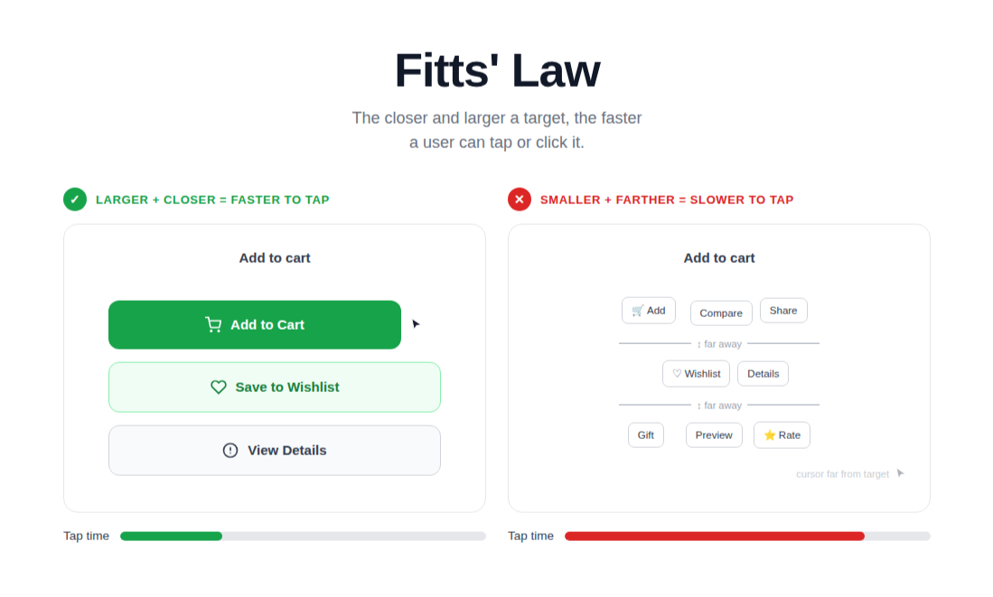
This law matters for buttons, menus, pagination, form fields, carousels, filter chips and any interactive website elements. If a target is too small, too close to another target, or too far away from relevant content, people miss it or avoid clicking.
Best Practices for Placement
Your primary CTA should appear close to the copy or visual that explains its value. If you ask users to start a trial, book a call, or read a case study, place the button immediately after the supporting message. Do not make visitors search for the action after they are convinced.
- Make primary buttons visually prominent and large enough to tap comfortably.
- Keep adequate spacing around buttons to avoid accidental taps.
- Repeat the CTA logically on long pages, especially after benefit sections and testimonials.
- Use clear labels such as Start Free Trial, Get a Quote, or Download the Guide.
Mobile UX Considerations
Mobile friendly ux raises the stakes. Thumb zones, smaller screens and on-the-go usage mean tiny buttons create real friction. On mobile, make touch targets easy to hit, avoid stacking too many inline links together and keep important actions near the natural reading flow.
For example, if your contact page has a phone number, email link, map and form submit button all crammed into a tight area, users may tap the wrong element. A cleaner vertical layout with generous spacing usually performs better.
Essential Blocks Features for Better Interaction
Essential Blocks can support Fitts’s Law through blocks such as Button, Call To Action, Infobox, Flip Box and Interactive Cards. These elements let you create larger, clearer click targets and place them closer to related content. That matters for both accessibility and conversion.
A well-designed Call To Action section can combine concise copy, a prominent button and supportive trust language in one area. Interactive Cards and Infobox layouts can make feature exploration easier, as long as spacing is generous and the click behavior is consistent across devices.
| Pro tip: design for thumbs first |
| – Test buttons on an actual phone, not just a browser preview. – Check whether users can tap critical actions one-handed. – Increase padding before increasing font size alone. |
Quick implementation checklist:
- Increase button size and padding.
- Place important actions near persuasive copy.
- Separate interactive elements with clear spacing.
- Validate tap targets on mobile devices.
Miller’s Law – Users Can Only Process Limited Information
Miller’s Law is often summarized as the idea that people can only process a limited amount of information at one time. In web content, that means dense pages, long lists and overloaded layouts quickly become hard to understand.
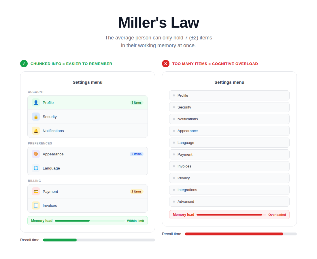
The solution is chunking: breaking information into smaller, meaningful groups so users can scan, understand and act without feeling overloaded.
Breaking Content into Smaller Sections
If you publish long blog posts, service pages, or documentation, chunking is one of the fastest ways to improve website readability. Use descriptive subheadings, short paragraphs, bullets, pull quotes, tables, summaries and visual separators. Each section should answer one clear question before moving to the next.
This is especially helpful for beginner readers. A well-structured article makes advanced concepts feel approachable.
Improving Readability & Scannability
Most people do not read line by line on their first visit. They scan. That is why scannability matters in UX principles for websites. Strong subheadings, highlighted key points, lists and table-based summaries help users decide where to slow down and where to move on.
- Keep paragraphs short and focused on one idea.
- Use headings that communicate value, not just topic names.
- Add tables or styled lists when comparing options.
- Include summaries near the top of long content pieces.
How Essential Blocks Improve Content Organization
For Gutenberg users, Essential Blocks offers several practical ways to chunk content: Advanced Tabs for category-based sections, Accordion for hidden details, Table of Contents for long posts, Timeline for step-by-step narratives, and Styled List for scannable takeaways. These blocks help readers process information progressively instead of all at once.
For example, a detailed agency service page could use a Table of Contents at the top, Styled List blocks for deliverables, an Accordion for frequently asked questions, and tabs for industries served. That structure improves website usability because users can jump directly to the information they need.
Quick implementation checklist:
- Chunk long content into logical sections.
- Use summaries, lists, and tables to reduce cognitive load.
- Add a table of contents to long-form articles.
- Design for scanning first, then deeper reading.
Aesthetic-Usability Effect – Attractive Designs Feel Easier to Use
The Aesthetic-Usability Effect describes a simple reality: users often perceive attractive interfaces as easier to use. Clean, modern website design creates goodwill. People become more patient, more trusting, and more open to exploring the page.
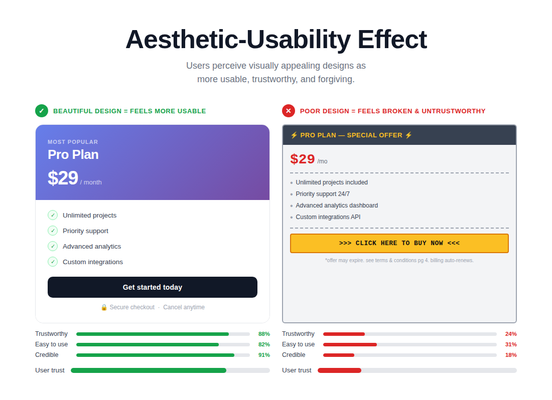
That does not mean beauty replaces function. It means visual polish supports confidence. A professional-looking site signals that the business behind it is credible and detail-oriented.
Minimal vs Cluttered Design
A minimal design is not empty; it is intentional. It uses whitespace, type scale, contrast, and hierarchy to make the important elements stand out. A cluttered design tries to show everything at once, so nothing feels important.
| Design choice | Minimal and intentional | Cluttered and distracting |
| Hero area | One headline, one supporting paragraph, one CTA | Slider, multiple badges, multiple CTAs, moving backgrounds |
| Typography | Consistent heading scale and line spacing | Multiple fonts, random sizes, inconsistent spacing |
| Color | Focused accent colors for actions | Too many competing bright colors |
| Layout | Clear sections with breathing room | Crowded blocks with little separation |
Improving Website Visual Hierarchy
Visual hierarchy in UX is what tells the eye where to look first, second, and third. Use larger headlines for the main message, medium-weight subheadings for structure, contrasting buttons for actions, and consistent spacing to separate ideas. The goal is to guide attention rather than demand it.
A strong hierarchy also improves conversions. If users immediately understand the value proposition, supporting proof, and next action, they move with less friction.
Essential Blocks for Better Visual Design
Essential Blocks can support better visual hierarchy through Image Gallery, Testimonial Slider, Team Member, Advanced Heading, Particle Effect, and Parallax Effects. The key is restraint. Use these blocks to reinforce the story of the page, not to compete with it.
For example, Advanced Heading can clarify section hierarchy, Team Member blocks can humanize an agency page, and a Testimonial Slider can add social proof. Particle Effects and Parallax Effects can add polish when used sparingly, but they should never harm readability, performance, or focus.
| Common mistakes: |
| – Using motion effects everywhere until every section fights for attention. – Choosing trendy typography that looks good in a mockup but hurts readability on mobile. – Adding decorative visuals without a clear role in the user journey. |
Quick implementation checklist:
- Use whitespace to separate sections.
- Keep typography consistent across templates.
- Use color intentionally to highlight important actions.
- Treat motion effects as supporting details, not the main attraction.
Law of Proximity – Related Elements Should Stay Together
The Law of Proximity says users assume items placed near each other are related. This affects how people interpret navigation groups, pricing plans, product specs, FAQs, author boxes and feature comparisons.
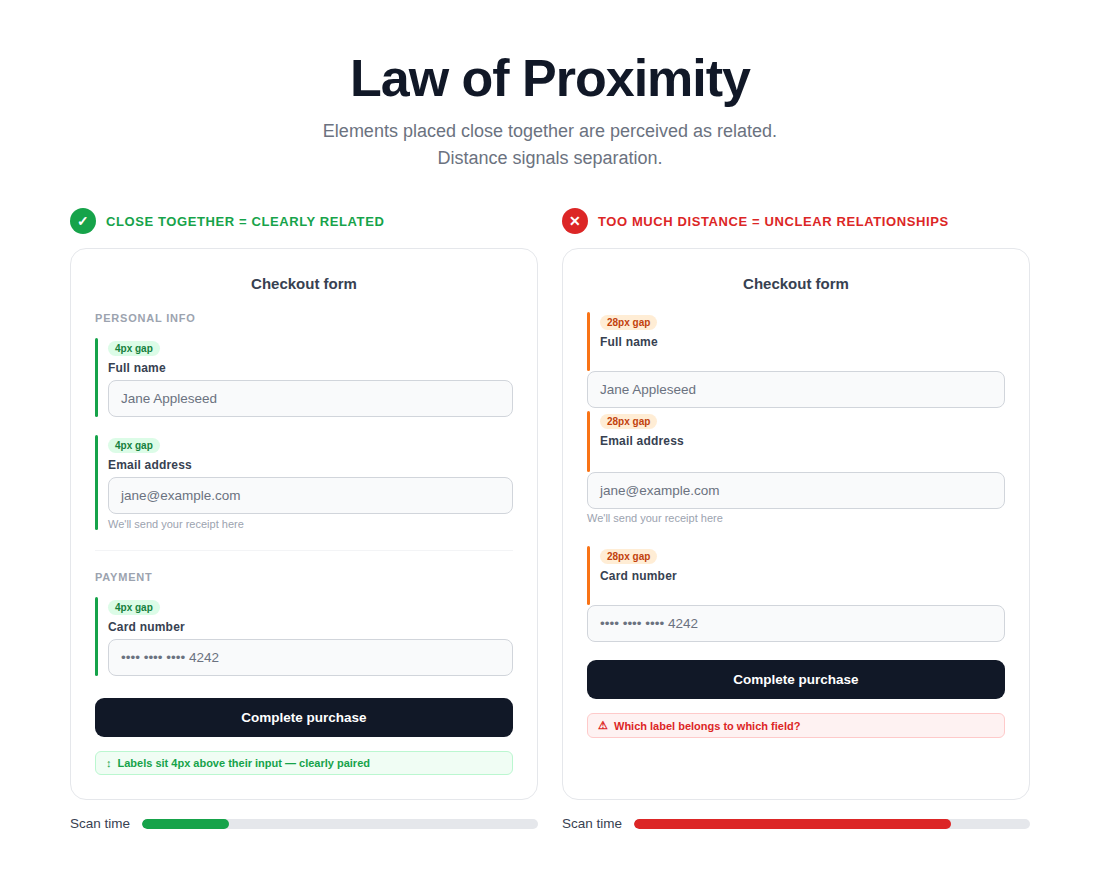
When related content is visually grouped, scanning becomes easier. When unrelated items are placed too close together, people misread the page or miss the intended relationship.
Improving Content Flow & Readability
Good grouping creates rhythm. A heading should sit close to the paragraph it introduces. A button should stay near the content that explains why someone should click it. A pricing table should visually connect plan name, features, price and CTA. These are small layout choices, but they strongly influence website readability and decision-making.
This principle is particularly useful on mobile, where limited space can make grouping problems worse. Use spacing intentionally so each section feels self-contained without becoming cramped.
How to Improve Content Structure with Essential Blocks
Essential Blocks supports proximity through row and column layouts, Pricing Table, Feature List, Infobox and Advanced Tabs. These blocks help related content stay together visually and functionally. For example, a Pricing Table keeps plan elements grouped, while a Feature List can align icons and short descriptions into clean, readable clusters.
If you are building a service comparison page in Gutenberg, use consistent row spacing, equal card heights and clear CTA placement inside each grouped unit. That makes the page easier to compare and more trustworthy.
Quick implementation checklist:
- Keep headings close to their related content.
- Group plan details, features, and CTAs into self-contained sections.
- Use spacing to separate groups, not random gaps.
- Check mobile layouts for broken grouping.
Tesler’s Law – Every System Has Complexity
Tesler’s Law says every system has a certain amount of inherent complexity that cannot be removed entirely. The real design challenge is deciding whether the user or the system should carry that complexity.
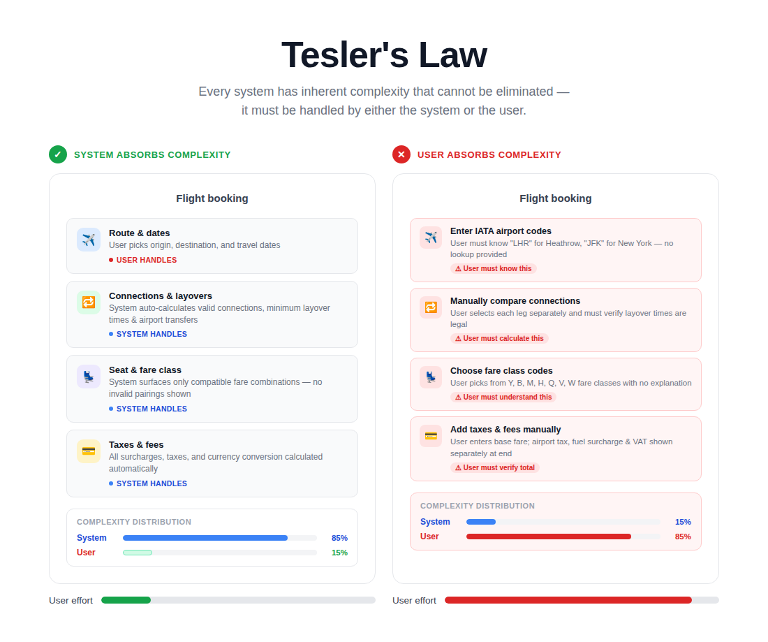
Great website UX shifts as much burden as possible away from the user. Instead of forcing visitors to figure things out, the interface should guide, simplify and automate where it can.
Reducing User Friction on Websites
Think about booking forms, multi-step checkouts, newsletter signups and account creation flows. Some complexity is unavoidable, but friction often comes from poor execution: too many required fields, unclear labels, confusing validation messages, duplicate steps, or unnecessary choices. Your job is not to remove all details. Your job is to make the necessary details feel manageable.
Simplifying Forms, Menus & User Flows
Use progressive disclosure, smart defaults, autofill support, short forms, and descriptive labels. Ask only for information you truly need at that moment. If a process requires several steps, show progress clearly and reassure users about what comes next.
- Reduce required form fields whenever possible.
- Break longer processes into smaller steps.
- Explain errors in plain language and next-step terms.
- Use social login or account shortcuts where appropriate.
Essential Blocks Features That Simplify UX
Essential Blocks can help reduce visible friction with blocks such as Form Styler, Login/Register Form, Social Share, Popup Modal and Table of Contents. Form Styler can help create cleaner forms that feel easier to complete. The Login/ Register Form can streamline account access. Popup Modal can surface focused information or lead capture, but it should be timed carefully so it helps rather than interrupts. Table of Contents reduces the effort required to navigate long pages.
In practice, simplifying UX means showing the right information at the right time, not all information at once.
| Pro tip: simplify the path, not just the visuals |
| – Review your most important conversion flow from first click to final confirmation. – Count how many decisions, fields, and page loads the user faces. – Then remove, combine, or clarify at least one friction point. |
Quick implementation checklist:
- Shorten forms and reduce unnecessary steps.
- Use progress cues for multi-step flows.
- Explain errors clearly and politely.
- Move complexity into the system whenever possible.
Doherty Threshold – Fast Websites Feel Better to Use
The Doherty Threshold suggests productivity and satisfaction improve when systems respond quickly. On websites, speed affects perceived quality, trust and momentum. Fast websites feel easier to use because they keep the interaction loop intact.
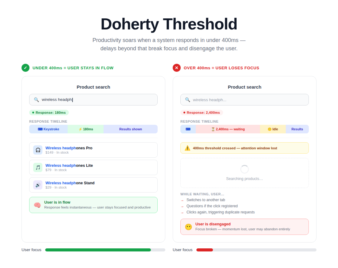
Even a strong design loses power when pages load slowly, images jump around, or filters lag. Users do not separate performance from design. To them, slow is bad UX.
How Slow Websites Hurt Engagement
Slow websites increase bounce rates, reduce page depth and weaken conversions. They also make other UX improvements less effective. A perfectly placed CTA will not help much if the page takes too long to become interactive. Likewise, a beautiful portfolio loses impact if animations stutter or images load late.
UX Tips to Improve Website Performance
Start with the basics: compress images, serve properly sized media, reduce third-party scripts, remove unnecessary plugins, cache aggressively and choose lightweight components. Also, review how your blocks behave on mobile connections, not only on fast office Wi-Fi.
- Use optimized images and modern formats where possible.
- Avoid loading scripts and effects on pages that do not need them.
- Limit excessive animations and heavy sliders.
- Test performance on real devices and slower networks.
Essential Blocks Features That Help Maintain Performance
One reason Gutenberg users often prefer well-built block libraries is performance control. Essential Blocks is commonly used as a lightweight Gutenberg block option and features such as optimized block loading, responsive controls and a minimal dependency approach can support better performance when configured thoughtfully. In simple terms, loading only what is needed helps preserve a smoother experience.
That said, no plugin can compensate for a generally heavy site. Good performance still depends on sensible design choices, optimized media, and a disciplined plugin stack.
Quick implementation checklist:
- Audit plugin weight and remove what is unnecessary.
- Use lightweight blocks and optimized media.
- Test page speed before and after adding interactive elements.
- Treat speed as a core ux best practice, not a technical afterthought.
Peak-End Rule – Users Remember First & Last Impressions
The Peak-End Rule says people remember the emotional high point and the ending of an experience more than every individual moment. On a website, that means your opening impression and your final interaction matter disproportionately.
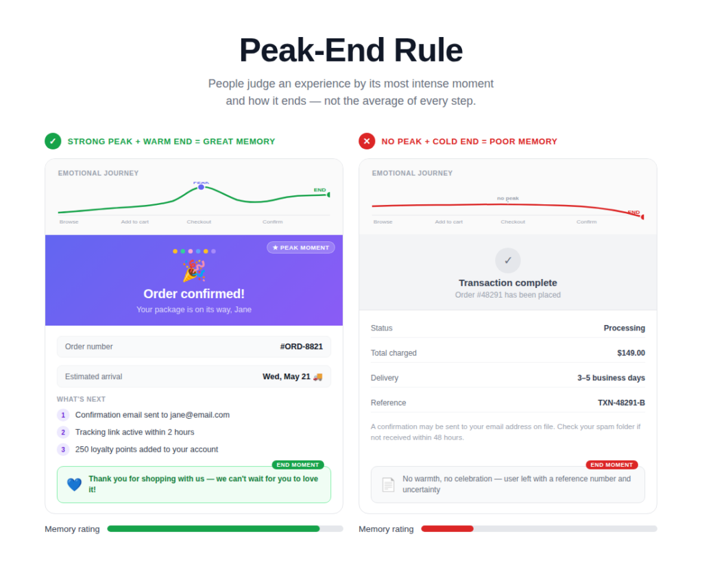
Your hero section is often the first impression. Your CTA, checkout confirmation, thank-you page, or lead form completion is often the final impression. Both deserve intentional design.
Optimizing CTAs & Final User Interactions
Do not let a strong page end with a weak close. A user who reads your content, checks your testimonials and reaches the bottom should see a relevant next step with reassuring copy. For example, after an in-depth blog post, invite the reader to download a related resource, browse a service page, or subscribe to more practical insights.
Likewise, the post-conversion experience matters. Confirmation pages should feel clear and rewarding, not like dead ends.
Designing Memorable User Journeys
Think beyond single pages. A memorable journey may include a clear homepage, a useful blog article, a persuasive case study and a smooth contact form. Each step should reinforce competence and reduce uncertainty. That is how trust compounds.
Blocks That Improve Engagement
Essential Blocks can help shape these memorable moments with blocks such as Call To Action, Countdown, Testimonial, Interactive Promo, and Button. A thoughtful CTA section near the end of a guide can turn attention into action. A Countdown block can create urgency for a webinar or a limited-time offer when used honestly. Testimonial blocks can reinforce trust right before a user decides.
The key is alignment. The final interaction should feel like the natural next step, not an abrupt sales push.
Quick implementation checklist:
- Create a strong first screen with one clear value proposition.
- End major pages with a relevant, low-friction CTA.
- Design thank-you states that reassure and guide the next step.
- Use social proof close to decision points.
How Essential Blocks Help Improve Website UX
For many WordPress users, Essential Blocks is useful because it covers several everyday UX needs in one toolkit: tabs for chunking content, accordions for reducing cognitive load, buttons and call-to-action sections for clearer interaction, testimonials for trust, post grids for cleaner archives, and table-of-contents functionality for long-form readability. When those pieces are used deliberately, they support modern UX design principles rather than just adding visual variety.
Performance, Flexibility & Responsiveness
A good block library should not force you to choose between design flexibility and performance discipline. Essential Blocks gives Gutenberg users responsive controls and layout options that can help maintain mobile friendly ux while preserving a consistent look across breakpoints. The practical value is simple: you can adapt layouts for desktop, tablet and mobile without rebuilding every section from scratch.
Creating Conversion-Focused Pages Without Coding
This is where Essential Blocks feels especially practical for non-developers. Website owners, marketers, bloggers, and agencies can assemble pages that follow ux principles for websites without writing custom CSS or JavaScript for every interaction. That is not a shortcut around strategy, but it is a faster path to implementation.
If you want to explore the block library itself, visit Essential Blocks and review which blocks solve real UX problems on your site. Start with structure, clarity, and responsiveness before adding decorative enhancements.
Best Practices for Applying UX Laws on WordPress Websites
Now that we have covered the core UX laws, let us look at some practical best practices for applying them on WordPress websites.
Focus on Mobile Responsiveness
Responsive website design is not only about stacking columns. It is about reprioritizing content, enlarging tap targets, shortening interactions and testing what matters most on smaller screens. Review menus, accordions, forms, sliders and buttons on real devices.
Maintain Visual Consistency
Use a consistent design system for headings, colors, buttons, icon sizes, card layouts, and spacing. Consistency supports trust and makes the entire website feel easier to use.
Improve Accessibility
Accessibility overlaps strongly with good ux. Use readable contrast, keyboard-friendly navigation, descriptive link text, alt text for meaningful images, visible focus states and clear form labels. Accessible design usually improves usability for everyone.
Reduce Clutter & Distractions
Every extra banner, popup, badge, and animation competes for attention. Remove anything that does not support the page goal. Cleaner pages usually convert better because they help users focus.
Optimize Navigation & Search
Use clear menu labels, internal linking, breadcrumbs where helpful, category logic that makes sense to users and an easy-to-find search option for larger sites. Good website navigation UX reduces the need for users to backtrack.
Continuously Test User Behavior
Do not rely on assumptions. Review analytics, form completion rates, session recordings, heatmaps, search logs and on-site feedback. Even five short user tests can reveal friction you would never notice on your own.
| WordPress UX implementation checklist |
| – Check mobile layouts before publishing.Keep templates visually. consistent. – Improve accessibility as part of every update. – Trim unnecessary plugins, widgets, and effects. – Monitor user behavior and refine pages continuously. |
Implement the Right UX Law for Your WordPress Website
The most useful thing about the laws of ux is that they make good design decisions easier to repeat. You do not need a massive redesign to benefit from them. Start by fixing one friction point at a time: simplify a menu, enlarge a CTA, group related content more clearly, improve page speed, or restructure a long article for scanning.
Over time, these improvements compound. Better website ux leads to stronger trust, smoother navigation, clearer messaging and more conversions. And if you build with Gutenberg, Essential Blocks can make many of these UX-focused improvements easier to implement with flexible, practical blocks that support readability, structure, engagement, and responsiveness.
The best next step is simple: choose one high-traffic page on your site and review it through the lens of the ux laws covered in this guide. Then make one improvement this week and measure the result.
Enjoyed the blog? Feel free to share your feedback on our Facebook Community. Do not forget to subscribe to our blog for more guidelines and exciting updates.