Building a beautiful WordPress site in Gutenberg feels great until a real user cannot tab to your button, a screen reader skips your menu or a form rejects everyone who does not use a mouse. You are not alone if this catches you off guard. Most WordPress sites look polished on the surface while quietly locking out a large slice of their audience.
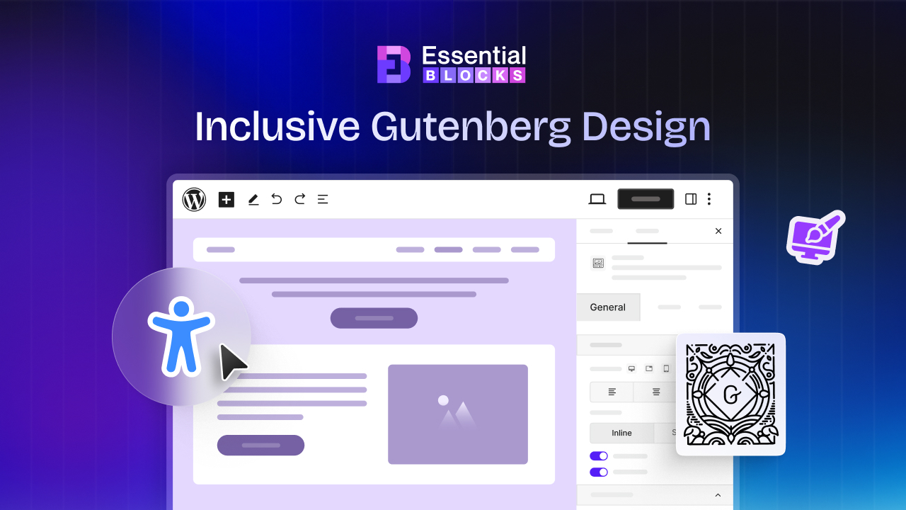
The good news? You can fix this at the source. Accessibility-first Gutenberg design means you build accessible buttons, menus, forms, and sections from the first block you drop onto the page, so accessibility is baked into the layout rather than bolted on at the end.
This guide walks you through the mindset, the standards and the exact block-level techniques you need, with practical steps you can apply today using the Gutenberg editor and Essential Blocks.
TL;DR
- Accessibility-first Gutenberg design builds inclusive buttons, menus, forms and sections into your page structure from the start, following WCAG 2.2 as the reference standard.
- The most common web mistakes are low color contrast, empty buttons, unlabeled form inputs and broken keyboard navigation; every one of them is preventable.
- Buttons need real button semantics, visible focus states and descriptive text. Menus need keyboard operability and a logical reading order. Forms need visible labels tied to inputs. Sections need proper landmarks and a sensible heading hierarchy.
- Accessible design also improves SEO, GEO and AEO because clean semantics, alt text and structured content help search engines and AI answer engines understand your pages.
- With Gutenberg plus Essential Blocks, you can ship accessible components without writing custom code, then verify them with free testing tools.
What Accessibility-First Gutenberg Design Actually Means
Accessibility-first design is a build approach where you treat inclusive access as a starting requirement, not a cleanup task. When you design a page in Gutenberg, every button, menu, form and section is created so that people using keyboards, screen readers, screen magnifiers, voice control and switch devices can all complete the same tasks as anyone else.
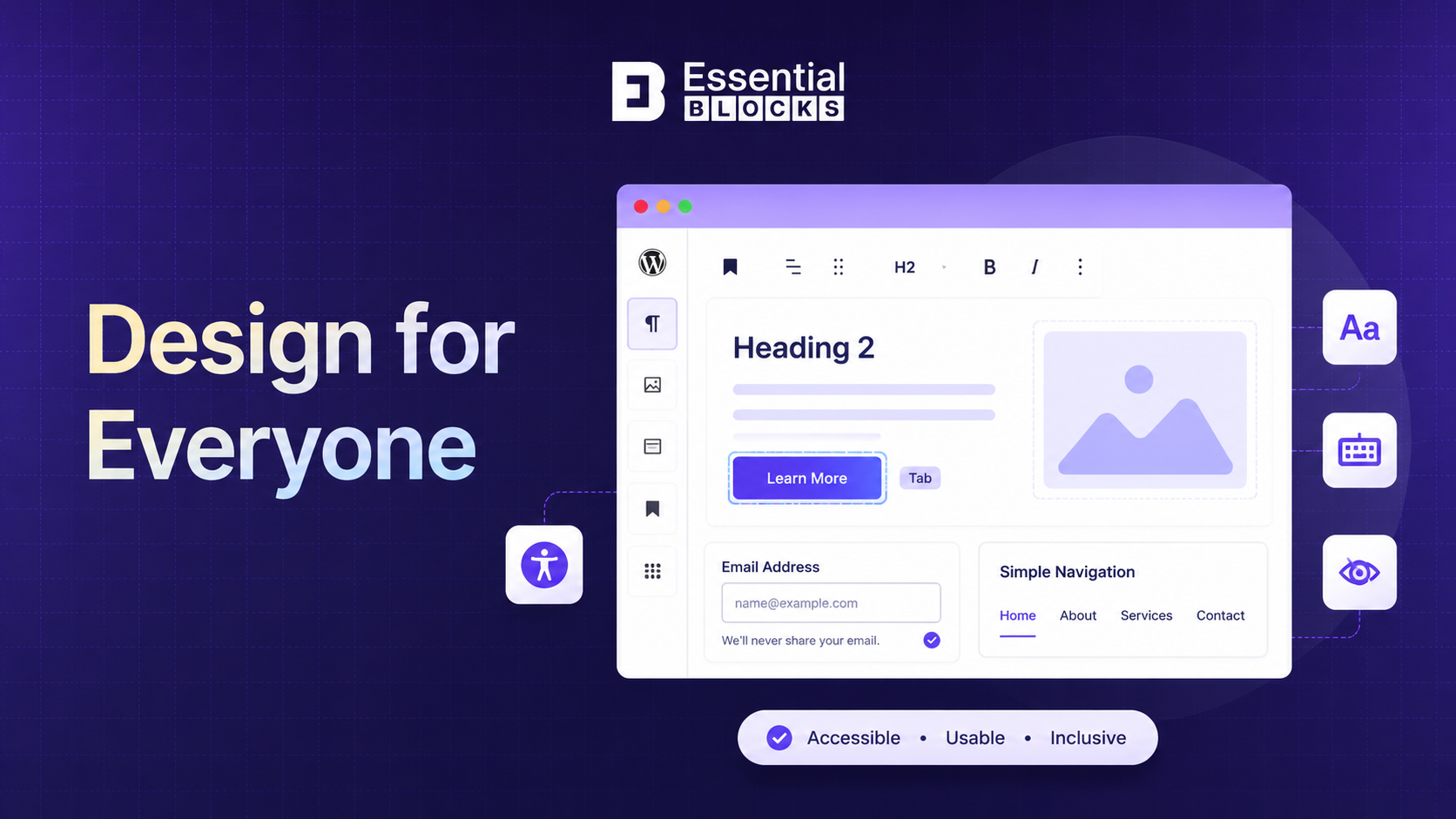
This matters because the numbers are sobering. According to the 2026 WebAIM Million report, 95.9% of the top one million home pages had detectable WCAG failures, with an average of 56.1 accessibility errors per page. WordPress powers a huge portion of these sites, which means the block editor is exactly where these problems either start or get solved.
WebAIM has found the same short list of issues year after year: low contrast text, missing alternative text, empty links, missing form input labels, empty buttons and missing document language. Those six issues alone account for the vast majority of detected errors.
The takeaway is simple. If you build accessible buttons, menus, forms and sections in Gutenberg from the beginning, you eliminate most of the barriers that trip up the rest of the web.
Accessibility-First vs Accessibility as an Afterthought
Many teams add accessibility once the design is finished, then wonder why it is expensive and frustrating. Fixing an old website usually means rebuilding broken parts, correcting code mistakes, and adding special code ARIA (Accessible Rich Internet Applications) to help disabled users.
WebAIM data shows this pattern clearly, because pages that rely heavily on ARIA to patch problems after the fact often end up with more errors, not fewer.
An accessibility-first workflow avoids that trap. You pick accessible blocks, set your color values, define your heading order and confirm keyboard support as you build. The result is a cleaner codebase, faster maintenance and a site that serves every visitor from day one.
Why Accessibility-First Design Matters for Your Gutenberg Site
Accessibility first design helps everyone use your website more easily, regardless of their abilities or device. It also improves usability, user experience and the overall quality of your Gutenberg site.
Reaches More People
Roughly one in six people worldwide lives with a significant disability. When your buttons, menus and forms work with assistive technology, you welcome millions of users who would otherwise bounce.
Protects You Legally
Accessibility regulations continue to tighten. The European Accessibility Act now applies to a wide range of digital products and services across the EU and web accessibility lawsuits remain common in the United States under the ADA. Building to WCAG 2.2 Level AA is the most reliable way to reduce this risk.
Improves SEO & AI Visibility
Search engines and AI answer engines read the same semantic signals that assistive technology relies on. Descriptive links, labeled controls, alt text and a clean heading structure help Google, Gemini, ChatGPT and Perplexity understand and surface your content.
Lifts Usability for Everyone
Captions help people in noisy environments. Strong color values help users in bright sunlight. Keyboard support helps power users move faster. Accessible design is simply better design, and every visitor benefits.
The Foundations of Accessible Gutenberg Design
Before you touch a single block, lock in these six foundations. They apply to buttons, menus, forms and sections alike and they map directly to the WCAG 2.2 success criteria you can review on the W3C Web Accessibility Initiative site. Keep these six in mind as we move component by component:
- Semantic structure: Use real headings, lists, buttons and landmarks so assistive technology understands the page. A styled <div> that looks like a button is invisible to a screen reader as a control.
- Keyboard operability: Every interactive element must be reachable and usable with the Tab, Enter, Space and arrow keys. If you cannot operate it without a mouse, neither can a large group of your visitors.
- Visible focus: Users navigating by keyboard need to see where they are. A clear focus outline on the currently selected element is required, and hiding it breaks the experience.
- Color and contrast: Text needs enough color contrast against its background to stay readable. WCAG 2.2 asks for a ratio of at least 4.5 to 1 for normal text and 3 to 1 for large text. Never rely on color alone to signal meaning, since color-blind users may miss it.
- Text alternatives: Images need meaningful alt text, and decorative images should carry empty alt attributes so they are skipped politely.
- Predictable order: The reading and tab order should match the visual order, so the page makes sense whether it is seen, heard or navigated by keyboard.
Next, we will explore how to build fully accessible buttons, menus, forms and page structures within the Gutenberg editor.
How to Build Accessible Buttons in Gutenberg
An inaccessible button completely blocks disabled visitors from navigating your site, submitting forms, or buying your products. This guide shows you exactly how to fix these hidden barriers in Gutenberg by using simple design, clear text, and keyboard-friendly code.
Small changes can make your WordPress site more inclusive while creating a better experience for every visitor.
What Makes a Button Accessible
A button is a promise of action. An accessible button announces itself as a button to screen readers, describes what it does, responds to keyboard input and shows a visible focus state. WebAIM consistently lists empty buttons among the most common accessibility failures, which usually happens when a button contains only an icon or an image with no readable text.
Why It Matters
Buttons drive your most important actions: submit, buy, subscribe, download and contact. If a button is unreachable by keyboard or unlabeled for a screen reader, you are losing conversions from real, motivated users. An accessible button removes that friction for everyone.
How to Build Accessible Buttons
You can create inclusive buttons in Gutenberg without custom code using the Button block, then apply these rules.
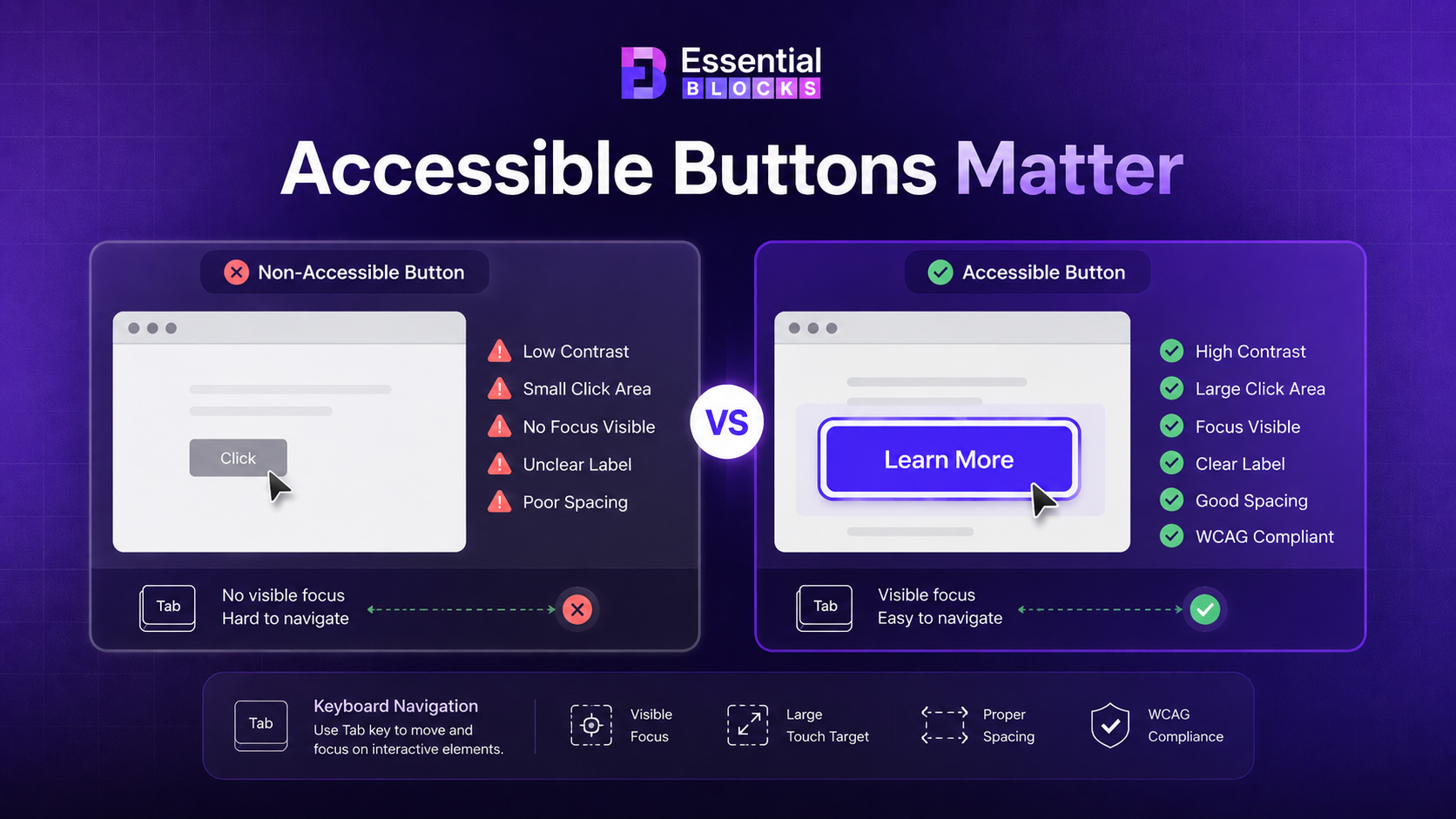
- Write descriptive button text: Use clear labels such as Download the free checklist or Start your free trial. Avoid vague text like Click here or Read more with no context, because screen reader users often browse controls out of context.
- Never ship an empty button: If your button uses only an icon, add visible text or an accessible label so the action is announced. An icon by itself communicates nothing to a screen reader.
- Set readable color values: Confirm the button text meets the 4.5:1 color contrast ratio against the button background and check the hover and focus colors too.
- Keep a visible focus state: Make sure a clear outline or style change appears when the button receives keyboard focus, so tab users can see where they are.
- Use real button semantics: For actions, use a button. For navigation to another page, use a link styled as a button. Choosing the correct element keeps the experience predictable for assistive technology.
- Size for touch: Give buttons a comfortable tap target, around 44 by 44 pixels, so users with motor differences can activate them on mobile.
Common Button Mistakes to Avoid
❌ Icon-only buttons with no accessible label.
❌ Low-contrast text that disappears against the background.
❌ Removing the focus outline for a cleaner look, which strands keyboard users.
❌ Generic labels like Click here that carry no meaning on their own.
❌ Fake buttons built from plain containers that screen readers cannot recognize as controls.
How to Build Accessible Menus & Navigation in Gutenberg
Your site’s navigation should help every visitor find what they need with ease. Here are the key steps to build accessible menus and navigation in Gutenberg for a smoother and more inclusive browsing experience.
What Makes Navigation Accessible
Navigation is how people move through your site. An accessible menu can be operated fully by keyboard, exposes its structure to screen readers, keeps a logical order and gives users a way to skip repetitive links. Dropdowns and mega menus need extra care, because complex menus are a frequent source of new barriers when interactions and roles are missing.
Why It Matters
If a visitor cannot open your dropdown with a keyboard or cannot tell which menu item is active, they cannot reach your content. Navigation failures block the entire site, not just one page, so this is one of the highest-impact areas to get right.
How to Build Accessible Menus
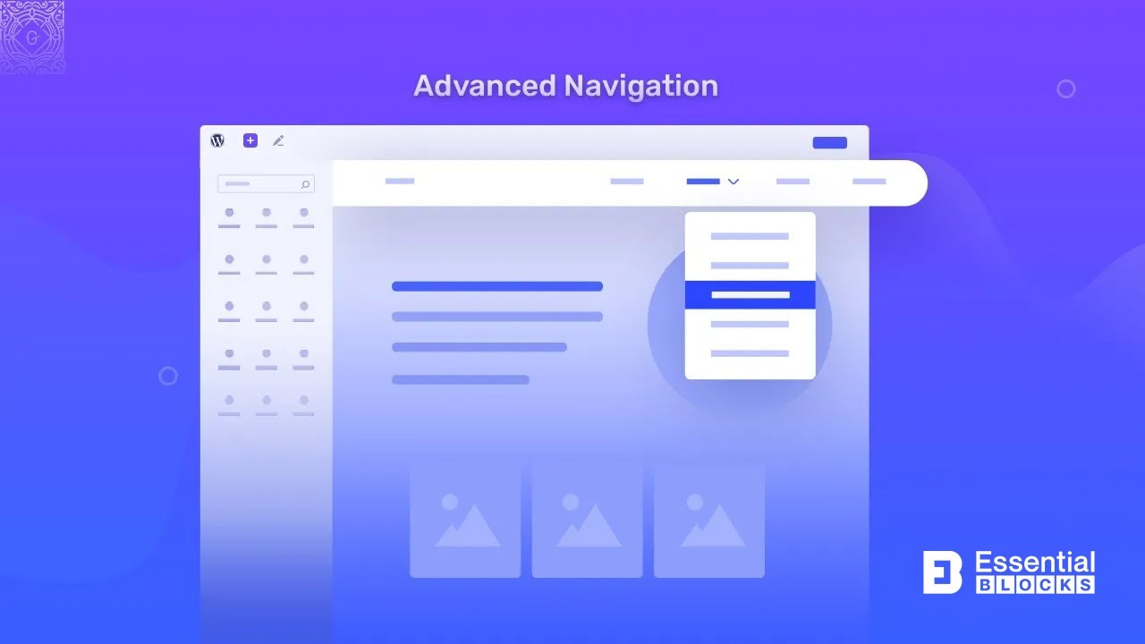
Use a navigation solution built for the block editor, such as the Advanced Navigation block and follow these steps.
- Confirm full keyboard support: Users should reach every menu item with Tab, open submenus with Enter or Space and move through options with arrow keys. Test this before you publish.
- Wrap navigation in a landmark: Place your main menu inside a <nav> landmark so screen reader users can jump straight to it. Give multiple navigation regions distinct labels.
- Add a skip link: Offer a Skip to main content link at the very top of the page so keyboard and screen reader users can bypass the header on every visit.
- Show the current page: Mark the active menu item so users always know where they are and do not rely on color alone to show it.
- Keep mega menus simple and ordered: If you build a large multi-column menu, group items under clear headings and confirm the reading order matches the visual layout.
- Make mobile menus operable: Ensure the hamburger toggle is a real button with an accessible label, and that focus moves logically when the menu opens and closes.
Common Navigation Mistakes to Avoid
Common navigation mistakes can make your website harder to use and reduce accessibility for many visitors. Avoid these common issues to create a smoother, more inclusive navigation experience in Gutenberg.
❌ Dropdowns that only open on hover and cannot be triggered by keyboard.
❌ Missing skip links, forcing keyboard users to tab through the whole header every time.
❌ Menus placed outside a <nav> landmark, which hides their purpose from screen readers.
❌ Active states signaled by color alone.
❌ Overloaded mega menus with no headings or logical order.
How to Build Accessible Forms in Gutenberg
Accessible forms make it easier for every visitor to complete actions without confusion. Follow these best practices to create user-friendly forms in Gutenberg that improve usability and accessibility.
What Makes a Form Accessible
Forms are where users take action, so accessibility here directly affects your leads and revenue. An accessible form pairs every input with a visible label, groups related fields, gives clear instructions, reports errors in plain language and can be completed entirely by keyboard. Unlabeled form inputs remain one of the most common problems on the web and WebAIM analysis has repeatedly found that roughly a third of form inputs lack proper labels.
Why It Matters
A missing label turns a simple contact form into a guessing game for screen reader users. If someone cannot tell which field is the email and which is the phone number, they abandon the form and you lose the lead. Accessible forms recover those conversions.
How to Build Accessible Forms
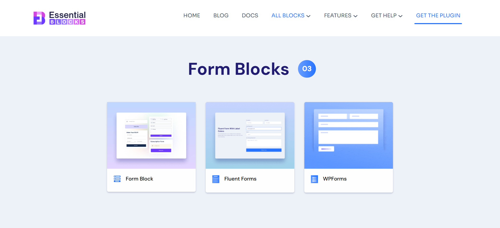
In Gutenberg, you can design and style forms using blocks that integrate popular form plugins, such as the Forms block. Apply these rules regardless of the form tool you choose.
- Use visible, persistent labels. Every field needs a label that stays on screen. Placeholder text is not a label, because it disappears the moment a user starts typing.
- Tie each label to its input. Make sure the label is programmatically associated with its field so screen readers announce the correct prompt.
- Mark required fields clearly. Indicate required fields with text or a symbol plus a text explanation, not color alone.
- Write helpful error messages. When validation fails, describe the problem and the fix in plain language and move focus to the field that needs attention.
- Keep a logical tab order. Confirm that pressing Tab moves through fields in the order users expect, top to bottom and left to right.
- Check color values on inputs and buttons. Field borders, labels, help text and the submit button all need readable color contrast.
- Group related fields. Use fieldsets and legends for grouped inputs like address blocks or radio button sets, so the relationship is clear.
Common Form Mistakes to Avoid
❌ Relying on placeholder text instead of real labels.
❌ Required fields shown only with a red asterisk and no text.
❌ Error messages that say something went wrong with no detail.
❌ Low-contrast field borders that vanish against the background.
❌ Multi-step forms where focus is lost between steps.
How to Build Accessible Sections & Layouts in Gutenberg
Well-structured sections and layouts help visitors navigate your content with ease. Here are the key practices for building accessible layouts in Gutenberg that improve readability and usability.
What Makes a Section Accessible
Sections are the containers that hold your content: hero areas, feature rows, testimonials, footers and calls to action. An accessible section uses landmark roles, follows a correct heading hierarchy, keeps a readable content order and never traps focus. Because home page complexity keeps rising, with WebAIM reporting an average of 1,437 elements per page in 2026, disciplined section structure is more important than ever.
Why It Matters
Screen reader users often navigate by landmarks and headings rather than reading everything top to bottom. If your sections lack structure, these users cannot build a mental map of the page and get lost quickly. Clean sections make your entire layout scannable for people and search engines alike.
How to Build Accessible Sections
Use a flexible container block such as the Wrapper block to structure your layout, then apply these principles.
- Follow a single, logical heading order: Use one H1 per page, then H2 for main sections and H3 for subsections. Do not skip levels for visual sizing, since headings carry structure, not just style.
- Use landmark regions: Structure the page with header, main, nav and footer landmarks so assistive technology can jump between the major areas.
- Match reading order to visual order: When you arrange columns and flex layouts, confirm the tab and screen reader order still makes sense.
- Give background media enough separation: When you place text over an image or color, keep the text readable with strong color contrast, and avoid busy backgrounds behind important copy.
- Do not convey meaning with color alone: Status, categories and links should include a text or shape cue in addition to any color.
- Keep motion safe: If a section animates, keep it subtle and respect reduced-motion preferences, because heavy motion can cause discomfort for some users.
Common Section Mistakes to Avoid
❌ Choosing heading levels for size instead of structure.
❌ Skipping landmarks, which flattens the page for screen readers.
❌ Column layouts where the visual order and tab order disagree.
❌ Text placed over busy imagery with weak color values.
❌ Auto-playing motion with no way to pause or reduce it.
Accessibility-First Design Best Practices Checklist
Use this quick checklist to make sure your Gutenberg website follows essential accessibility best practices. It will help you create a more inclusive and user friendly experience for every visitor.
[ ] Keep this quick checklist near your editor. Run through it before every publish.
[ ] One H1 per page and a heading order that never skips levels.
[ ] Every button and link has clear, descriptive text.
[ ] All interactive elements are reachable and usable by keyboard.
[ ] Visible focus states are present on buttons, links, menus and form fields.
[ ] Text meets the 4.5 to 1 color contrast ratio, and 3 to 1 for large text.
[ ] Meaning is never carried by color alone.
[ ] Images have meaningful alt text, and decorative images have empty alt attributes.
[ ] Every form field has a visible, associated label.
[ ] Navigation sits inside a <nav> landmark, with a skip link at the top.
[ ] The document language is set, and the reading order matches the visual order.
How Accessibility-First Design Improves SEO, GEO & AEO
Accessible structure and search performance grow from the same roots. When you build accessible buttons, menus, forms and sections, you also feed search engines and AI answer engines the exact signals they use to understand your pages. Here is how good accessibility supports modern discovery.
✅ Clean heading structure helps ranking and snippets: A logical H1 to H3 hierarchy tells Google what your page covers, which supports featured snippets and clear topical relevance.
✅ Descriptive links improve crawlability: Meaningful anchor text like Download the accessibility checklist helps search engines understand your internal links far better than generic Click here.
✅ Alt text unlocks image search and context: Descriptive alt text serves screen reader users and gives Google Images and AI engines real context about your visuals.
✅ Labeled forms and semantic controls build trust signals: Properly structured, keyboard-friendly pages tend to have lower bounce rates, and a satisfied visitor who stays and converts sends positive engagement signals.
✅ Structured, scannable content wins in AI Overviews: Answer engines like ChatGPT, Gemini and Perplexity favor content that is well organized with clear headings, concise answers and clean semantics, which is exactly what accessibility-first design produces.
✅ Landmark and language markup aid understanding: Setting the document language and using landmarks helps machines parse your page structure, improving both accessibility and machine readability.
Accessibility-first design is one of the few practices that improves the human experience and the machine experience at the same time.
Real-World Use Cases: Who Needs Accessibility-First Gutenberg Design
Accessibility-first design helps every WordPress site, and it becomes essential for these groups.
It benefits every website, regardless of its purpose or audience. Here are some real world examples of who can benefit most from accessibility first Gutenberg design.
Businesses & Agencies Serving the Public
Any company that sells or informs online reaches customers with a wide range of abilities. Agencies that deliver accessible sites protect their clients from legal risk and win repeat work by shipping higher-quality builds.
eCommerce Stores
Online stores live and die by conversions. Accessible product buttons, filters, menus and checkout forms mean more completed purchases and fewer abandoned carts from users who hit a barrier.
SaaS & Software Companies
Product marketing sites and help centers need accessible navigation and forms so every prospect can sign up, request a demo or find support without friction.
Education & Nonprofits
Schools, universities and public bodies often carry legal accessibility duties, and inclusive access aligns directly with their mission to serve everyone.
Content Creators & Bloggers
Creators who want the widest possible audience benefit from readable typography, strong color values and keyboard-friendly navigation that keeps every reader engaged.
How to Test Your Gutenberg Site for Accessibility
Testing your website helps you find and fix accessibility issues before they affect visitors. Here are some simple ways to check if your Gutenberg site is accessible and easy to use for everyone.
Building accessible components is step one. Verifying them is step two. Use this simple testing routine.
- Run an automated scanner: Free tools like WAVE and Lighthouse catch low contrast text, missing labels and empty buttons in seconds. Remember that automated tools find only a portion of issues, so treat them as a starting point.
- Navigate with your keyboard only: Put the mouse away and Tab through the page. Confirm you can reach and operate every button, menu and form field, and that the focus indicator is always visible.
- Test with a screen reader: Try VoiceOver on Mac or NVDA on Windows. Listen to whether headings, buttons, links and labels are announced clearly.
- Check your color values: Use a free color contrast checker on text, buttons and states like hover and focus.
- Zoom to 200%: Increase browser zoom and confirm text does not overlap and nothing important gets cut off.
Run this routine on new templates and after major design changes, and most issues will be caught long before a real user meets them.
Future Trends in Accessible WordPress Design
Accessibility is moving from optional to expected and a few trends are accelerating that shift. Designing accessibility-first today means your Gutenberg site is ready for where the web is heading, not just where it is now.
- Stronger Regulation: The European Accessibility Act is expanding accessibility duties across the EU, and similar momentum continues elsewhere. WCAG 2.2 is now the working reference, and future versions will keep raising the bar.
- Accessibility Built into Tools: Block libraries and page builders are shipping more accessible defaults, so creators can build inclusive components without deep technical knowledge.
- AI-assisted Remediation: AI tools increasingly help generate alt text, flag weak color values and suggest labels, which helps reduce the most common errors at scale.
- Accessibility as an SEO And AEO Signal: As AI answer engines grow, the clean structure that accessibility demands becomes a competitive advantage for visibility.
Start Building Accessibility-First in Gutenberg Today
If you have read this far, you already know that accessible buttons, menus, forms and sections are not a luxury. They are the difference between a site that works for everyone and one that quietly turns people away. The best part is that Gutenberg gives you the foundation, and the right block library makes inclusive design practical without code.
With Essential Blocks, you can build accessible buttons, navigation, forms and layout sections inside the block editor you already use, then verify them with free testing tools. Start your next page with accessibility in mind, apply the checklist above and you will ship a site that ranks well, converts better and welcomes every visitor.
If you found this guide helpful, subscribe to our blog for more Gutenberg design tutorials, and join our Facebook community to stay connected with new features, tips and announcements.
Frequently Asked Questions
1. Is Gutenberg accessible by default?
Accessibility-first design means making the right choices as you build, and using block tools that support accessible output.