Modern web users rarely read a page from top to bottom on their first visit. They scan. They jump between headings, pause at bolded lines, skim bullet points, and look for visual cues that indicate where the value lies. That means even strong content can underperform if the layout makes it difficult to absorb quickly.
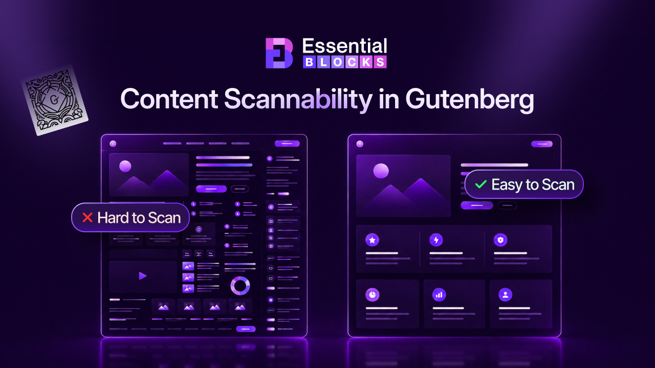
You spend hours writing a detailed article. It ranks on Google, visitors arrive, but most leave within seconds. The problem may not be your writing at all. It may be that people simply cannot scan your content enough to discover its value.
This is where scannability becomes essential. Good content scannability helps readers find the information they need without effort, improves content readability, and increases the chances that visitors stay engaged long enough to take action. The good news is that the Gutenberg content editor gives WordPress users more control than ever over how content is structured, spaced, and presented.
TL;DR: Quick Summary
| Topic | Key Takeaway |
| What is scannability? | Scannability is how easily readers can skim a page and find useful information fast. |
| Why it matters | Better scannable content improves engagement, readability, accessibility, and conversions. |
| Common Gutenberg problems | Long paragraphs, weak heading hierarchy, poor spacing, and buried key points make pages hard to scan. |
| Core fixes | Use clear headings, short paragraphs, lists, visual breaks, and consistent formatting. |
| Gutenberg advantage | Blocks like headings, columns, lists, groups, spacers, and media make content easier to organize visually. |
| Helpful enhancement | Tools like Essential Blocks can add cleaner visual structure without making pages feel cluttered. |
| Best next step | Audit one page at a time and redesign it around how users actually scan website content. |
What Is Content Scannability?
Content scannability is the quality that makes a page easy to skim before fully reading. It allows visitors to quickly understand what a page covers, where specific answers are located and which ideas matter most. In a digital environment where attention is limited, this matters more than ever. In research by Nielsen Norman Group, a sample website scored 47% higher when the text was scannable. Let us have a detailed look at what are the differences between scannable and non-scannable content.
| Pointer | Scannable Content | Non-Scannable Content |
| Structure | Uses clear heading hierarchy with H2s, H3s, and well-separated sections. | Has weak or inconsistent headings, making the page harder to navigate. |
| Paragraph Length | Uses short paragraphs that are easier to read on both desktop and mobile. | Contains long walls of text that overwhelm readers and cause fatigue. |
| Content Presentation | Breaks information into bullet points, numbered lists, callouts, and highlighted takeaways. | Packs too much information into plain text blocks with little visual relief. |
| Visual Organization | Includes spacing, dividers, columns, and media to create breathing room and guide the eye. | Lacks spacing and visual hierarchy, making the layout feel dense and cluttered. |
| User Experience | Helps readers quickly scan website content, find answers faster, and stay engaged. | Makes readers work harder to find key information, increasing bounce risk. |
Scannable content does not mean shallow content. It means well-structured content. A page can be detailed, insightful and comprehensive while still being easy to navigate. The real goal is to reduce friction between the reader and the information they came for.
When people land on a page, they often make an instant decision: keep reading, scroll further, or leave. Content readability influences that decision. If a page feels dense, chaotic, or visually tiring, readers may leave before they ever discover the value you worked hard to create.
That is why scannability is not just a design preference. It is a usability principle that directly shapes engagement, trust, and conversions.
How People Consume Content Online?
According to Hubspot, blog posts (38%) are the third most popular content format. For these blog posts, most online readers do not begin with deep reading. They begin with content scanning. They look for signals: headings, subheadings, short paragraphs, highlighted statements and lists. These elements help them decide whether the page is relevant.
Reading and scanning are not the same behavior. Reading is linear and focused. Scanning is selective and fast. A visitor scanning your article is trying to find the most useful parts in the least amount of time. If your layout supports that behavior, the page feels intuitive. If not, it feels like work.
This matters because your audience is usually multitasking, distracted, or comparing multiple sources. They are not always prepared to invest full attention right away. Good scannable content respects that reality and makes the first interaction easier.
Why Scannable Content Matters
Scannable content helps readers find answers faster. That alone improves user experience because people feel rewarded instead of frustrated when they visit your site. They do not have to hunt through heavy text just to extract one useful point.
It also increases time on page and overall engagement. When a page feels easy to move through, readers are more likely to continue exploring. Clear structure builds momentum. Every heading, bullet list and visual break acts like a signpost that keeps the reader going.
There are also SEO and accessibility benefits. Search engines favor content that is clearly organized and assistive technologies work better with a logical hierarchy. So while scannability is often discussed as a writing or design issue, it also supports discoverability and inclusive browsing.
Signs Your Gutenberg Pages Are Hard to Read
Sometimes a page feels “off” even when the writing itself is strong. The problem is often not the message but the presentation. A page can contain valuable ideas and still underperform because readers cannot quickly process its structure.
In the Gutenberg editor, this often happens when pages are created as a sequence of text blocks without enough attention to hierarchy, rhythm, or visual segmentation. The result is a page that technically works but feels dense and tiring to explore.
If users seem to bounce, skim without converting, or ignore key sections, poor content readability may be part of the issue. Below are common signs your page needs improvement.
Long Walls of Text
A large uninterrupted section of text is one of the fastest ways to lose the reader’s attention. Even when the copy is excellent, a wall of text creates psychological resistance. It looks demanding before the user has read a single sentence.
Readers need visual breaks to maintain focus. Shorter paragraphs create breathing room and make a page feel more approachable. This is especially important on mobile, where long blocks feel even heavier.
If someone opens your page and sees massive paragraphs stacked back to back, they may decide it is too much effort and leave immediately.
Weak Heading Structure
Headings are not decoration. They are navigation tools. If your page uses vague headings, inconsistent levels, or too few subheadings, readers struggle to understand how the information is organized.
A strong hierarchy helps users move through the page with confidence. They can scan H2s for major sections, H3s for supporting ideas, and quickly jump to the area that matches their intent.
Without that structure, the content becomes flat. Everything feels equally important, which means nothing stands out.
Overloaded Paragraphs
Sometimes the issue is not the number of paragraphs but what each paragraph is trying to do. If one block contains multiple ideas, examples and transitions, readers have to work harder to identify the main point.
Overloaded paragraphs slow down scanning because they blur the boundaries between concepts. Breaking them into smaller units helps readers absorb information step by step.
As a simple rule, one paragraph should usually communicate one clear idea. If it starts doing too much, it probably needs to be split.
Poor Visual Organization
Visual organization is what makes content feel guided instead of dumped onto a page. This includes spacing, columns, separators, grouped content, callout areas, and alignment.
When these elements are missing, a page can feel visually monotonous. Readers lose the cues that help them distinguish sections, priorities, or supporting details.
Gutenberg gives you enough tools to create order, but if you only use basic paragraph blocks, the result can look more like a rough draft than a finished reading experience.
Important Information Gets Buried
If readers cannot quickly scan website content and spot the main takeaway, your most important message may never land. This happens when key insights, calls to action, or high-value information are hidden inside long paragraphs.
Not every sentence deserves equal visual weight. Some points should be elevated through formatting, layout, or placement. If everything is presented the same way, readers may miss what matters most.
Good scannability ensures that your strongest ideas are visible even to someone who only skims the page first.
Why Most Gutenberg Pages Struggle with Content Readability
The Gutenberg content editor is powerful, but many pages still end up difficult to read. That is usually not because Gutenberg lacks capability. It is because users often treat it like a plain text editor instead of a visual content-building system.
When content creators focus only on writing and ignore layout, the final result can feel flat. The page may technically be published, but it is not optimized for how people consume content online.
To improve content scannability, you need to use Gutenberg intentionally. That starts with understanding where most pages go wrong.
Treating Gutenberg Like a Traditional Text Editor
Many users still approach Gutenberg the way they used to approach the classic editor: write a headline, add some paragraphs, insert an image and publish. That workflow may produce content, but it does not necessarily produce scannable content.
Gutenberg is built around blocks for a reason. It encourages modular structure. When you ignore that and treat the page like a long document, you miss opportunities to create clarity and flow.
The more you think in sections rather than just text, the better your page will perform.
Underusing Gutenberg Blocks
A surprisingly common problem is relying only on Heading and Paragraph blocks. Those two are essential, but they are rarely enough on their own.
Lists, columns, groups, separators, spacers, images, quotes and other layout blocks help transform text into an easier reading experience. They create rhythm. They separate ideas. They allow readers to pause and reorient.
If your page feels visually repetitive, underused blocks may be the reason.
To know some basic tips for Gutenberg Blocks, check this blog 👉 10 WordPress Block Editor Tips to Work Faster in Gutenberg
Lack of Visual Content Hierarchy
Readers should immediately understand which information is primary, secondary and supportive. That is the visual hierarchy. It is created through heading size, spacing, alignment, contrast, and layout choices.
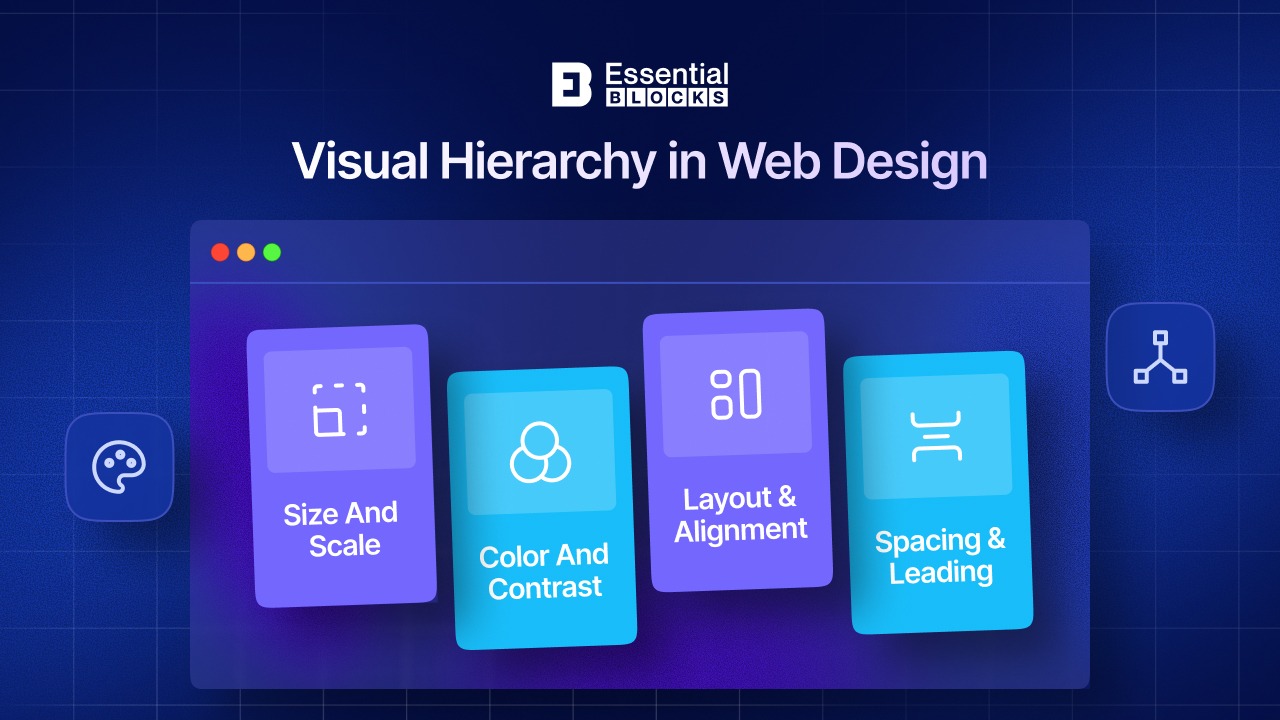
Without hierarchy, a page feels visually flat. The eye has nowhere to land. Readers cannot quickly tell where to begin or what deserves the most attention.
Strong hierarchy is one of the foundations of content readability, especially on long-form pages.
Ignoring Mobile Reading Experience
According to statistics, mobile devices now account for 63.8% of all global web traffic. A layout that feels acceptable on desktop can become exhausting on mobile. Paragraphs look longer, spacing feels tighter and visual sections collapse closer together.
Because so much content is consumed on phones, mobile readability cannot be an afterthought. Scannability must work on smaller screens where distractions are higher and patience is lower.
If you are not previewing your Gutenberg pages on mobile, you may be overlooking the experience most visitors actually have.
The Core Principles of Scannable Content
Scannability is not achieved through one trick. It comes from a collection of small, deliberate choices that make a page easier to navigate and understand. When combined, those choices dramatically improve the reading experience.
The good news is that these principles are simple to apply. They do not require complicated design knowledge. They require consistency, empathy for the reader and better use of the tools already available in Gutenberg.
If you want to improve content readability, start with these fundamentals.
Create a Strong Heading Hierarchy
Use H2s for major sections, H3s for supporting ideas, and H4s only when additional structure is truly needed. This helps readers understand the flow of the page in seconds.
Clear headings also improve accessibility and SEO, but their first job is helping humans navigate. A strong heading should tell the reader exactly what the next section is about.
A good hierarchy creates confidence. It turns a long article into a readable map.
Keep Paragraphs Short
Short paragraphs are easier to scan, especially on screens. A paragraph of two to four lines is often enough to communicate one idea without feeling dense.
This does not mean every paragraph must be tiny. It means you should avoid unnecessary bulk. If a paragraph looks heavy, it probably reads heavy too.
Shorter paragraphs reduce reader fatigue and keep momentum high.
Use Lists Whenever Possible
Bulleted and numbered lists break complex ideas into manageable parts. They are ideal for steps, benefits, mistakes, comparisons and checklists.
Lists create contrast within a page. They stand out visually and help readers absorb information faster than a long sentence chain would.
Whenever you notice a paragraph containing multiple examples or takeaways, consider whether a list would communicate it better.
Highlight Key Information
Not every important point should be left inside standard body text. Pull quotes, notices, callouts, and highlighted boxes can help key ideas stand out.
Used carefully, these elements guide attention without overwhelming the page. They are especially useful for definitions, warnings, quick wins, or action steps.
The goal is not to decorate the page but to help readers identify value quickly.
Add Visual Breaks
Dividers, white space, media, and separated content sections give the reader room to breathe. These visual pauses matter more than many people realize.

A page with no breaks feels like a task. A page with intentional pauses feels inviting. Even simple separator lines or spacer blocks can make a major difference.
Visual breaks are one of the easiest ways to improve content scannability in Gutenberg.
Maintain Consistent Formatting
Consistency creates trust. If heading sizes, paragraph spacing, button styles and highlight treatments change randomly across the page, the content feels less polished.
Consistent formatting builds visual rhythm. Readers quickly learn how to interpret the page because similar elements behave the same way.
That predictability makes content easier to scan and more pleasant to read.
How Gutenberg Helps You Build Scannable Content
One of Gutenberg’s biggest advantages is that it allows you to structure content visually without needing custom code. Instead of thinking only in terms of writing, you can think in terms of sections, containers, and reading patterns.
That makes Gutenberg especially useful for long-form blog content, guides, landing pages, and documentation. With the right block choices, even information-heavy pages can feel easy to navigate.
Here are some of the most useful native tools for improving scannability.
Headings Block
The Heading block is the foundation of the structure. It helps establish hierarchy, break sections into clear units, and guide the reader through your ideas.
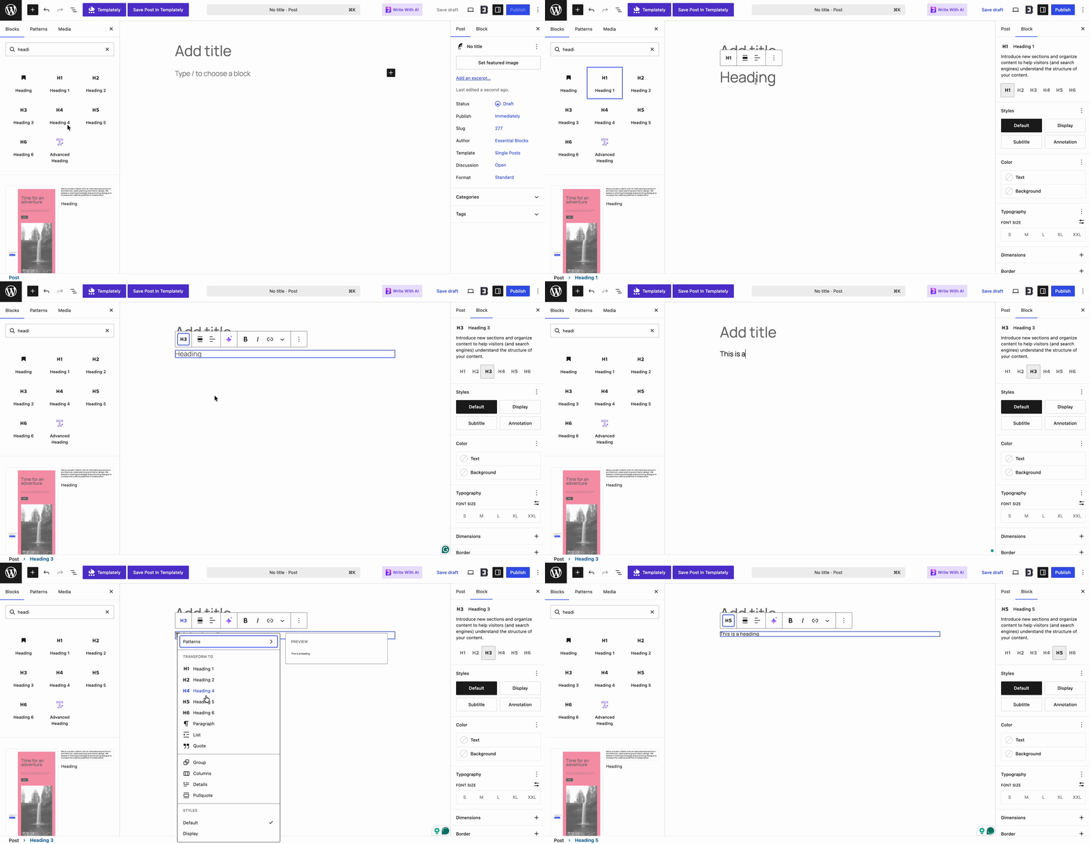
Used well, headings make long content feel less intimidating. A reader scanning the page should be able to understand the outline just by reading the headings alone. Use Heading blocks every 250–350 words. If readers scroll for several screens without seeing a heading, they begin to lose orientation.
That is one of the clearest signs of good content organization.
Columns Block
The Columns block is useful when you want to present related information side by side. This works well for comparisons, feature summaries, benefits, or paired explanations.
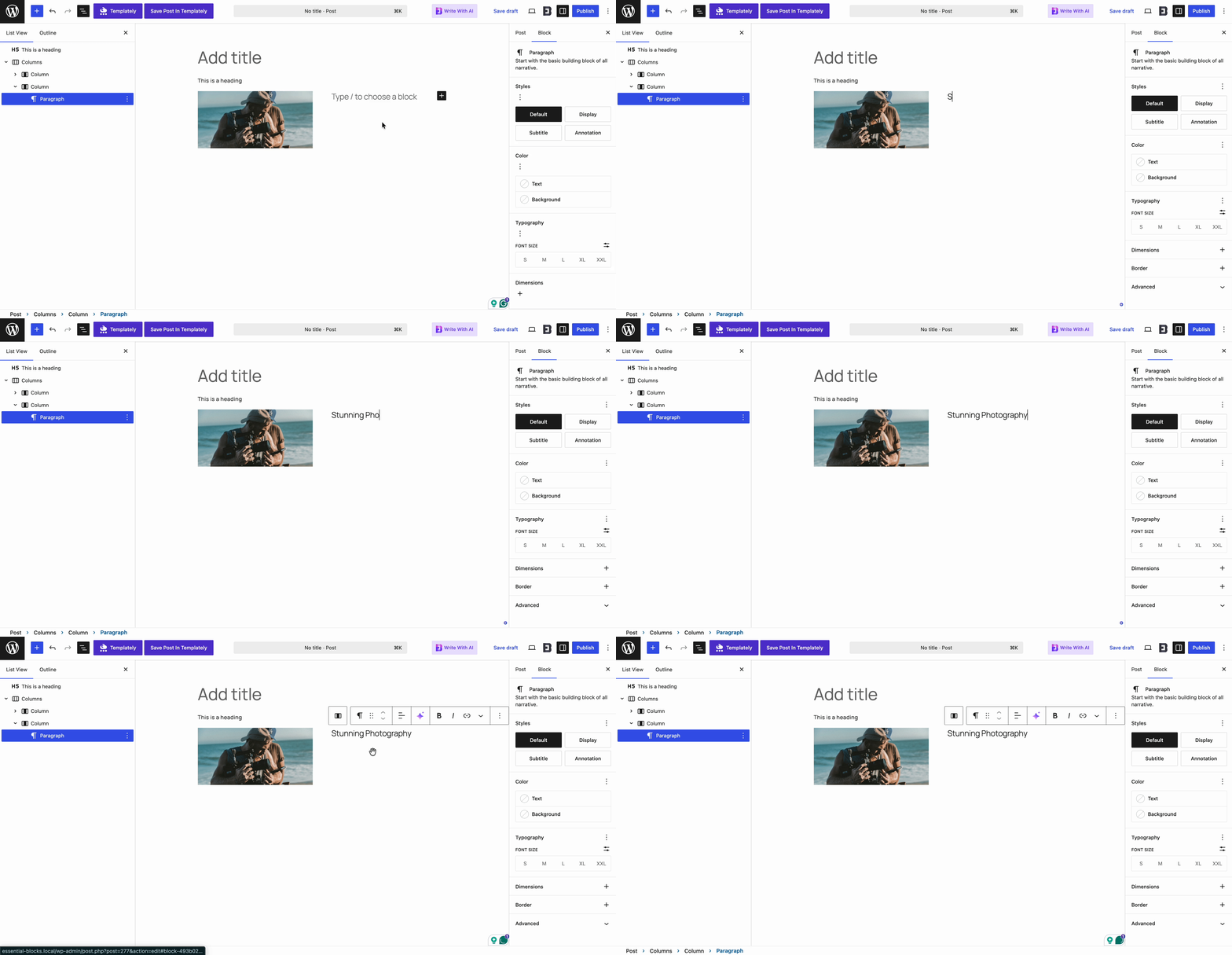
Instead of stacking everything vertically, columns let you reduce scroll fatigue and improve visual variety. On the right content type, they make scanning much easier.
The key is moderation. Use columns where comparison helps, not just for decoration.
List Block
The List block is one of the simplest and most effective tools in the Gutenberg content editor. It transforms dense information into a format readers can process quickly.
Lists are especially helpful for tips, checklists, steps, benefits, and mistakes. They support content scanning by making individual points distinct and easy to spot.
If a section feels too text-heavy, a list is often the fastest fix.
Group And Container Blocks
Group-style blocks help you organize related content into clean sections. This can make a page feel more intentional and easier to follow.
For example, you can place a heading, short intro, and callout inside one visual unit. That helps readers understand which elements belong together.
This kind of structure is subtle, but it makes a big difference in readability.
Separator And Spacer Blocks
Sometimes the smallest blocks have the biggest impact. Separator and Spacer blocks help create breathing room between ideas.
Without spacing, content can feel compressed and visually tiring. With spacing, sections become easier to distinguish and the overall page feels calmer.
These blocks are especially helpful on long pages where visual fatigue builds over time.
Image And Media Blocks
Visuals can reinforce meaning, illustrate concepts, and break up text-heavy layouts. Even a simple screenshot, diagram, or relevant image can reset the reader’s attention.
Media should support the content, not distract from it. When used strategically, it improves scannability by creating contrast and helping explain key ideas faster.
This is especially useful for tutorials, examples, and product-led educational content.
Enhance Content Scannability with Essential Blocks
Native Gutenberg blocks are strong, but sometimes you need more flexibility to present content in a cleaner and more reader-friendly way. That is where block libraries can quietly improve the experience without making your page feel overdesigned.
A thoughtful solution like Essential Blocks can help you create better visual hierarchy, cleaner segmentation and more interactive layouts while still keeping the page easy to read. The key is subtle implementation.
Used well, these blocks do not replace good writing. They amplify it by making your structure easier to follow.
Advanced Heading
An Advanced Heading block can help create section titles that stand out more clearly, especially on longer pages where hierarchy matters.
It allows you to make headings more visually intentional without resorting to awkward styling hacks. That can improve both structure and attention flow.
When readers can instantly recognize section transitions, they are more likely to keep moving through the page.
Content Toggle
Content Toggle is helpful when you need to include extra detail without overwhelming the page all at once. This works well for optional explanations, advanced tips, or expandable sections.

Instead of forcing every reader through every block of information, you let them choose how deep they want to go. That keeps the main layout cleaner.
It is a smart way to improve scannability on longer educational pages.
Accordion
Accordion layouts are especially useful for FAQs, support content, and documentation-style sections. They reduce clutter while preserving access to detailed information.
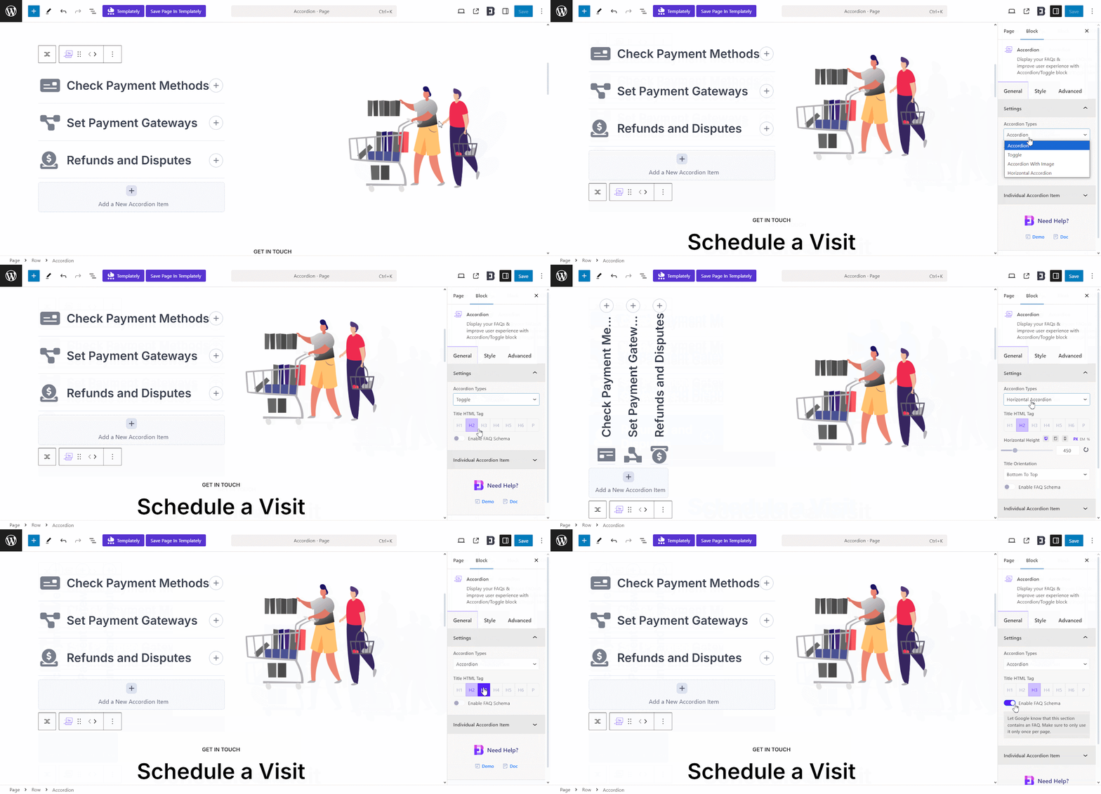
For users who want quick answers, accordions make content scanning much easier. For users who need depth, the information is still there.
This balance is one reason expandable layouts are so effective.
Advanced Tabs
Tabs can present multiple related topics in one compact area. They work well when content categories are connected, but do not need to appear all at once.
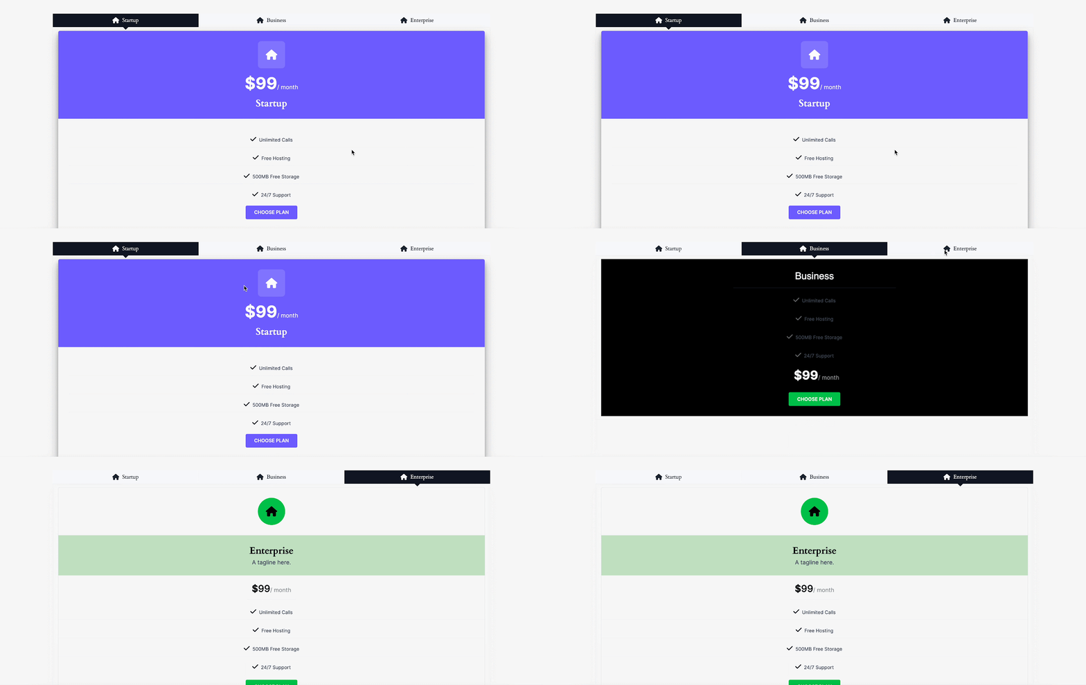
Instead of forcing readers to scroll through repetitive sections, tabs condense the experience and improve navigation.
When used carefully, they can make a page feel more organized and less overwhelming.
Call to Action
A good call-to-action block helps important next steps stand out visually. This is useful when you want readers to subscribe, explore related content, or try a solution.
The key is restraint. A CTA should feel like a clear invitation, not a loud interruption.
Subtle emphasis usually performs better than aggressive design.
Shape Divider
Shape dividers can create cleaner, more polished section breaks than a plain line alone. This can strengthen visual segmentation across longer pages.
When sections are clearly separated, readers are less likely to feel lost or fatigued.
Small design details like this often improve readability more than people expect.
Post Grid
A Post Grid can improve content discovery by helping readers jump to related articles without digging through menus or sidebars.
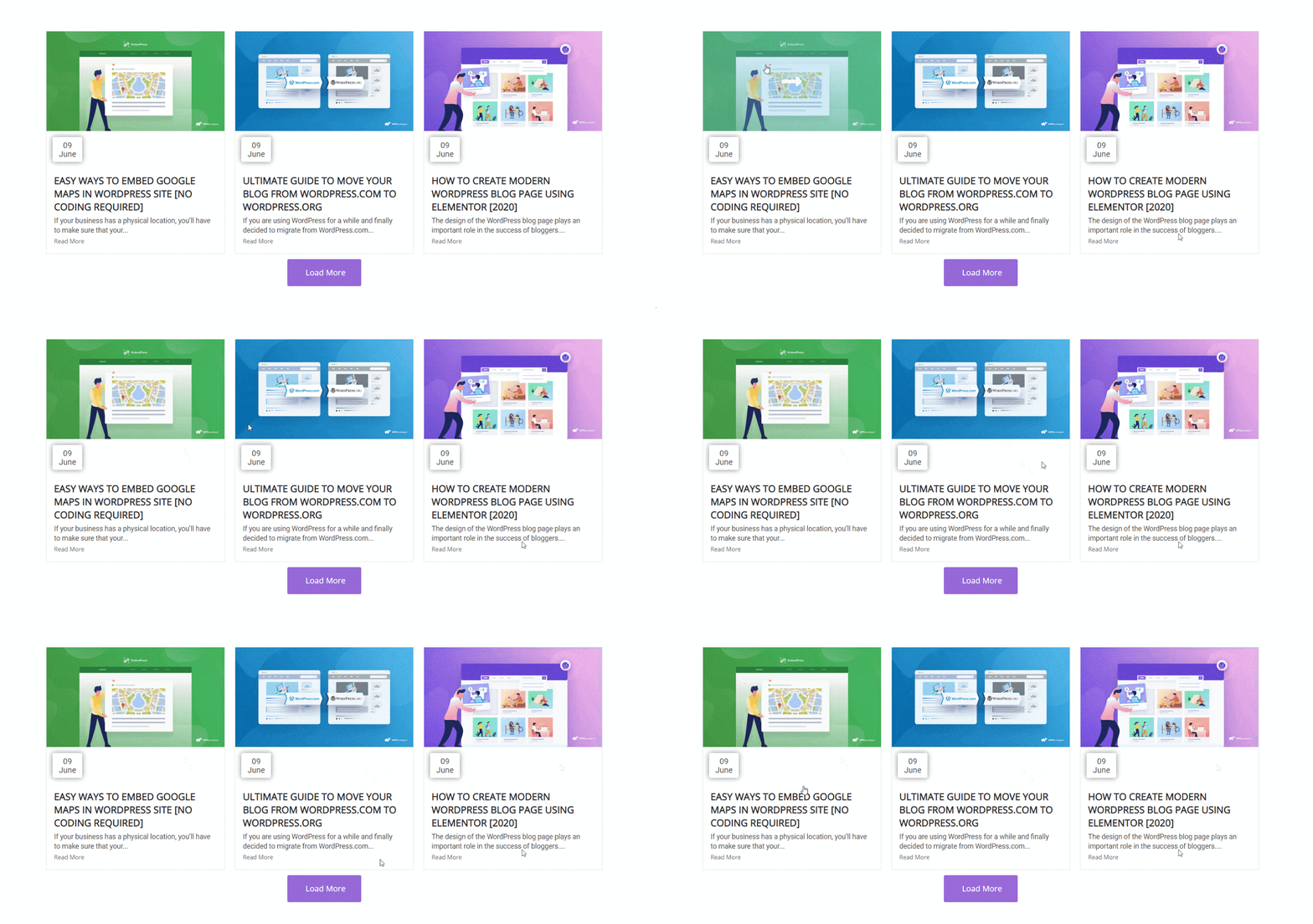
This supports scannability beyond the current page. Once the reader finishes one post, it becomes easier to navigate to the next useful resource.
That kind of guided exploration helps reduce friction across the site.
Image Gallery And Interactive Blocks
Interactive or visual blocks can break up heavy text and re-engage the reader. Galleries, sliders, or visual content groupings are particularly useful when explaining examples or showcasing outcomes.
The important thing is that visuals should support clarity. If they add a distraction, they hurt scannability. If they add structure, they help.
That is why subtle, purpose-driven use works best.
A Quick 5-Minute Scannability Audit Checklist
Before you publish any blog post or update an existing Gutenberg page, it helps to run a quick scannability audit. This does not require advanced UX knowledge or a full redesign. In just a few minutes, you can spot the most common readability issues that make content harder to skim, harder to understand, and less engaging for visitors.
The purpose of this checklist is simple: help you look at your page the way a real reader would. Most visitors do not study every line on their first visit. They scan headings, glance at formatting, and search for quick answers. If your page supports that behavior, it becomes easier to read and more likely to perform well.
This kind of review is especially useful for Gutenberg users because content can look “complete” in the editor while still feeling dense or unstructured to readers. A quick audit helps you catch those issues before they affect engagement, bounce rate, or conversions.
Use the checklist below before hitting publish, or when improving older blog posts that feel text-heavy or difficult to navigate. Here are 5-minute scannability audit questions:
✔ Can I understand this article only by reading the headings?
If someone can skim your H2s and H3s and still understand the flow of the article, your structure is likely strong. If the headings feel vague or incomplete, the page may need a clearer hierarchy.
✔ Is every paragraph under 4 lines?
Short paragraphs are easier to scan, especially on mobile. If large text blocks dominate the page, readers may feel overwhelmed before they even start reading.
✔ Are important ideas visually separated?
Key takeaways should not get buried in the middle of dense paragraphs. Use lists, callouts, dividers, bold emphasis, or spacing to help important information stand out.
✔ Can someone find the answer within 15 seconds?
Think about the main promise of the article. Can a new visitor quickly locate the most useful insight, step, or takeaway? If not, the page may need better formatting and stronger visual cues.
✔ Is there enough white space?
White space improves readability by giving the eyes room to rest. If sections feel cramped or too close together, the page will feel heavier than it should.
✔ Are lists replacing long sentences where appropriate?
If you are explaining steps, examples, benefits, or mistakes, bullet points often work better than long descriptive sentences. Lists make content scanning much easier.
✔ Does it feel comfortable on mobile?
Always preview your content on a smaller screen. A page that feels clean on desktop can still feel crowded on mobile if spacing, paragraph length, or section flow is off.
Common Content Scannability Mistakes to Avoid
Improving scannability is not just about adding more design elements. It is also about avoiding choices that make pages harder to process.
In fact, many readability issues come from overcorrection. A page that is too busy can be just as difficult to scan as one that is too plain.
Here are some mistakes to watch for.
Overusing Bold Text
Bold text should guide attention, not compete for it. If too many phrases are bolded, nothing feels important anymore.
Use emphasis selectively. Highlight only what truly deserves immediate attention.
Too Many Colors and Visual Elements
Adding more design does not automatically improve readability. Too many colors, icons, boxes, or decorative elements can create noise.
Scannable content feels clear, not chaotic.
Excessive Content in One Section
If one section tries to explain too much at once, readers lose focus. Break big ideas into smaller subsections and use layout tools to create flow.
Readers should never feel trapped inside a block of information.
Inconsistent Heading Levels
Skipping from H2 to H4 or using headings based only on appearance creates confusion. Structure matters.
Use heading levels logically so the page feels coherent and easy to follow.
Ignoring Mobile Users
A page that only works on desktop is already falling behind. Always check spacing, line length, and section flow on mobile.
If the content is hard to scan on a phone, it is hard to scan for a large part of your audience.
Make Your Gutenberg Content Easier to Scan and Read
Users scan first and read second. That one reality should influence how every blog post, landing page, and resource page is structured in Gutenberg. If your content is valuable but difficult to skim, you are creating unnecessary friction between your ideas and your audience.
Improving content readability does not require a complete overhaul. It starts with better hierarchy, shorter paragraphs, stronger visual organization, and more intentional use of blocks. And if you want to go a step further, tools like Essential Blocks can help you build cleaner, more user-friendly layouts without making your pages feel forced or overly designed.
In the end, content scannability is about respect for the reader’s time and attention. When your pages are easier to scan, they become easier to trust, easier to engage with, and more likely to convert.
If you enjoyed this post, subscribe to our blog and join our Facebook community to connect with web creators and Gutenberg users.
Frequently Asked Questions
What is scannable content?
Scannable content is content that readers can quickly skim to understand the main ideas, locate important information, and decide where to focus their attention. It usually includes clear headings, short paragraphs, lists, white space, and visual structure that makes the page easier to navigate.
Why is content scannability important?
Content scannability is important because most users scan before they read in detail. If your page is hard to skim, visitors may leave before they find the value in your content. Better scannability improves readability, user experience, engagement, and the likelihood that readers take action.
How can I improve scannability in the Gutenberg content editor?
You can improve scannability in Gutenberg by using a clear heading hierarchy, shortening paragraphs, adding bullet points, inserting visual breaks, and organizing content with blocks such as columns, groups, separators, and media. The goal is to make the page feel structured and easy to explore.
What are the biggest signs that a page is not scannable?
Common signs include long walls of text, weak or inconsistent headings, poor spacing, too much information in one section, and important points getting buried inside large paragraphs. If readers cannot quickly find what they need, the page likely needs better content organization.
Can Gutenberg blocks really help make content more readable?
Yes, Gutenberg blocks can significantly improve content readability when used strategically. Native blocks such as headings, lists, groups, spacers, and images help create structure and visual rhythm. Additional tools like advanced layout or content organization blocks can further improve how readers scan and interact with the page.