Long pages can be incredibly effective when they are built well. Sales pages, event sites, product showcases, portfolios, agency homepages and even internal company pages often work best when everything lives on a single URL. But without a clear structure, users can get lost, skip important sections, or bounce before they reach your call to action. That is exactly where One Page Navigation on Gutenberg becomes so useful. Instead of forcing visitors to scroll aimlessly, you can guide them from one section to another with a clean, interactive flow.
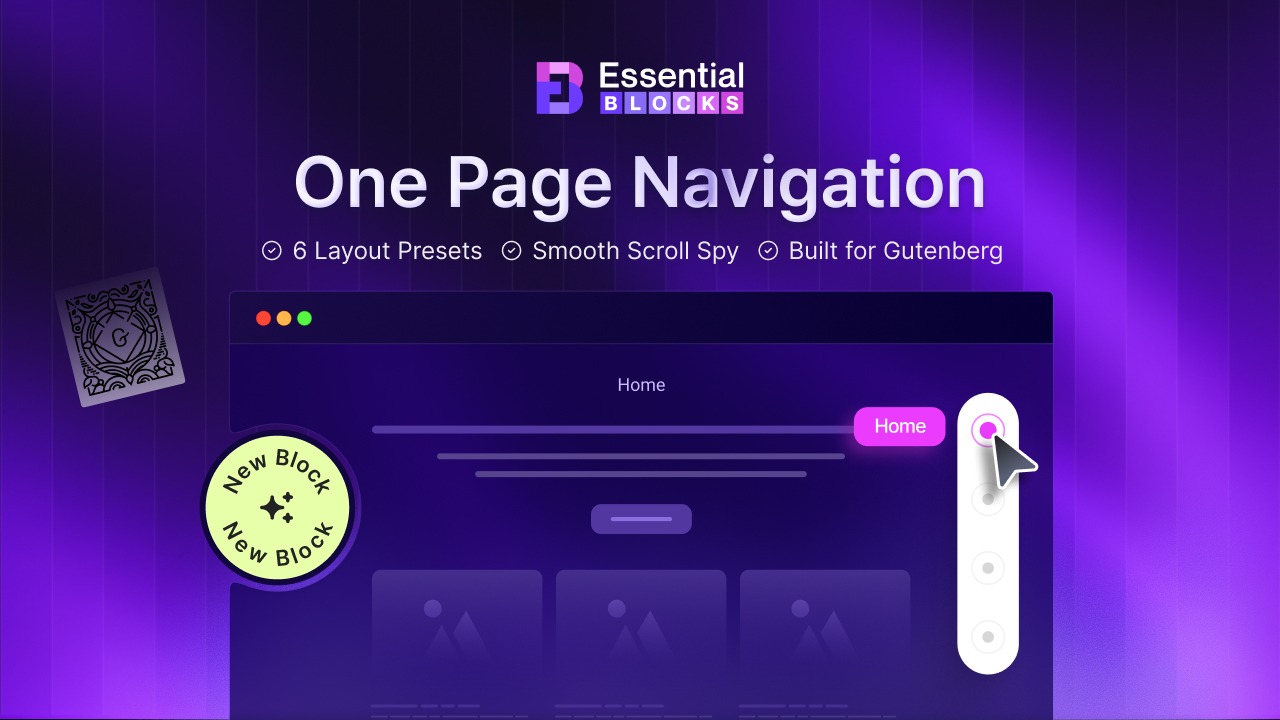
A smart navigation experience does more than help people move around. It improves readability, keeps users engaged and makes long-form layouts feel organized instead of overwhelming. With the right block, you can turn a static one-page design into a smoother browsing journey that feels modern and intuitive. Essential Blocks now makes that much easier for WordPress users with its new One Page Navigation feature.
What Is One Page Navigation?
One Page Navigation is a navigation system designed for single-page websites or long landing pages where multiple sections live on the same page. Instead of sending users to separate URLs, it lets them jump directly to specific sections like About, Features, Pricing, FAQs, Contact, or Testimonials. In practice, this usually appears as a floating or sticky navigation element that stays visible while the visitor scrolls, highlights the active section, and allows smooth scrolling between page anchors.
Think of a SaaS landing page, for example. A visitor lands on your hero section, then wants to jump straight to pricing, reviews, or product benefits without endlessly scrolling through everything in between. With ‘One Page Navigation’, each section becomes instantly accessible. The same idea works beautifully for conference websites, restaurant menus, agency portfolios, nonprofit campaigns, or product launch pages. It creates a guided journey while still giving users control over where they want to go next.
Why Does a Website Need One Page Navigation Block?
A long page without navigation can feel like a maze. Visitors may not know how much content is left, where the key information is located, or how to jump back to an earlier section. That confusion can quietly hurt engagement, conversions and even the perceived quality of your website. One Page Navigation solves that by giving users a visual map of the page. It adds momentum to the browsing experience and helps every section perform better because people can actually find what they are looking for.
For site owners, it also adds structure without requiring custom coding or extra scripts. When your page is doing a lot of heavy lifting, navigation becomes part of the content strategy itself.
Better User Experience
When people land on a content-rich page, they do not always want to consume it in a top-to-bottom order. Some want to jump to pricing. Others want to see features first. Some want to check FAQs before reading anything else. A one-page navigation menu respects those browsing habits and helps users move in the way that feels natural to them. That kind of freedom makes the page feel easier to use.
Stronger Engagement
Every extra second of confusion can reduce the chances of someone continuing through your page. If users cannot quickly locate the section they care about, they may leave. Navigation removes that friction. It gives them visible signposts, makes movement effortless and encourages deeper interaction with more sections of your content.
Clearer Page Structure
One-page websites often rely on a narrative flow. You introduce a problem, explain the solution, show benefits, add proof, answer objections and close with a call to action. One Page Navigation reinforces that structure visually. It tells visitors, “Here is what this page covers,” which makes the content easier to trust and easier to follow.
Introducing One Page Navigation by Essential Blocks
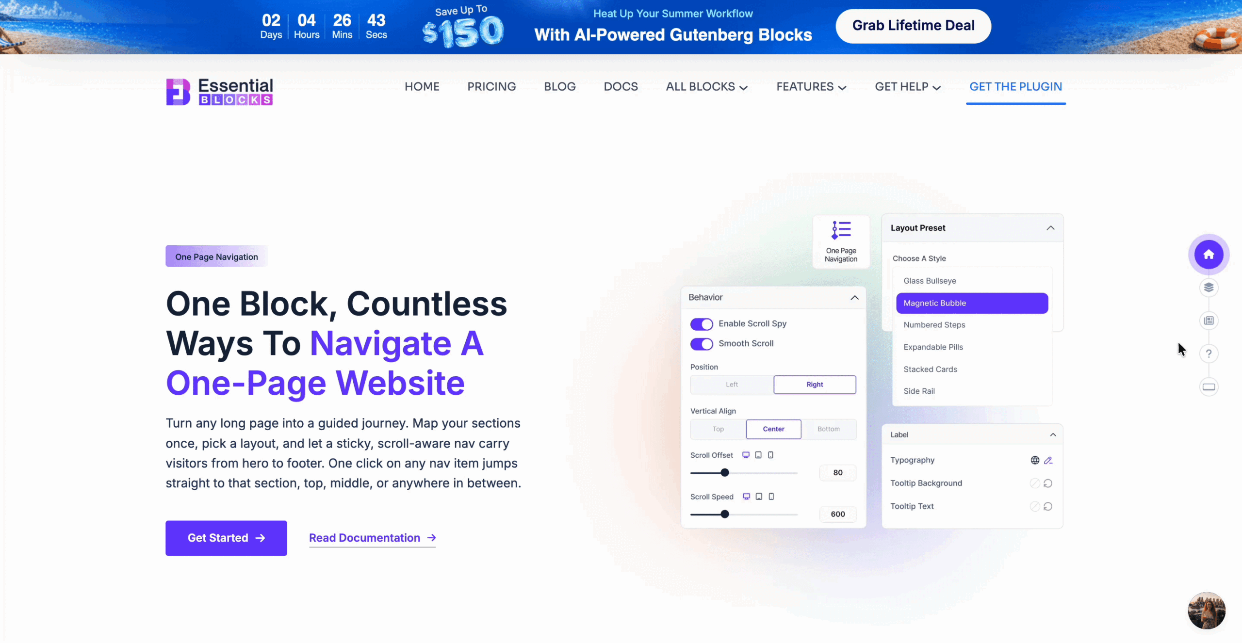
This is the kind of block that instantly feels useful the moment you see it in action. Essential Blocks has introduced One Page Navigation to help Gutenberg users create sleek, scroll-friendly single-page experiences without having to build the navigation behavior from scratch with custom code. The block is designed to add a sticky navigation menu, map it to section IDs, highlight the active section and enable smooth jumps across long pages, all from inside the editor. It also includes multiple ready-made layout styles plus behavior and styling controls, making it flexible for different types of websites.
For websites built as long, single-page experiences, this block solves a practical problem: helping visitors move between important sections without getting lost in the scroll. Instead of forcing users to manually scan the entire page, it gives them a quicker way to reach the information they care about, whether that is pricing, features, FAQs, contact details, or testimonials. For anyone building long scrolling pages in Gutenberg, it solves a real usability challenge while giving designers more creative freedom at the same time.
How to Add One Page Navigation to Your WordPress Website
Getting started with this block is actually pretty straightforward. You definitely do not need to code anything from scratch. The main idea is simple: decide which sections you want people to jump to, give those sections anchors, add the block, and connect the dots. After that, you can style it until it feels like part of your brand. That is really the beauty of the feature. It feels advanced on the front end, but the setup stays friendly inside Gutenberg. Essential Blocks also allows you to enable the block from its library first, then configure navigation items, behavior, positioning, and style inside the editor.
Step 1: Enable the Block First
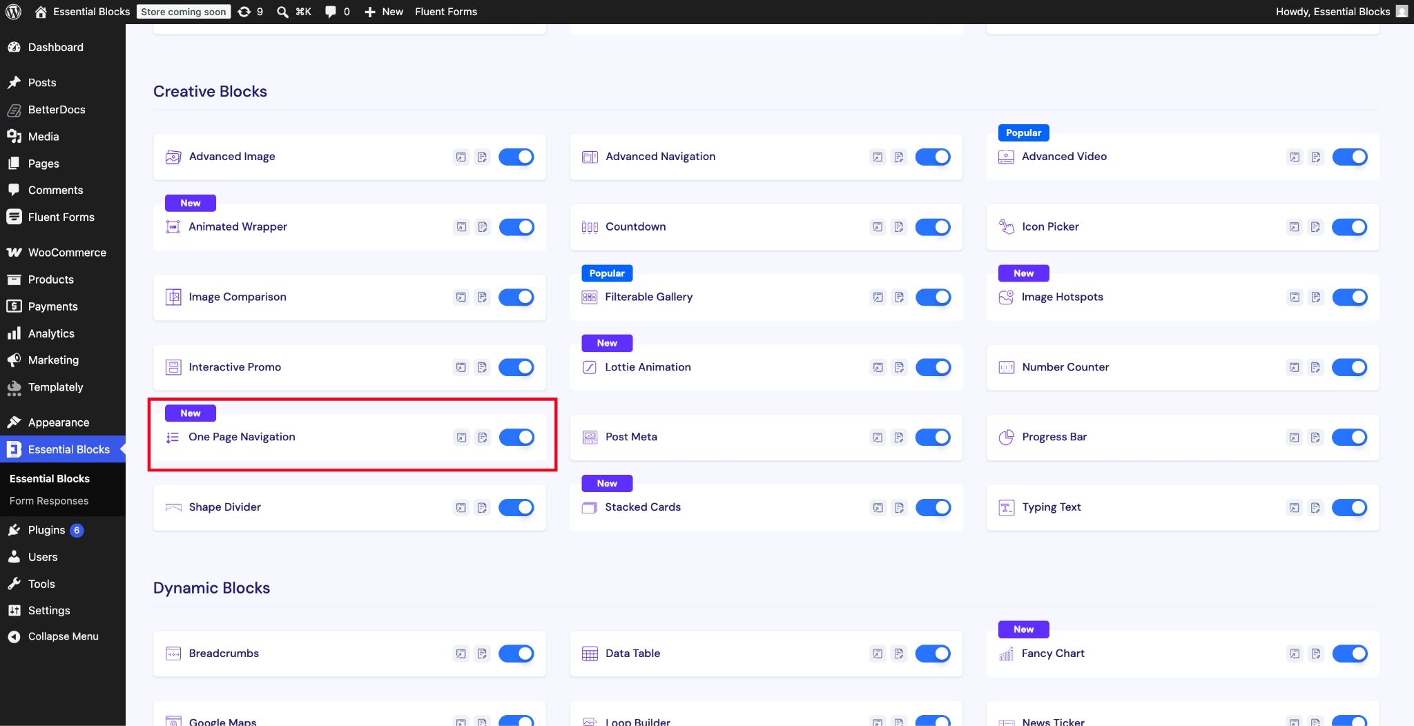
Before anything else, make sure the One Page Navigation block is turned on inside Essential Blocks. Since the plugin lets you enable or disable blocks individually, this keeps things lightweight and organized. Once it is active, you will be able to find it directly in the Gutenberg editor.
Step 2: Add Section IDs
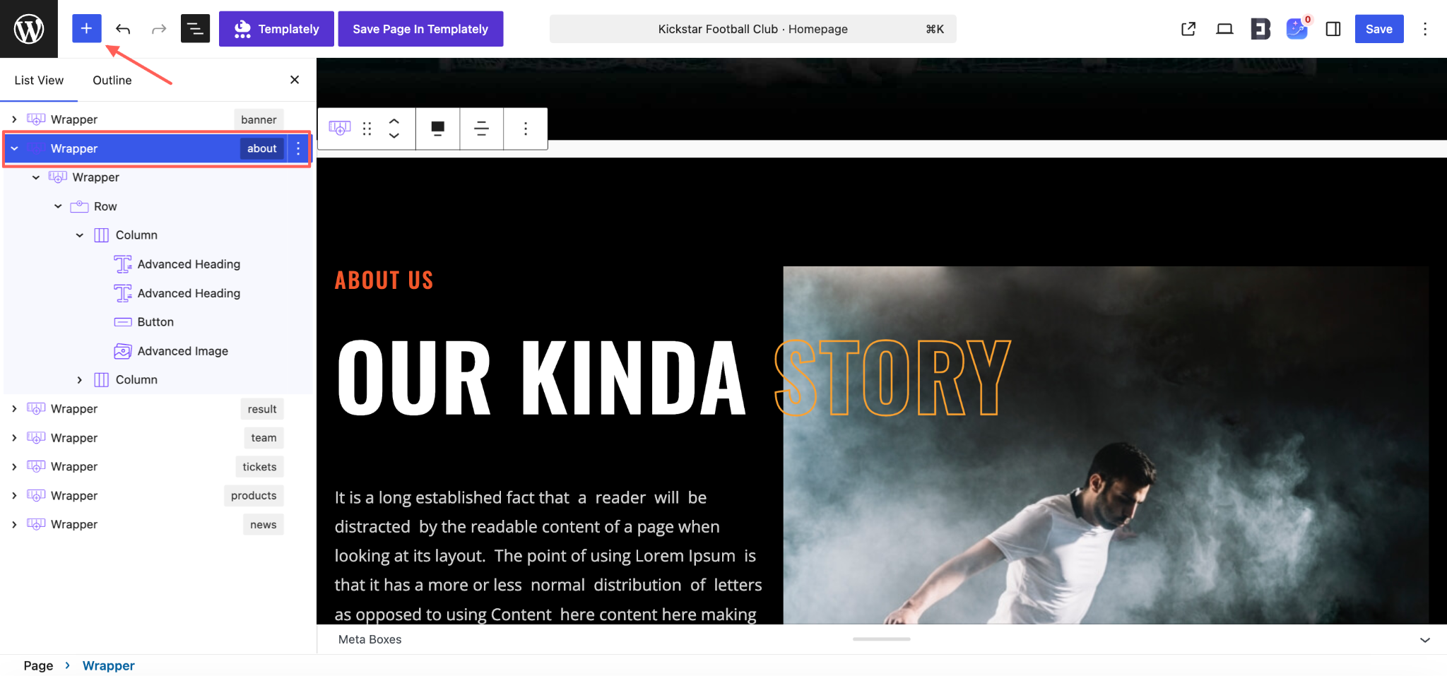
Each destination section has its own unique anchor or section ID. This is what tells the navigation where to scroll. A simple naming style works best here, like about, pricing, faq, or contact. Keep them short, clean, and easy to match later. The block works by linking menu items to those section IDs.
Step 3: Insert the One Page Navigation Block
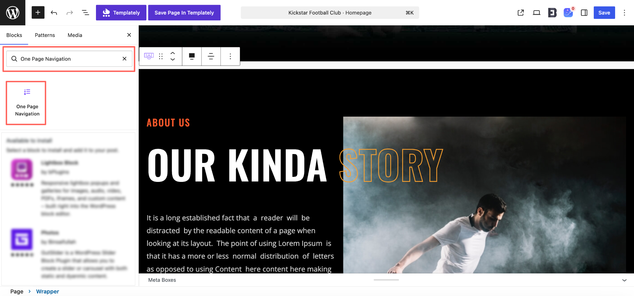
Once your sections are ready, add the One Page Navigation block to the page. You can place it where it is easy for you to manage in the editor, since the final front-end position is controlled by the block settings anyway. That makes editing easier without affecting the user experience.
Step 4: Add Your Navigation Items
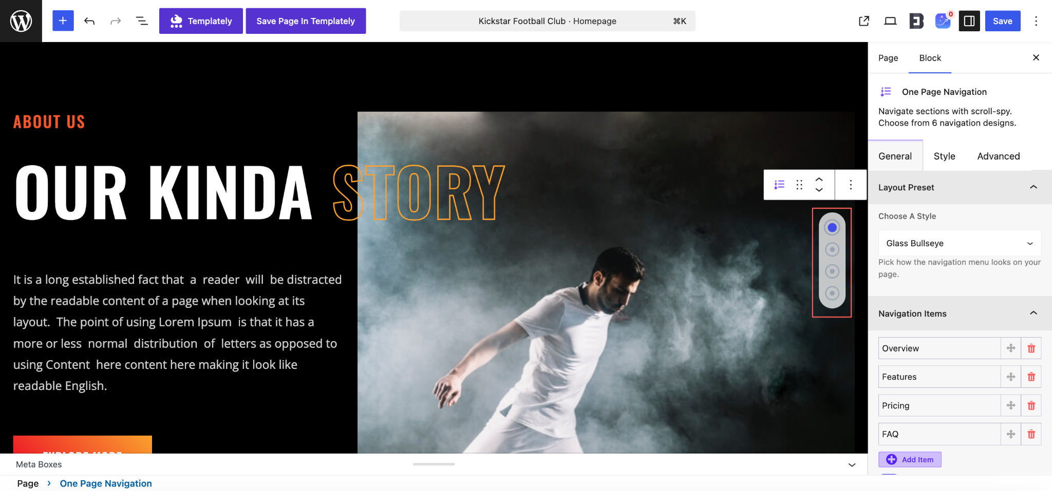
This is the fun part. Add the labels people will actually see, like “About Us,” “Services,” “Schedule,” or “Tickets.” Then assign the correct section ID to each one. Keep the order aligned with the natural reading flow of the page so the navigation feels intuitive instead of random.
Step 5: Pick a Layout Style That Matches the Page
Essential Blocks includes several layout presets for this block, ranging from minimalist to more expressive visual styles. So do not just pick one blindly. If your page is sleek and modern, go subtle. If it is bold and highly visual, choose a style with more personality. The navigation should support the design, not fight it.
Step 6: Style It And Publish
Finally, customize the colors, labels, and marker styling so everything feels consistent with your brand. Then preview the page and test every item. Click through. Scroll manually. Check mobile. Make sure it feels smooth and useful. Once that is done, hit publish and enjoy the upgrade.
To know more details on the feature, check the documentation.
Who Needs the One Page Navigation Block?
This is one of those features that sounds specific at first, but ends up being useful across a surprisingly wide range of websites. Any page that tells a story section by section can benefit from it. If your content lives on a single page and your visitors need help navigating that content quickly, this block is relevant. It is not limited to designers or developers either.
Marketers, bloggers, agencies, educators, organizers, and online sellers can all use it in practical ways. The real question is not whether a site can use One Page Navigation. It is whether the site has enough content on one page to justify a better navigation layer. In many cases, the answer is yes.
Agencies And Freelancers
Agencies often build long homepage experiences that include services, portfolios, client testimonials, team intros, pricing, and contact sections. One Page Navigation helps potential clients skip to exactly what they care about while still staying on the same page. It makes service-based websites feel much easier to explore.
SaaS And Product Marketing Teams
Product pages usually have a lot going on: feature breakdowns, integration highlights, use cases, pricing tables, comparison sections, and user reviews. One-page navigation block helps visitors jump from headline interest to conversion-driving sections without losing momentum.
Event And Conference Organizers
Events are a perfect use case. You can create navigation items for speakers, schedule, venue, ticket info, sponsors, and FAQs. Instead of forcing visitors to scroll through everything, you give them a faster route to the details they need most.
Portfolio Creators And Personal Brands
Designers, photographers, coaches, consultants, and creators often prefer one-page portfolio websites. A sticky navigation menu makes those sites feel cleaner and more premium. Visitors can jump directly to case studies, bio, services, testimonials, or booking sections.
Restaurants, Cafes And Local Businesses
A restaurant one-pager can benefit hugely from quick links to menu, story, location, reservation details, customer reviews and contact information. The same goes for salons, studios, gyms, and clinics. It reduces friction for local visitors trying to find a very specific detail fast.
Course Creators And Educators
If you are selling a course or presenting a program, you probably have sections like curriculum, instructor, outcomes, pricing, student feedback, and enrollment. One Page Navigation helps guide people through that journey and makes it easier for high-intent visitors to jump right to the sections that influence decisions.
When Not to Use One Page Navigation
One Page Navigation is incredibly useful, but it is not something you should force into every website layout. Like any good design feature, it works best when it solves a real navigation problem. If a page is already short, highly focused, or split across multiple URLs, adding this block can feel unnecessary and even distracting. Instead of improving usability, it may add visual clutter or create an experience that feels too “busy” for the content.
Short Pages with Minimal Content
If your page only has a hero section, a short paragraph and a contact form, then One Page Navigation is probably overkill. Visitors can already see everything they need without extra assistance. In cases like this, adding a floating or sticky navigation element can make the page feel more complicated than it really is.
Multi-Page Websites with Standard Navigation
If your website already separates content properly across different pages, like About, Services, Blog, Pricing and Contact, then a one-page navigation block may not be the right fit. It is designed for single-page experiences where users need to jump between sections on the same URL. On a traditional multi-page site, the main menu usually does the job just fine.
Pages without Clear Section Structure
One Page Navigation works best when the page is organized into strong, clearly defined sections. If the content flows more like a continuous article or an unstructured layout without clear content breaks, the navigation may feel awkward. In that case, users are less likely to benefit from section jumping because the page was not built around section-based browsing in the first place.
Mobile-First Layouts with Very Limited Space
While the block can be useful on mobile, it is not always the best choice for layouts where screen space is extremely tight. If the sticky navigation overlaps important content or interrupts the reading flow on smaller devices, it can do more harm than good. In those cases, simplifying the page experience may be the better route.
Highly Conversion-Focused Pages
Some landing pages are intentionally designed to guide users through a very specific flow without encouraging them to skip ahead. For example, if the page depends on a strong emotional or strategic narrative before the final call to action, too much jump navigation could reduce that impact. If the sequence matters more than flexibility, it may be smarter to let the page unfold naturally.
Pages Where It Adds More Noise Than Value
Sometimes a feature is technically useful but practically unnecessary. If the design already feels crowded with popups, sticky headers, chat widgets, banners and buttons, adding one more floating interface may overwhelm the visitor. In that situation, usability often improves more by removing elements than by adding new ones.
Best Practices to Follow to Use One Page Navigation Block
Like any feature, One Page Navigation works best when used intentionally. Just because you can add lots of navigation items does not mean you should. The best results come from balancing clarity, usability, and design harmony. A cluttered one-page navigation can become just another distraction, while a thoughtful one can improve the entire experience of the page. So if you want the block to actually add value, it helps to follow a few smart practices from the start. These are the small decisions that separate a flashy feature from a genuinely effective one.
Keep the Navigation Items Focused
Do not try to turn every section into a navigation item. If the page has fifteen separate blocks, that does not mean the menu needs fifteen links. Focus on the major sections people are likely to search for. Too many items make the navigation feel noisy and reduce its usefulness.
Use Clear, Familiar Labels
Your labels should be instantly understandable. “About,” “Pricing,” “FAQ,” and “Contact” work because people already know what to expect. Avoid vague labels unless your audience already understands your language. Good navigation does not make people think twice.
Match the Navigation Order
The order of the navigation should mirror the way sections appear on the page. If the user clicks downward through the list, the page should feel consistent with that rhythm. Random ordering creates subtle friction and makes the page feel less trustworthy.
Always Test Scroll Offset with Sticky Headers
This one matters a lot. If your site has a fixed header and your offset is wrong, users will click a menu item and land on a section title that is partially hidden. That makes the page feel broken. Set the offset thoughtfully and test it on desktop, tablet, and mobile for a cleaner experience. Essential Blocks provides scroll offset controls specifically for this reason.
Prioritize Contrast And Readability
Make sure active and inactive states are visually distinct. If everything looks the same, users will not immediately understand which section they are viewing. Good contrast improves orientation. This is especially important if your page has colorful backgrounds or layered visuals.
Choose a Layout Style That Supports the Content
A highly playful style might look amazing on a creative brand site but feel out of place on a corporate service page. Let the design language of the website guide the navigation style. Essential Blocks offers multiple presets, so use that flexibility with intention rather than treating it like decoration.
Check Mobile Experience Carefully
A navigation feature that feels elegant on desktop can become intrusive on a smaller screen if the spacing, placement, or size is not right. Preview it on mobile before publishing. Make sure it stays helpful and does not cover important buttons, headlines, or forms.
Use Navigation to Support Your Page Goals
Think strategically about what sections matter most to your goals. If your page is designed to generate leads or sales, navigation should help users get to trust-building and conversion-driving sections faster. The best one-page navigation setups support business outcomes, not just aesthetics.
Make Your One-Page Website Easier to Explore
One Page Navigation is one of those features that can make a page feel instantly more professional, more usable, and more conversion-friendly. It gives structure to long layouts, helps visitors move with confidence, and turns scrolling into a guided experience rather than a guessing game. For Gutenberg users, that matters because great design should not require custom development every time you want to improve usability.
With Essential Blocks, adding that experience becomes much more accessible. You get a sticky, scroll-aware navigation system with style presets, smooth scrolling, active section highlighting, and customization options directly inside the editor. So if you are building long landing pages, event pages, product showcases, or portfolio-style websites, now is a great time to try One Page Navigation and make your content easier to explore from the very first click.
If you liked our blog, then subscribe to our blog for all the latest updates and join our Facebook community to stay connected with new features, tips and announcements.