In this digital era where every click and conversion matters, a small but mighty element often takes center stage: the Call to Action, or CTA. Whether you are running a website, blog, email campaign, or social media ad, the effectiveness of your CTAs can make or break your success and is one of those criteria you need to focus on to stay ahead of the game.
In this blog post, you will get a complete idea about Call to Action examples or CTAs. We will explore what they are and why they matter, and provide practical tips and examples to help you create a call to action that drives results.

How To Define A Call To Action (CTA)?
A Call to Action, often abbreviated as CTA, serves as a directive intended to inspire an immediate response or action from your target audience. It basically explains to the audience what they should do next.
CTAs can guide visitors easily. The main objective of using a call to action is to turn inactive or exploring visitors into active leads or customers. But unlike common beliefs, CTAs are not only limited to buttons that prompt users to buy or subscribe to something. You can use many types of CTAs like forms, links, photos, text, or others.
Why Call To Action Or CTAs Even Matter?

CTAs are the bridge between your content and your business goals. They expedite conversions, helping you achieve various objectives, such as:
Driving Sales:
Whether you are selling products, services, or subscriptions, a well-crafted CTA can help you attract and lead potential customers down the sales funnel, ultimately resulting in a purchase.
Building An Email List:
CTAs can encourage visitors to subscribe to your newsletter or join your mailing list, providing you with valuable leads for future marketing efforts.
Afterward, you can include interactive CTAs in your emails to these lists as well, prompting users to take further actions like reading a blog, viewing a newly published video, and more. According to HubSpot statistics, “43% of marketers use only one CTA per email, whereas 30% use two per email.”
Encouraging Engagement:
An effective call to action can boost user engagement by guiding visitors to comment on a blog post, share your content on social media, or participate in a survey or quiz.
Fostering Trust:
Call to Action can offer free trials, demos, or downloadable resources, allowing potential customers to get a taste of what you offer before committing.
Nurturing Leads:
CTAs can lead to landing pages with more in-depth information, helping educate and nurture leads who are still in the research phase.
5 Excellent Call To Action Examples That Will Earn You More Clicks
Now that you have all the essentials of an effective Call to Action (CTA), let us dive into some real-world examples to inspire your own CTA creations:
Buttons:
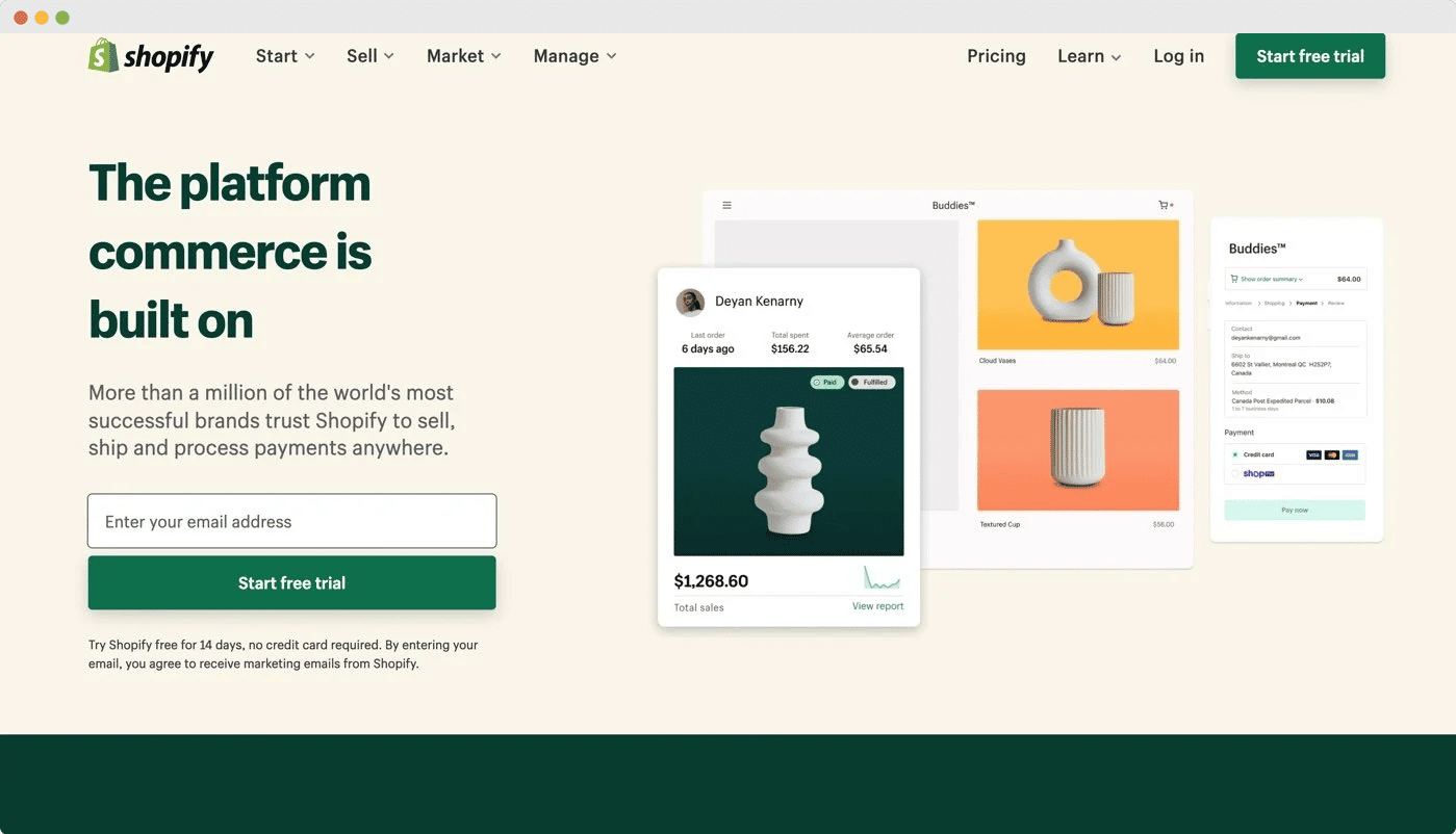
The button is the most common type of call to action (CTA), and it often comprises a symbol or icon, and a convincing statement that invites visitors to click and carry out a certain action. However, button designs can vary depending on the brand’s aesthetic and marketing goals. It is generally advised to select a button color that offers a strong contrast to make your page look stand out.
If you own a software business, Free Trials CTA or Get A Demo is one of the excellent initiatives that invites users to try out your product or service without any commitment. It is an effective way to introduce potential customers to what you offer them, build credibility and trust, and convert them to paying customers.
Learn More: Top 5 Call To Action Button Examples That Make You Want To Click
Contextual Links
Contextual links within a blog post’s body act as helpful directional cues for readers. These links have clickable language that, when activated, directs viewers to a landing page that is closely related to the topic being covered in the blog.
This thoughtful placement not only improves the user experience by making it simple to find additional pertinent information, but it also presents a chance to promote interaction and exploration within the ecosystem of material on your website.
Banners:

A CTA banner can be placed anywhere on your website, including the top, bottom, or side. These banners frequently have intriguing copy and appealing design features that are intended to persuade your visitors to click and do a particular action.
PopUps:
Think of a pop-up window opening for an unexpected visitor who lands on your website – it will build interaction and drive engagement. When typical CTA buttons and forms could go overlooked, it’s a dynamic technique to draw your consumers’ attention right away.
Pop-ups with an interactive CTA that showcases discounts can excel and entice customers to sign up for your business. Some websites even use exit-intent pop-ups, which are only activated as viewers are about to leave the website but help to bring user’s attention back to your site.
Forms:
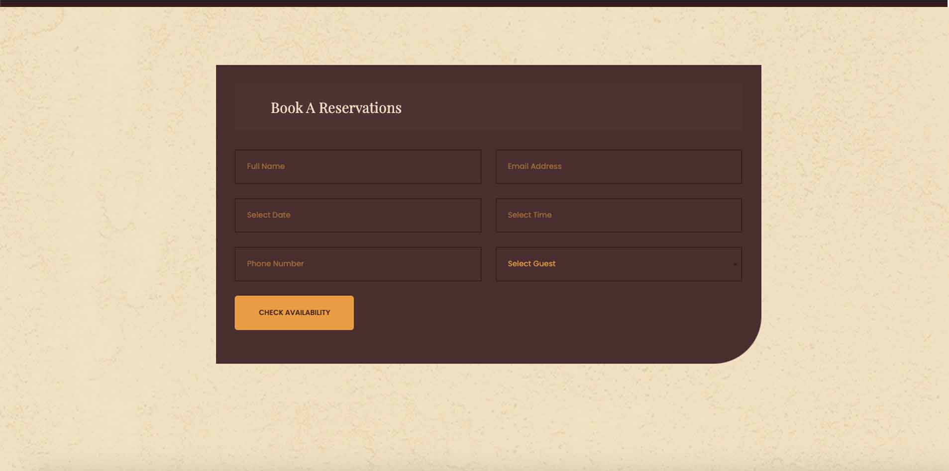
By offering incentives in exchange for contact information, CTAs for form submissions efficiently convert website users into potential leads. These offers can range widely, including downloadable content, product price quotations, service sign-ups, subscriptions, and numerous more possibilities.
Bonus Tip: Importance Of Testing And Optimization Different Types Of Call to Action (CTA)

CTA development and implementation are not one-size-fits-all tasks. What is effective for one industry or audience may not be effective for another. Continuous testing and optimization are essential because of this.
A/B testing entails the creation of two or more variants of a CTA and the evaluation of their effectiveness. You can experiment with a number of things, including the button’s language, color, placement, and even shape. This data-driven strategy can drastically raise your conversion rates over time.
Now It Is Your Turn To Explore Call To Action!
In the fast-paced world of online marketing, the humble call to action plays a pivotal role in achieving your business objectives. The glue connects your content to your goals, guiding users on their journey from passive observers to active participants.
Remember, the key to an effective CTA lies in its clarity, action-oriented language, and alignment with your audience’s needs and desires. Do not be afraid to experiment, test, and iterate to find the CTAs that resonate best with your unique audience. By using the power of CTAs, you can boost conversions, engagement, and, ultimately, the success of your digital marketing efforts. So, start crafting compelling CTAs today and watch your online presence flourish!
Do you find this blog helpful? If so, consider following our blog for upcoming posts. To connect with like-minded individuals and foster community growth, feel free to join our Facebook group.


