
When your website loads fast but users still leave, something deeper is broken. Speed matters, but it is just one layer of a much bigger performance picture. UX performance metrics are the data signals that reveal how real users experience your product, not just how fast it loads.
UX performance metrics go beyond page speed. They measure how users interact with your interface, where they struggle, what they ignore and how smoothly they complete tasks. When tracked properly, these metrics give you a direct line into the real user experience, not just the technical one.
TL;DR (Too Long, Didn’t Read?)
Tracking UX performance metrics is essential for building products that are both usable and efficient. While developers often focus on system performance and errors, many critical UX metrics slip under the radar. Key metrics like task success rate, time on task, error rate, click path efficiency and user satisfaction help identify friction points, improve workflows, and drive better engagement.
UX Performance Metrics at a Glance
| Metric | What to Track | When to Track | Why It Matters | Expected Result / Goal |
| Task Success Rate | Percentage of users completing a task | During usability testing, post-launch analytics | Measures if users can complete key tasks | ≥ 78% indicates a smooth UX |
| Time on Task | Average time to complete a task | During usability testing, A/B testing | Indicates efficiency; long times suggest friction | Shorter time = more efficient experience |
| Error Rate | Number/type of user errors | During usability testing, analytics tracking | Highlights confusing UI elements or processes | <2% is ideal; >2% requires investigation |
| Click Path Efficiency | Number of clicks to complete a goal | Session recordings, analytics | Identifies unnecessary steps in user flow | Fewer clicks = streamlined experience |
| User Satisfaction (CSAT/Surveys) | Ratings from users | After key interactions, post-launch | Measures perceived experience quality | ≥ 4/5 indicates high satisfaction |
| Drop-off / Abandonment Rate | Percentage of users leaving mid-task | Funnel analysis, analytics | Shows where users get frustrated or lost | <10% at critical steps is healthy |
| Navigation & Search Success | Accuracy & speed of finding info | During usability testing, live site | Ensures content and features are discoverable | High success rate = intuitive navigation |
| Accessibility Issues | Number of accessibility barriers | During accessibility testing | Ensures inclusivity for all users | Aim for WCAG compliance; zero critical issues |
| System Feedback & Error Handling | Frequency & clarity of system messages | Usability testing, analytics | Good feedback reduces user confusion | Clear, actionable messages = better user experience |
Why Developers Miss the Most Important UX Metrics?
Developers are trained to optimize systems, not experiences. They watch dashboards filled with load times, API calls, memory usage and crash reports. This is valuable work, and getting the technical layer right, for example with performance-tuned hosting like xCloud, is the baseline. But it only tells you how the system is performing, not how the human on the other side of the screen is performing within it.
Many organizations measure UX in isolation without connecting those insights to business outcomes. That disconnect is exactly why critical metrics get ignored.
The result? Teams ship fast products that feel slow to use. Pages load instantly but users cannot find what they need. Buttons work perfectly in code but confuse real people in context.
Bridging the gap between technical performance and human performance is where UX metrics become essential.
The UX Performance Metrics Developers Rarely Track
Most teams measure page speed, load time and Core Web Vitals but those numbers only tell part of the story. The real gaps in user experience often hide in subtle behavioral signals that developers rarely track.
Let’s go through each metric category, what it means and why it matters more than most teams realize.
1. Task Success Rate
Task success rate measures how often users successfully complete a specific action within your interface. That action could be signing up, finding a product, submitting a form or completing a checkout.
This is one of the most telling user experience metrics available. A high task success rate means your design is working. A low one means users are getting lost, confused or blocked somewhere in the flow.
You can measure this through usability testing tools, session recordings or funnel analytics. The key is to define what ‘success’ looks like for each task before you start measuring.
- Above 78% is generally considered a solid benchmark for digital products
- Below 50% signals serious usability problems that need immediate attention
- Track per task, not overall, to identify exactly where friction exists
2. Time on Task (ToT)
Time on task tracks how long it takes a user to complete a specific action. Shorter is not always better. But significantly longer than expected usually points to a usability issue.
If a user spends four minutes trying to find your pricing page, that is a problem. If they spend four minutes reading a detailed product comparison, that could be intentional and valuable engagement.
Context matters here. Pair this metric with task success rate for a clearer picture. A user who succeeds quickly is a sign of a well-designed experience. A user who takes forever and still fails is a clear red flag in your UX performance metrics dashboard.
3. Error Rate
Not the technical error rate your developers track. This is the user error rate, which counts how often people make mistakes while interacting with your interface. These include form validation errors, incorrect input formats, failed search queries or clicking the wrong element.
High user error rates reveal that your design is not communicating clearly. Your labels might be confusing. Your form fields might not give enough guidance. Your navigation might be leading people in the wrong direction.
High user error rates indicate inefficiencies in processes and systems, whereas low rates reflect effective training and robust operational controls. An ideal target is typically below 2%, signaling a well-functioning system.
Performance Guidelines:
- <1% – Excellent: Demonstrates strong user training and well-designed systems.
- 1%–2% – Acceptable: Generally satisfactory but monitor for potential issues.
- >2% – Concerning: Requires immediate investigation and corrective action.
4. Rage Clicks And Dead Clicks
Rage clicks happen when a user clicks the same element multiple times in quick succession out of frustration. Dead clicks happen when a user clicks on something that is not interactive but looks like it should be.
Both of these are invisible to most development teams but instantly visible in tools like Hotjar, FullStory or Microsoft Clarity. They reveal exactly where your interface is creating confusion or false expectations.
Here is what these signals typically mean:
- Rage clicks often point to elements that look clickable but are not, or buttons that do not respond fast enough
- Dead clicks reveal design patterns that mislead users about what is interactive
- Both can significantly drag down your website performance metrics when left unaddressed
If you are not tracking these, you are missing some of the loudest signals your users are sending you without saying a word.
5. Scroll Depth vs. Meaningful Interaction
Most teams track scroll depth as a sign of engagement. But scrolling alone does not mean reading, understanding or caring. Meaningful interaction is what you actually want to measure.
Meaningful interaction includes actions like clicking a link, expanding a section, hovering over a product image, watching a video past the 50% mark or submitting a form. These signals show that a user is not just scrolling past your content, they are engaging with it.
When you combine scroll depth data with click maps and interaction heatmaps, you get a much richer picture of real engagement. This is one of the important UX performance metrics that separates surface-level analytics from deep behavioral insight.
6. System Usability Scale (SUS) Score
The System Usability Scale is a standardized 10-question survey that gives you a single usability score between 0 and 100. It was developed by John Brooke in 1986 and is still widely used today because it works.
A SUS score above 68 is considered average. Above 80 is considered excellent. Below 50 is a serious problem.
The beauty of SUS is that it captures subjective user experience in a measurable and comparable format. It is one of the few UX metrics that lets you benchmark your product against industry standards over time.
7. Cognitive Load Indicators
Cognitive load refers to the mental effort required to use your product. High cognitive load means users have to think too hard. They have to read more, decide more and process more than they should in order to complete basic tasks.
You cannot measure cognitive load with a single number, but you can observe it through several proxy signals:
- Long hesitation times before making a choice
- High drop-off rates at decision-heavy steps
- Frequent backward navigation (going back to re-read or reconsider)
- High error rates in complex forms or multi-step workflows
- Lower task success rates in feature-heavy sections
Reducing cognitive load is one of the highest-impact improvements you can make to any digital product. Less effort from the user always leads to better outcomes.
8. First Contentful Paint vs. Perceived Performance
First Contentful Paint (FCP) is a technical metric that measures when the first piece of content appears on screen. Developers track this carefully. But what matters more to real users is perceived performance, which is how fast the page feels, not just how fast it loads.
A page can technically load quickly but still feel slow if the content jumps around, images load late or interactive elements are not ready when the user tries to use them. This is where metrics like Cumulative Layout Shift (CLS) and Interaction to Next Paint (INP) become critical parts of your app performance metrics toolkit.
Perceived performance directly influences user trust and satisfaction, often more than actual load speed.
9. Net Promoter Score (NPS) as a UX Signal
Net Promoter Score is typically seen as a marketing or customer success metric. But it is also a powerful UX performance indicator when used correctly.
If users do not recommend your product to a friend, the reason is almost always rooted in the experience. Poor onboarding, confusing navigation, slow task completion or frustrating errors all contribute to a low NPS.
Tracking NPS alongside your UX metrics creates a direct connection between experience quality and overall user satisfaction. It helps product teams justify UX improvements with data that leadership actually listens to.
10. Drop-off Points in User Flows
Every multi-step process in your product, whether it is an onboarding flow, a checkout, a signup form or a feature walkthrough, has a point where users give up and leave. These are your drop-off points.
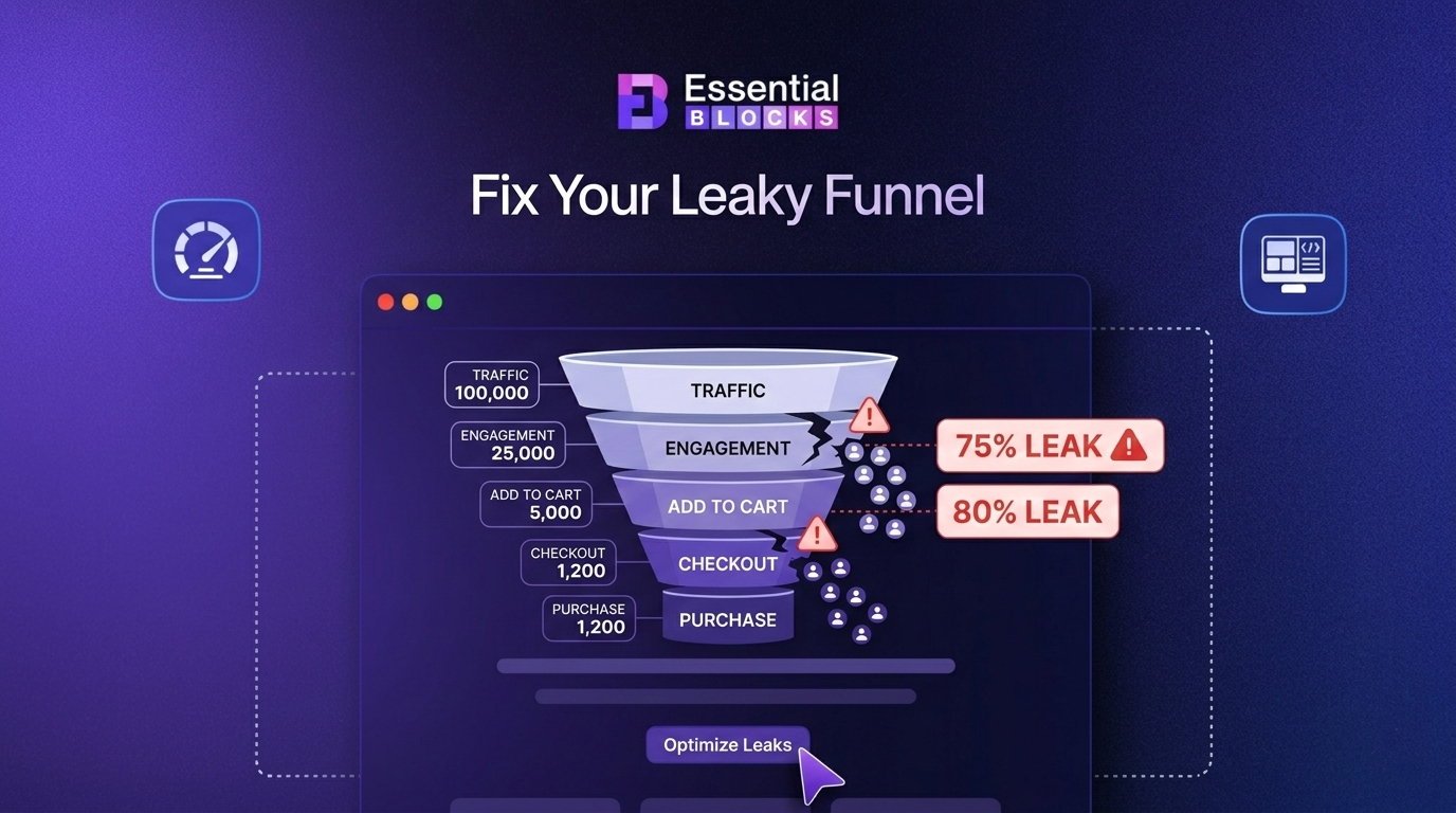
Tracking exactly where users abandon a flow is one of the most actionable UX performance metrics you can monitor. It tells you precisely where to focus your design improvements rather than guessing.
Use funnel analysis tools within your analytics platform to map the full journey and identify which steps have the highest exit rates. Even a small improvement at a high-drop-off step can produce significant gains in conversion and retention.
How to Start Tracking UX Performance Metrics the Right Way?
Knowing the metrics is one thing. Building a system to track them consistently is another. Here is a practical approach to get started without overwhelming your team.