As the color palettes on your website resemble your brand image, they can significantly influence visitors’ perceptions of your business. So, you need to choose color gradients for web design thoughtfully to boost your website’s engagement.

Perfect web color design can also attract new site visitors and increase sales. However, it would be a hard nut to crack to settle on a set of color palettes for web design from 16.8 million colors. But we are here to help you choose stunning color gradients for web design.
🎨 Color Palette: Definition & Importance In Web Design
A color palette is a set of colors that complement one another and serve as the basis of digital branding. Nowadays, digital designers typically create color schemes for web design utilizing a mix of HEX codes, also known as hexadecimal values.
The HEX method tells the computer which colors to show on the screen. Although the old versions of computers only featured eight-color digital palettes, designers today can choose from an infinite number of colors for web design. Now, let’s discuss how color gradients for web design play an important role.
🏬 Web Color Design Resemble Your Brand
Colors and brands resemble each other. Although your color palette might alter as your brand matures, having solid color palettes for web design is crucial. Your web color design will inform your brand’s visual components, such as graphics, fonts, and photos, to ensure everything functions together. Designers mainly generate visual assets guided by solid color gradients for web design.
📈 Color Schemes For Web Design Elevate UX
Well-researched color gradients for web design can take the user experience to the next level. Plus, perfect color palettes for web design will keep sections and functionalities distinct while stunning the website. On the other hand, irrelevant and unnecessary colors for web design may often distract users’ entire experience and interfere with the website’s usability.
🎊 Color Palettes Provide Consistency
If your logo doesn’t match your business card, your clients will be confused, and your brand’s reputation will suffer. The same is true for slight modifications in choosing color gradients for web design. A consistent web color design helps your company stand out from the crowd.
💁 Color Palettes Make Design Effortless
It would be too inconvenient and time-consuming to double-check the HEX codes you previously used every time for a graphic element. But if you make your color gradients for web design widely available to everyone, you can save time and effort.
🌈 Color Psychology: Should You Consider It For Web Design?
The human mind reacts and interprets colors to influence our actions. It’s why we choose one brand over another or are more likely to click on a green button than a red one. Before picking colors for a web design, you might consider color psychology. It’s the study of colors and how they impact us mentally.
To create a color palette for your target audience, it’s essential to have a basic understanding of the most common colors and their use cases:
👉 Red: It primarily expresses speed, energy, desire, and participation. eCommerce websites, restaurants, and takeout apps utilize red for a speedier service and delivery message.
👉 Orange: This color increases positivity. Plus, it might show you’re not too serious.
👉 Yellow: You can express warmth, a welcoming, and a cheerful vibe. Yellow also symbolizes pleasure and brightness.
👉 Green: Green is soothing and natural for a healthy brand’s color palette. It also symbolizes sustainability and eco-friendliness.
👉 Blue: Websites often choose blue because it inspires trust.
👉 Purple: You can symbolize knowledge, creativity, and confidence. Purple is a bold, eye-catching hue for a website.
👉 Pink: When people of all genders and identities embrace something, you can glorify it using pink.
👉 Brown: Brown makes the site design cozy. Plus, It offers websites with simple and vintage-inspired designs.
👉 Black: Black is contemporary, sleek, and neutral. Its simplicity is perfect for luxury websites that use black to indicate quality.
👉 White: White inspires simplicity and clarity. Minimal web design often uses no color and is easy to brand in white.
👉 Grey: You can express maturity and authority. So, grey is a pleasing hue for a more professional website.
🎉 20+ Stunning Color Gradients For Web Design: Plan Your Next Project
To get you started, we’ve compiled a list of 20+ color gradients for web design. Using the information provided below, you can mix and match colors to set color palettes for web design.
🌟 Yellow-Green & Dark Grey

When you use a combination of yellow, green, and dark grey as the color gradients for web design, it highlights essential features such as buttons, pricing, and offers. Plus, yellow-green stands out against a website’s grey backdrop. On top of that, the yellow-green combination helps visitors view CTAs more clearly, resulting in more conversions.
Hex codes: Yellow Green (#BAFF39), Dark Grey (#6E6E6E), and White (#FFFFFF).
🌟 Blue & White Tones
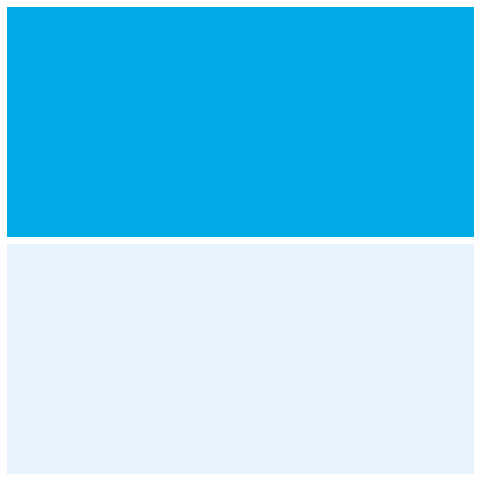
Blue symbolizes solidity and dependability, which makes it suitable as the color gradients for web design, including tech company websites. The backdrop of this color palette is a very light blue with a white gradient.
Despite similar hues, the varying blue tones distinguish crucial parts from the light blue backdrop.
Hex Codes: Bright Blue (#E9F1FA), Iris blue (#00ABE4), and White (#FFFFFF)
🌟 Yellow & Charcoal
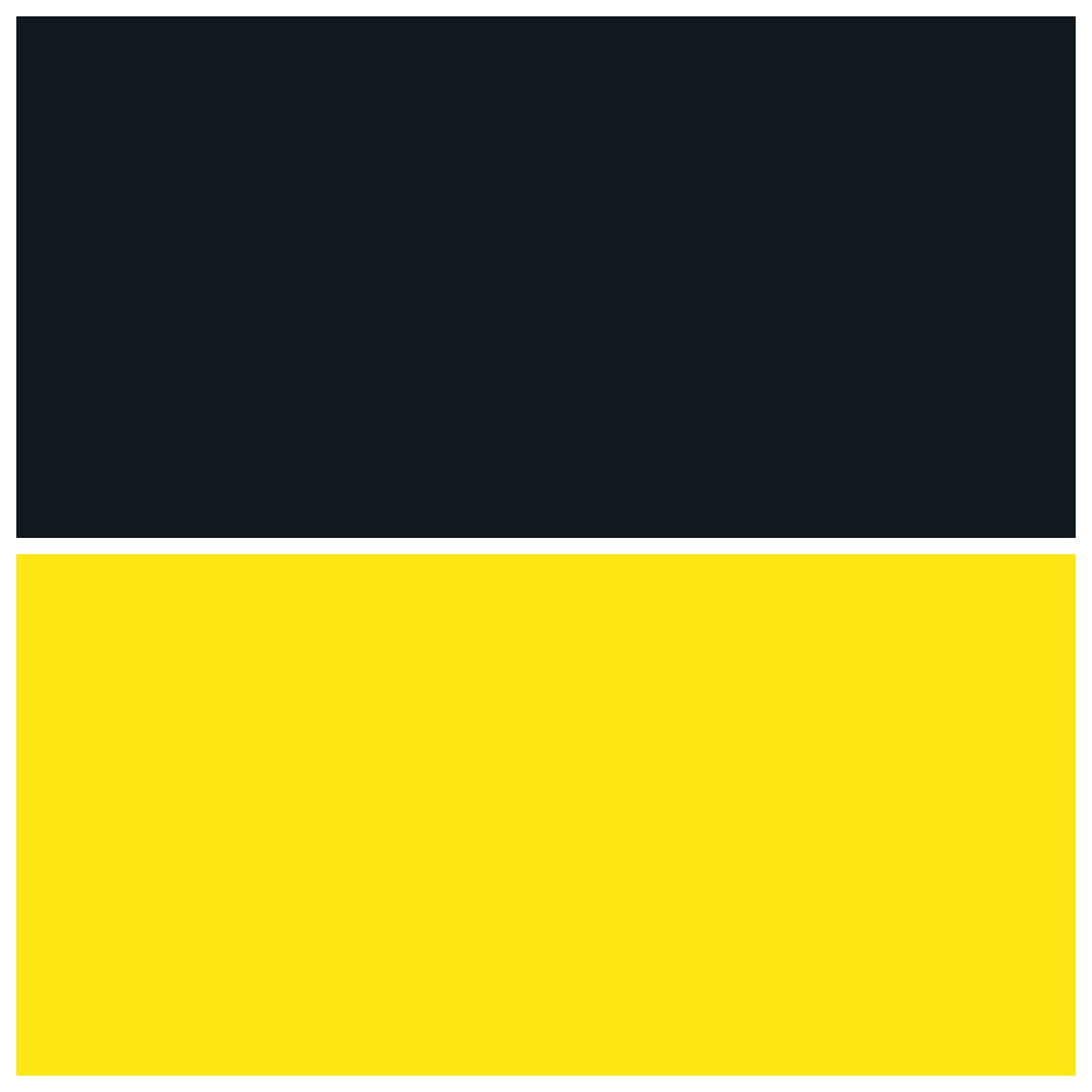
One of the most common color pairings is charcoal and yellow. Because of their great contrast, these two hues work well together. This combination would be ideal for a logo or a branded product label. So, you can use these color gradients for web design and stunning product design.
Hex Codes: Charcoal (#101820) and Yellow (#FEE715)
🌟 Lavender & Teal
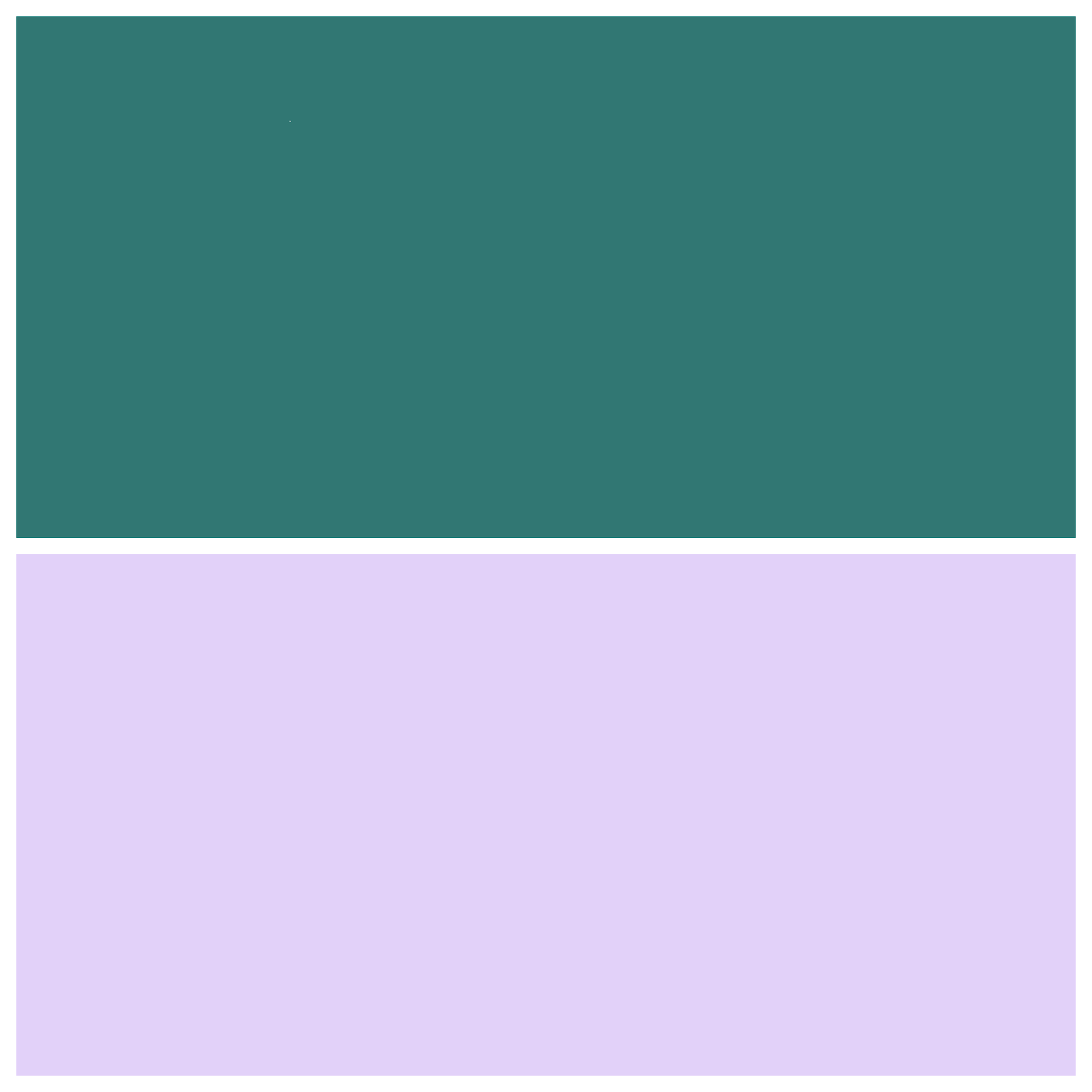
The classic color combination for all things visually pleasing is lavender and teal. Because of its harmonic, earthy character, this mature but fun combination is often used in infant items sold to parents.
Hex Codes: Lavender (#E2D1F9) and Teal (#317773)
🌟 Neon Blue & Black

With its relationship with current technology, blue is appropriate for a futuristic and high-tech-themed website. Plus, black ensures quality. The minimal color schemes for web design also help to simplify a hectic site design.
Hex Codes: Neon Blue (#2272FF) and Black (#000000)
🌟 Accents In Pastel Purple & Neutral
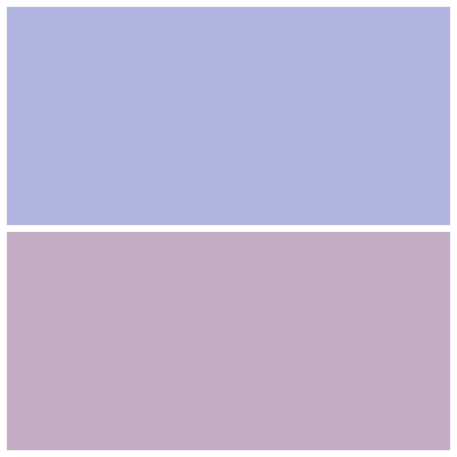
These color gradients for web design keep the website’s backdrop minimal to allow other aspects to stand out. The gradient colors make your website backdrop visually appealing while remaining basic.
Furthermore, these color palettes for web design employ the neutral colors white and black for text and buttons.
Hex Codes: Pastel Purple (#C5ADC5) and Light Steel Blue (#B2B5E0)
🌟 Color Gradient, White, & Dark Blue

Consider utilizing a color gradient to add color to your website. You can experiment with color schemes with gradients without disrupting your website.
When utilized in these patterns, half of the backdrop on a web page is a dynamic color gradient, while the other half is plain white. So, using gradients and neutral colors creates a vibrant but tidy design.
Hex Codes: White Lilac (#F8F8F9), Dark Blue (#111439), and Color Gradient
🌟 Vibrant Red & White

Bright red and white can highlight a two-column website structure. Employing contrasting colors side by side can also assist in visually distinguishing the website’s information. Moreover, combining red with a neutral hue like white makes the former look more prominent.
Hex Codes: White Smoke (#F0F0F0) and Brilliant Red (#E7473C)
🌟 Dark Royal Blue & Gold

This color combination is ideal for a website that wants to seem professional and composed. A website that employs a dark royal blue hue with white and gold accent colors will seem elegant and prestigious, affluent, and successful.
As a result, this color palette for web design is ideal for websites such as those of premium real estate firms. When combined, the dark royal blue and gold form an elegant and clean website.
Hex Codes: Dark Royal Blue (#002349), Gold (#957C3D)
🌟 Purple & White
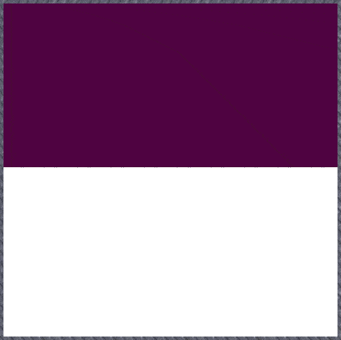
Introducing one color is an excellent technique for making a white-dominated website more appealing. A website can look most simple by only using purple for crucial parts. By dominating the rest of the page with neutral hues like white and black, purple can stand out.
So, these color gradients for web design boost the impression of the homepage on visitors, resulting in increased conversions.
Hex Codes: Tyrian Purple (#4F0341) and White (#FFFFFF)
🌟 Mustard, Sage, & Forest Green
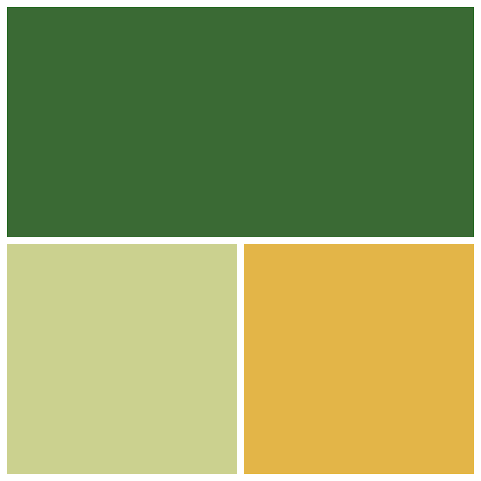
The harsh and earthy mustard, sage, and forest green contrast can combine to create a perfect earth-tone color pallet. These colors are ideal for natural businesses and may be used in logo, site, product, and package design.
Hex Codes: Mustard (#E3B448), Sage (#CBD18F) and Forest Green (#3A6B35)
🌟 Orange, Peach, & Custard Pastels
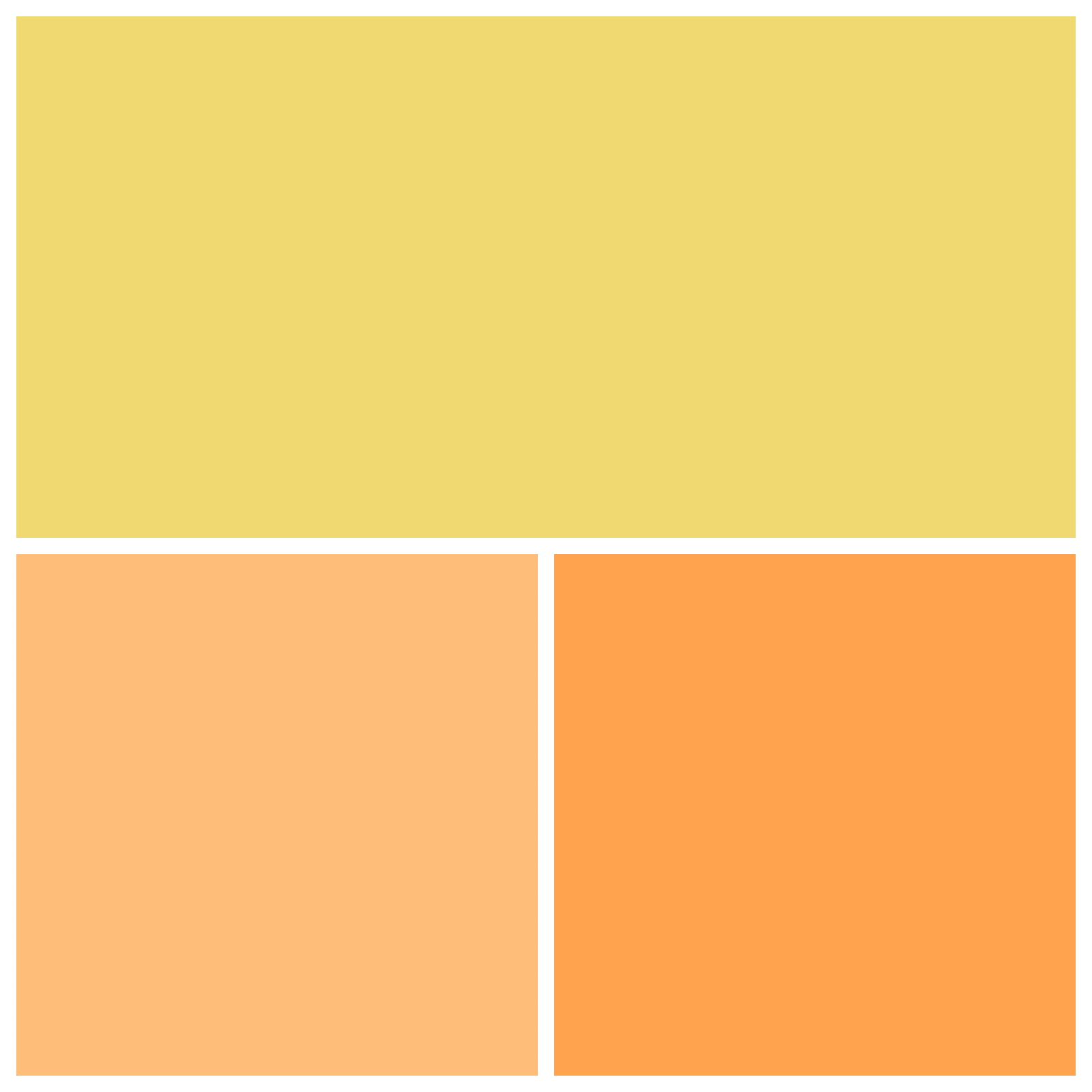
A creamy orange gradient creamsicle combines pastel orange, peach, and custard. These color palettes for web design combinations are great for backdrop colors for cosmetic or fashion firms looking for a playful but ethereal vibe.
Hex Codes: Pastel Orange (#FFA351), Peach (#FFBE7B), Custard (#EED971)
🌟 Bright Green & Hot Pink
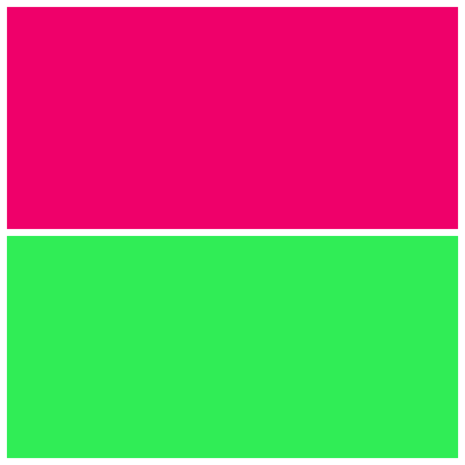
Vibrant colors add energy and excitement to any website. They excite the brain and create intense emotions. You can create a colorful site that matches fun and enthusiastic corporate values by using pink and bright green.
White and black can be utilized as accent colors to contrast the brilliant hues. It also includes many vivid pink and green colors, which provide depth to a webpage. This vibrant color scheme is helpful in capturing the attention of visitors.
Hex Codes: Malachite Green (#31EC56), Hot Pink (#EF036C)
🌟 Beige, Black-Brown, & Tan
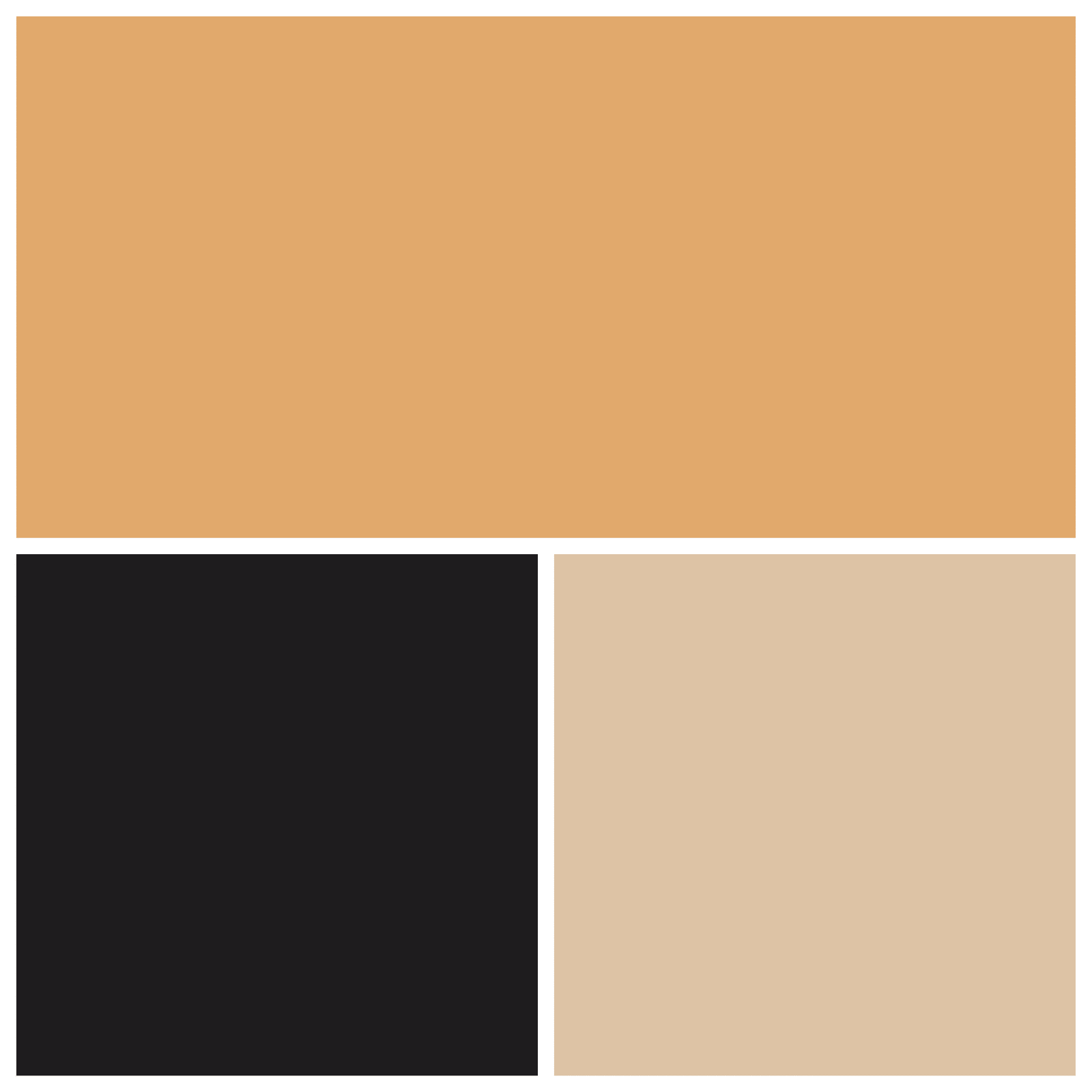
Beige, black-brown, and tan combine to make a classic Victorian look ideal for outstanding coffee companies, artisan beer packaging, or alternative food products. Combined, these colors convey gravity from the black-brown and warmth and intimacy from the beige and tan. As a result, it becomes one of the coolest color gradients for web design projects.
Hex Codes: Beige (#DDC3A5), Black-Brown (#201E20), and Tan (#E0A96D)
🌟 Blue, Maroon, & Indigo

Another lovely futuristic similar color combination is blue, maroon, and indigo. These blue tones combined with maroon convey the same tranquility and trustworthiness as the color blue but with a maroon twist. If you have a tech product or brand, consider using these color palettes for web design.
Hex Codes: Blue (#408EC6), Maroon (#7A2048), Indigo (#1E2761)
🌟 Red, Light Olive, & Light Teal
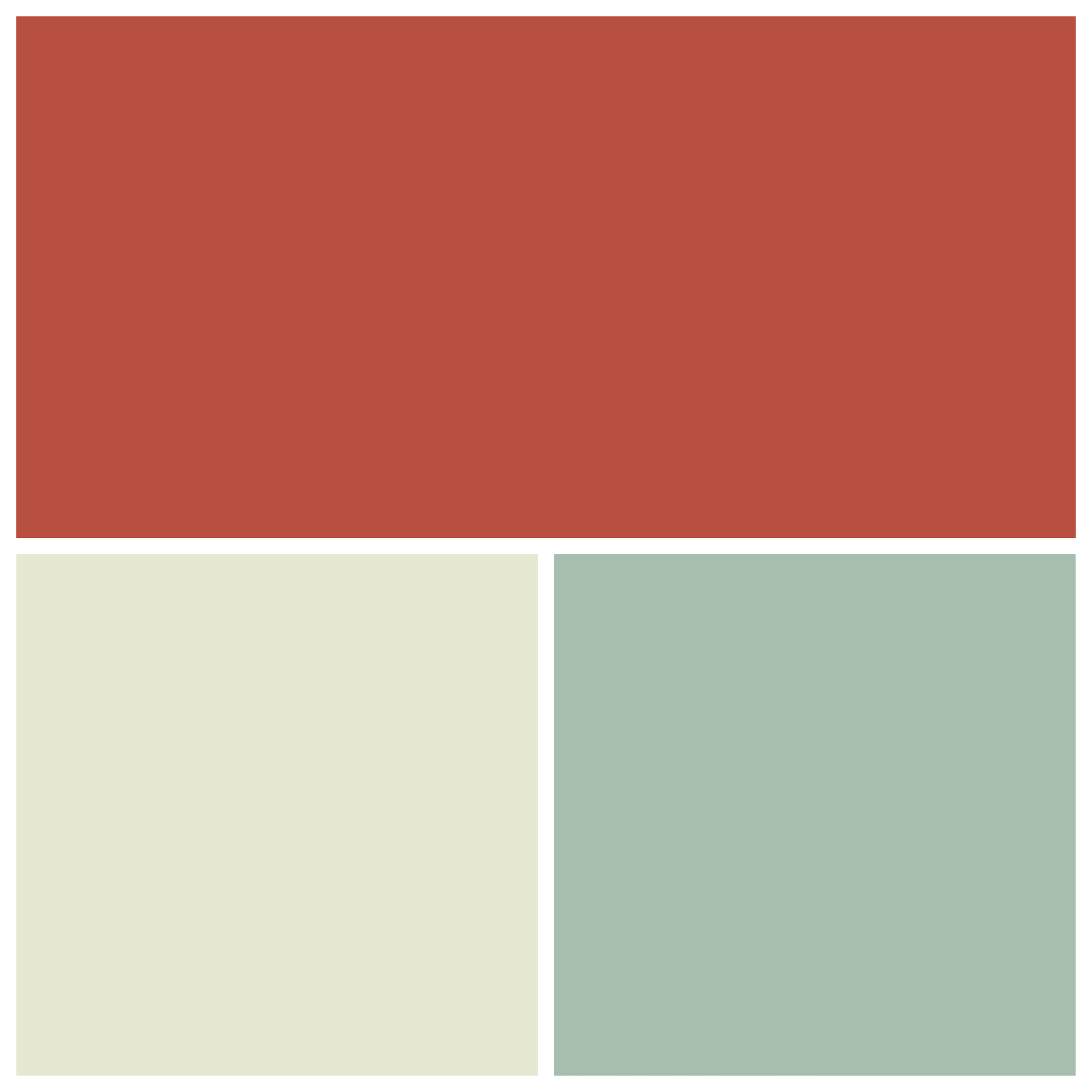
These timeless color schemes for web design combine hues of green with a rich, seductive crimson red that will enchant anybody who sees it. These colors work together to create a captivating but mysterious appearance, ideal for more mature and somber graphic designs or drawings.
Hex Codes: Scarlet (#B85042), Light Olive (#E7E8D1), Light Teal (#A7BEAE)
🌟 Nepal, Botticelli, & Ship Gray
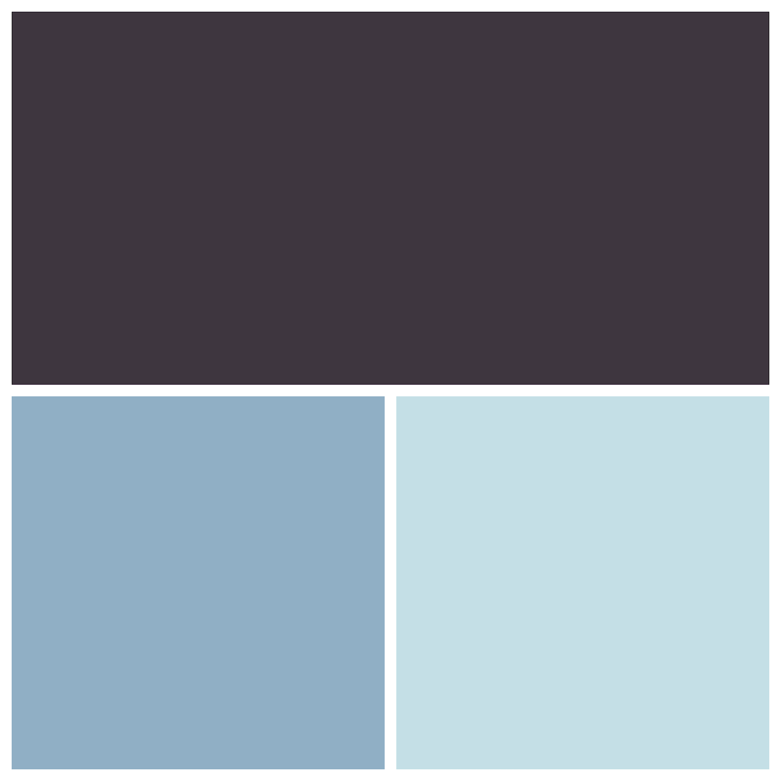
With its dark contrast, Ship Gray is another wonderful alternative to dull black lettering if you plan to use it as the color gradient for web design. This works beautifully with the delicate blue-grays of Nepal and Botticelli.
Hex Codes: Nepalese (#90AFC5), Gray (#3E363F), Botticelli (#C4DFE6)
🌟 Teal & White

If you can’t decide between blue and green, choose teal. Teal combines the attributes of the two hues, making it appropriate for an eco-friendly tech business. Teal conveys a thoughtful and intelligent vibe, matching a website focusing on zero-emission innovation.
Plus, light teal and white increases the visibility of the CTAs and text. Overall, this simple color gradient for web design is ideal for a clean and contemporary website.
Hex Codes: Cardin Green (#0C1A1A) and Downy Teal (#6ACFC7)
🌟 Brown & Narvik Beige
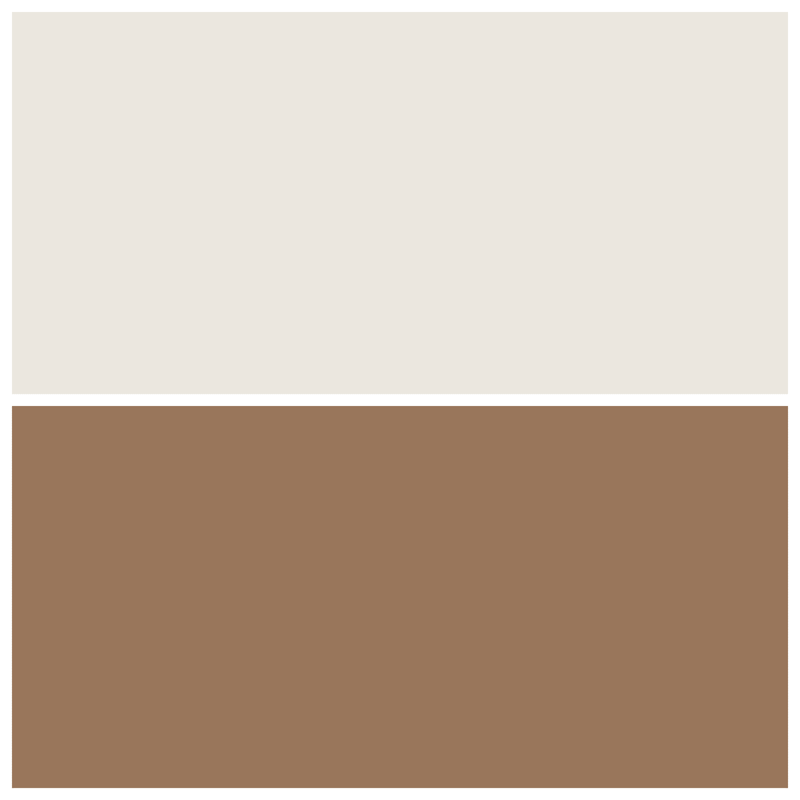
Brown and beige are natural hues that exude an earthy and calm vibe. Beige is a neutral hue, but when combined with brown, it adds warmth to the former. This combination produces a warm and welcoming color palette.
Hex Codes: Narvik (#EAE7DD) and Sorrell Brown (#99775C)
🌟 Orange & Blue
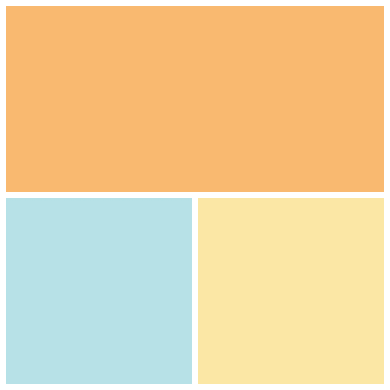
Consider an orange and blue color palette for a one-of-a-kind website color style. When various tones of orange add powder blue, it can enhance the depth of a website and complements great color gradients for web design.
The color orange is frequently linked with joy and excitement. It’s ideal for this website, inviting users to vacation. Plus, blue and white dominate the foreground items. This contrasting hue draws attention to the website’s interactive parts.
Hex Codes: Orange (#F9B872, #FAE7A5) and Powder Blue (#B6E1E7)
🌟 White & Lime Green
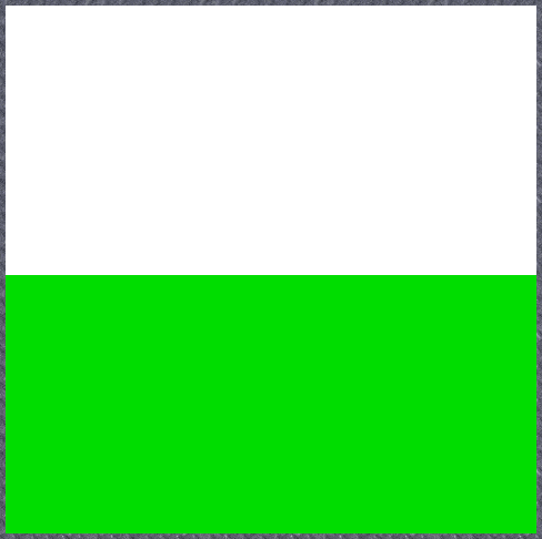
Green is ideal for an environmentally conscious online firm like Lime. The color palette of a greenery company’s website can be just green and white. The use of just two colors maintains the website simple and clean. Moreover, utilizing green on a neutral backdrop guarantees that all important information is visible.
Hex Codes: Lime (#00DD00) and White (#FFFFFF)
🏌 Tips To Choose The Best Color Pallets For Your Web Design Project
Now that we’ve covered the basics, let’s look at how to build an excellent color scheme for your website that your visitors will emotionally connect with.
🎯 Learn About Your User Base
Before you choose web color design, you must first determine who your audience and target market are. Build some user personas and user profiles. Doing organized, in-depth research on your target audience will help you fine-tune design ideas and make it easier to use color palettes for web design.
🎯 Make Use Of Color Psychology
People’s moods and mental processes are deeply influenced by the colors they’re exposed to. Associating your brand or message with a certain color emotion may help grab people’s attention, motivate them to take action, and get them more invested in your selling. Your colors for web design should be aesthetically beautiful and useful in conveying your intended message.
🎯 Consider Complementary Colors
A color palette should not include more than six colors. However, most designers start with four. They should consist of one dominating color, one standard color, and two accent colors. So, while picking your color gradients for web design, consider complementary colors.
🎯 Add Some Contrast For More Visibility
Color contrast is essential in every interface since it makes each UI element visible and unique. User interfaces featuring just shades from the same hue family are unlikely to attract users’ attention.
🎯 Apply The 60-30-10 Rule
The 60% + 30% + 10% formula, derived from interior design concepts, is often used by designers to guarantee that the colors selected stay balanced. According to this method, 60% of your website should be your dominant color, 30% your secondary color, and 10% your accent color.
🚀 Pick The Best Color Grade That Best Matches Your Site
Color palettes for websites are vital in website design. The appropriate color choices make your website more visually appealing and provide additional advantages.
In this post, we addressed why choosing the proper color gradients for web design is essential. We’ve also included more than 20 website color choices for you to use as inspiration. Now, it’s up to you to make a choice.
If you have found this blog helpful, feel free to share your opinion with our Facebook community. You can also subscribe to our blogs for valuable tutorials, guides, knowledge, tips, and the latest WordPress updates.


