Using eye-catching graphs and fancy charts in WordPress websites can significantly enhance their appeal and importance, and the EB Fancy Chart block from Essential Blocks is an excellent option to achieve this. This blog will provide you with a detailed guide on how to add a fancy chart in Gutenberg.

3 Reasons To Incorporate Fancy Charts In WordPress Websites
Using beautiful charts in WordPress websites enhances its appeal, increases user engagement, and improves the overall user experience, making your website more effective and influential. Below are some reasons why you should use charts in WordPress websites.
Visual Appeal And Engagement
Presenting data in graph or chart form can make your website more engaging. It’s more likely to attract the attention of site visitors and keep them interested. EB Fancy Chart transforms boring datasets into stunning visuals, adding color and life to your site.
Enhanced Data Comprehension
Data presented with eye-catching graphs and charts in WordPress is easier to understand compared to plain text or raw data. EB Fancy Chart block simplifies the data interpretation process, enabling visitors to grasp the key insights quickly.
Professionalism And Credibility
High-quality graphs and charts in WordPress websites indicate a level of professionalism that builds trust with your visitors. It shows you value clear, effective communication and are serious about providing useful information.
Now that you know the effectiveness of using graphs and charts in WordPress websites, you must be thinking about utilizing the benefits of using them. The EB Fancy Chart block from one of the growing Gutenberg block libraries, Essential Blocks can be an option for you. Here’s why
🚀 Efficiency: EB Fancy Chart block integrates seamlessly with Gutenberg, the WordPress block editor. This makes creating and editing charts a breeze, even for those with no coding skills. This saves time and effort while ensuring consistency in design.
🎨 Customization: The EB Fancy Chart block offers an array of customization options, allowing you to match the design with your brand identity and the specific needs of your website. You can control colors, styles, dimensions, and more to create a unique and personalized experience.
🎯 Accessibility: EB Fancy Chart makes your data more accessible to a broader audience. Visual representations can transcend language and literacy barriers, making your website more inclusive.
Step-By-Step Guide To Add Fancy Charts In WordPress Websites
The EB Fancy Chart block allows you to easily use beautiful graphs and charts in WordPress websites that are built with the Gutenberg block editor. This allows your visitors to quickly grasp complex concepts.
By adding this premium block from Essential Blocks, you can give your dull datasets a lively appearance and clarity for your site users. This means you can use this block to display complex charts, used to emphasize data in Gutenberg without the need for any code.
Follow this step-by-step guide to incorporate charts in WordPress websites using the EB Fancy Chart in Gutenberg.
Step 1: Activate The EB Fancy Chart Block
The EB Fancy Chart is a premium block, you will need to install and activate Essential Blocks PRO on your website along with the free version.
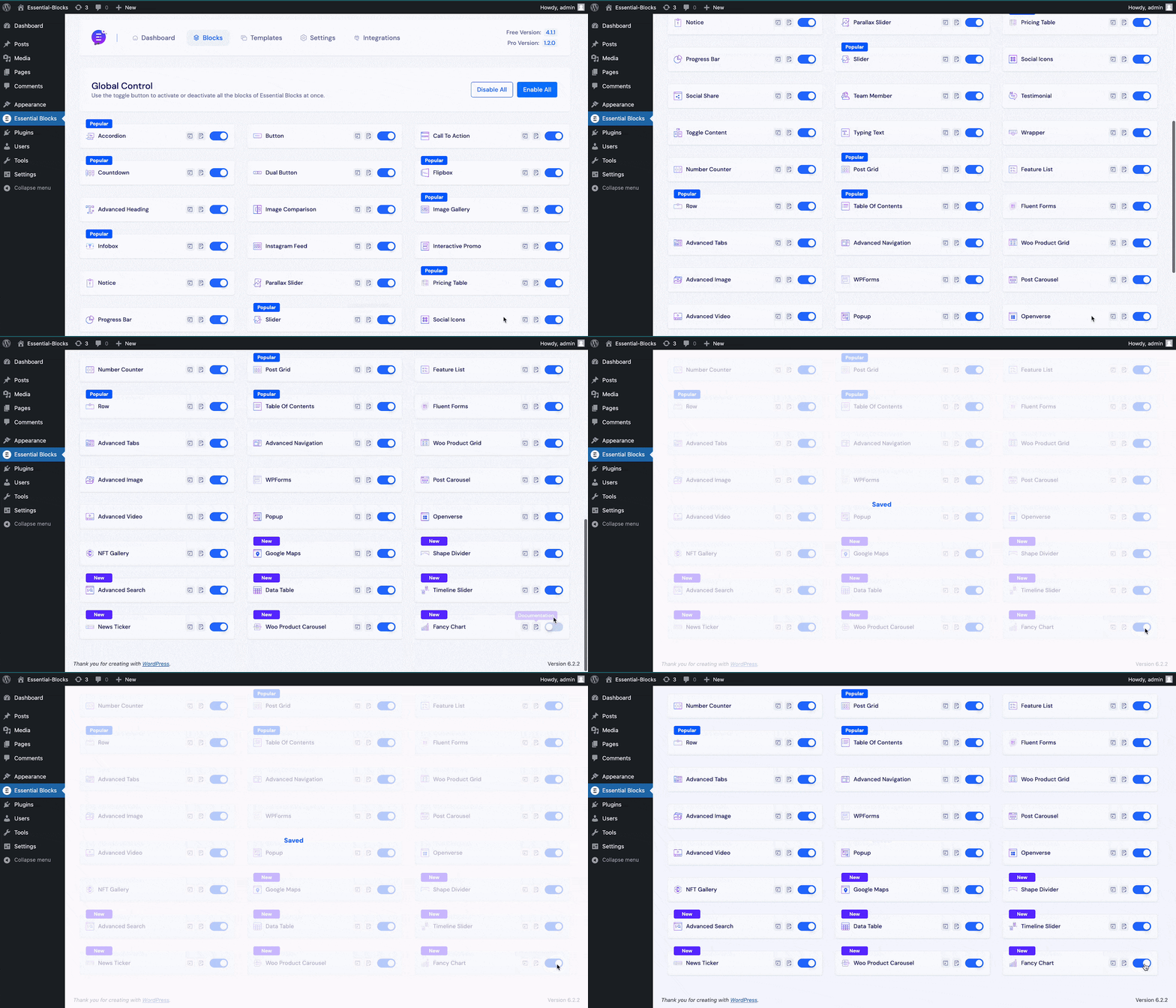
To activate the EB Fancy Chart in WordPress Gutenberg websites, navigate to Essential Blocks → ‘Blocks’. Then, toggle to enable the block as shown below. After that, click on the ‘Save’ button.
Step 2: Add The EB Fancy Chart Block
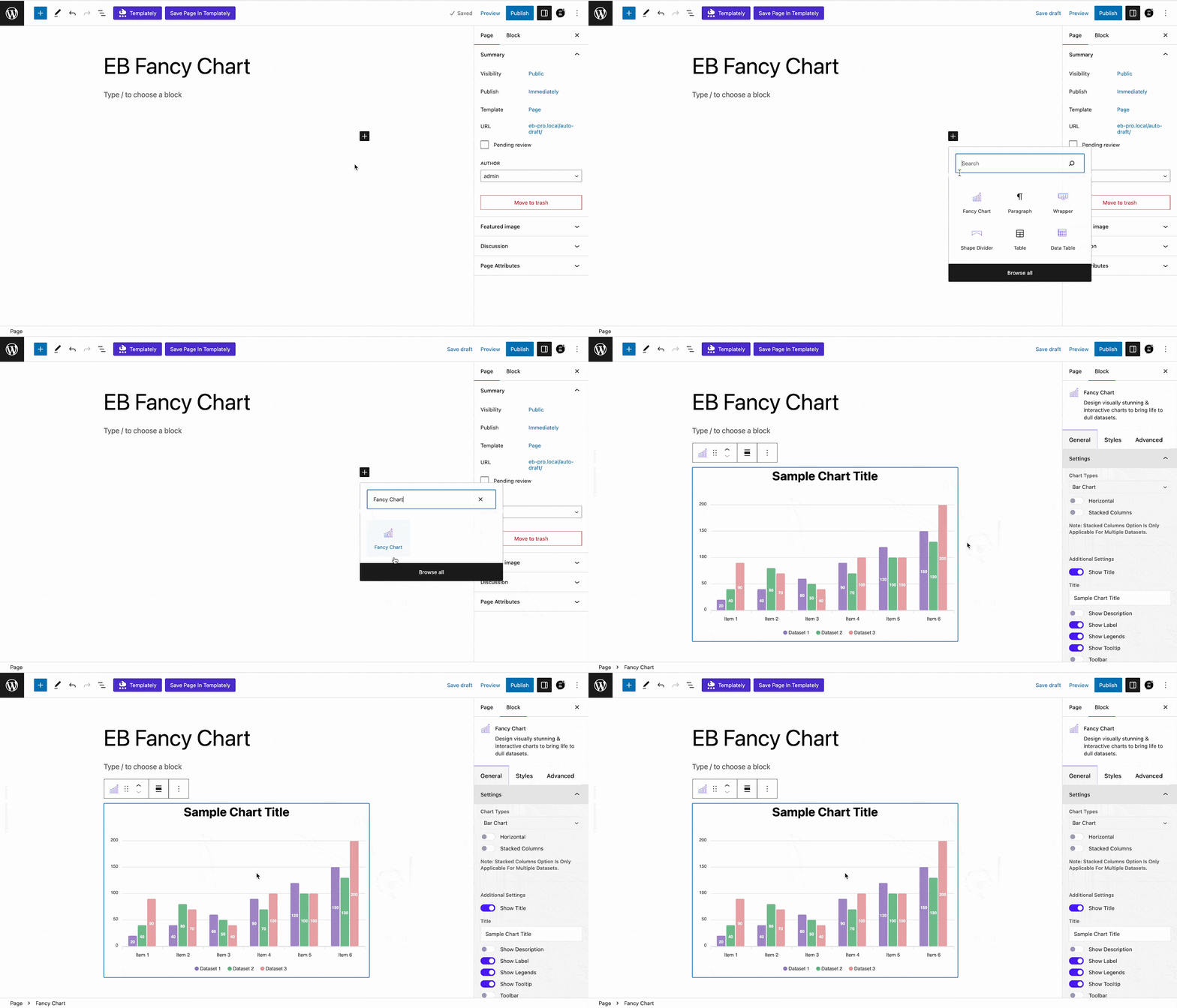
Now, open the page where you want to insert your data chart. Then, click on the ‘+’ button and find the ‘Fancy Chart’ block. Click on the block to insert it into your web page.
Step 3: Configure General Settings
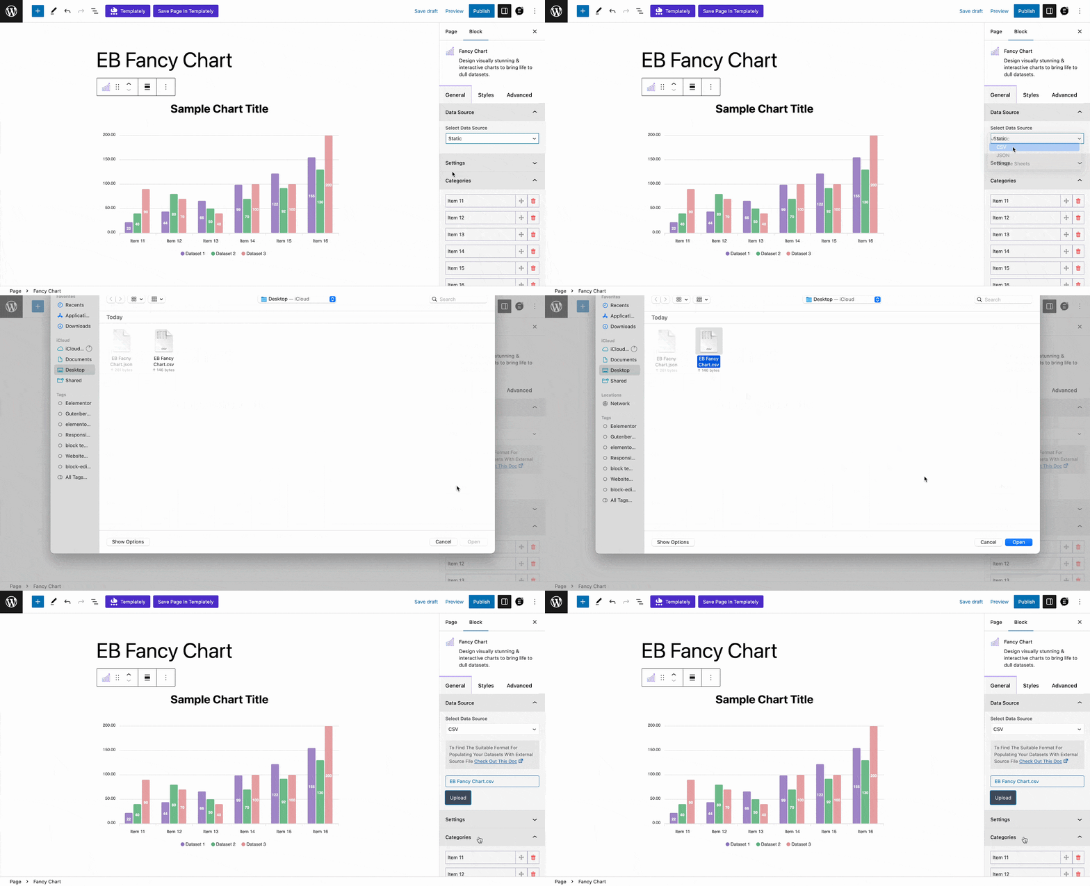
Navigate to the Block→ General tab from the block customizer side panel. Choose the data source you prefer for the Fancy Chart from the ‘Select Data Source’ option. By default, the ‘Static’ option will be selected. With this, you have to insert your chart data manually. You can also insert your chart data from CSV, JSON, or any Google Sheets and modify them as you want.
To insert your chart data from a CSV file, choose the ‘CSV’ option from the drop-down and click on the ‘Upload’ option. Now, select the CSV file that you want to upload as shown.
Note: To find the suitable format for populating the Facny Chart datasets with external CSV files, please check out this documentation first.
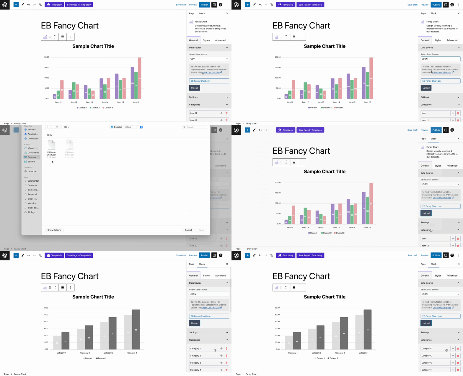
You can insert data on your chart from a JSON file as well. For that, choose the ‘JSON’ option from the drop-down and click on the ‘Upload’ option. Now, select the JSON file that you want to upload as shown.
Note: To find the suitable format for populating the Facny Chart datasets with external JSON files, please check out this documentation first.
If you want to insert your chart data from Google Sheets, choose the ‘ Google Sheets’ option from the drop-down and provide the ‘API Key’, ‘Sheet ID’, and ‘Sheet Name / Range’ there.
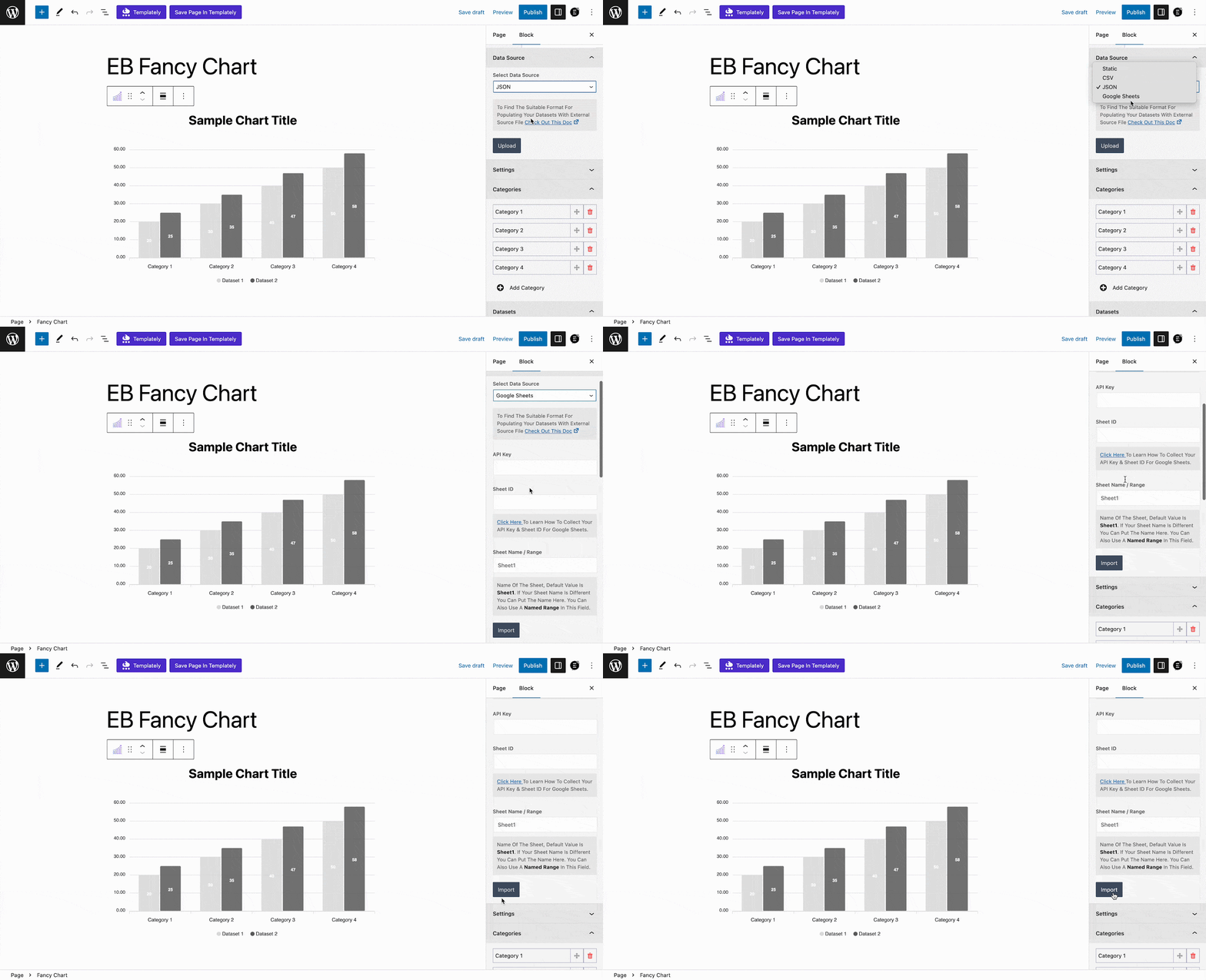
Note: By default, the default Google Sheets value is ‘Sheet1’. If your sheet name is different need to put that name on the ‘Sheet Name / Range’ field. If you want to insert a specific range of data, input the named range in this field. Please check out this documentation to learn how to collect your API key & sheet ID for Google Sheets.
Step 4: Select Your Preferred Chart Type
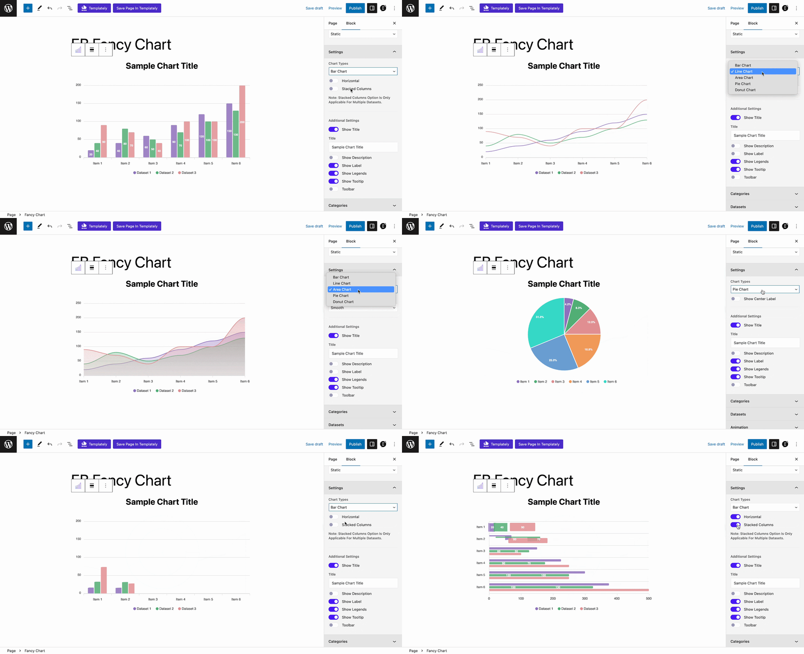
Now, go to the ‘Settings’ dropdown section. Choose your chart types and other options as you need. Essential Blocks Fancy Chart block comes with 5 stunning chart types for your data sets which are: Bar Chart, Line Chart, Area Chart, Pie Chart, and Donut Chart.
Choose any type of chat you like from the ‘Chart Types’ option. Enable the ‘Horizontal’ option to show your data horizontally. Similarly, enable the ‘Stacked Columns’ buttons to show stacked columns on your chats.
Note: Stacked Columns option is only applicable for multiple datasets.
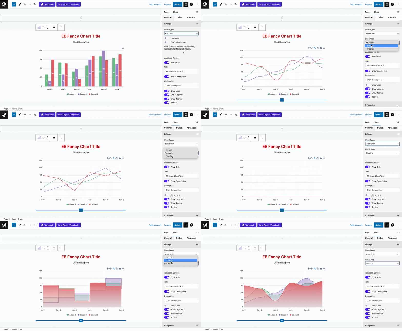
For the ‘Line Chart’, ‘Area Chart’, and ‘Pie Chart’ you will get multiple options to choose your preferred line shape. Select ‘Smooth’, ‘Straight’, or ‘Stepline’ from the ‘Line Shape’ option as per your requirements.
From the ‘Additional Settings’ section, enable or disable the ‘Show Title’ option to display or hide the chart title. Now, customize the title as you need from the ‘Title’ option. Similarly, enable or disable the ‘Show Description’, and your chart description if needed from the ‘Description’ option.
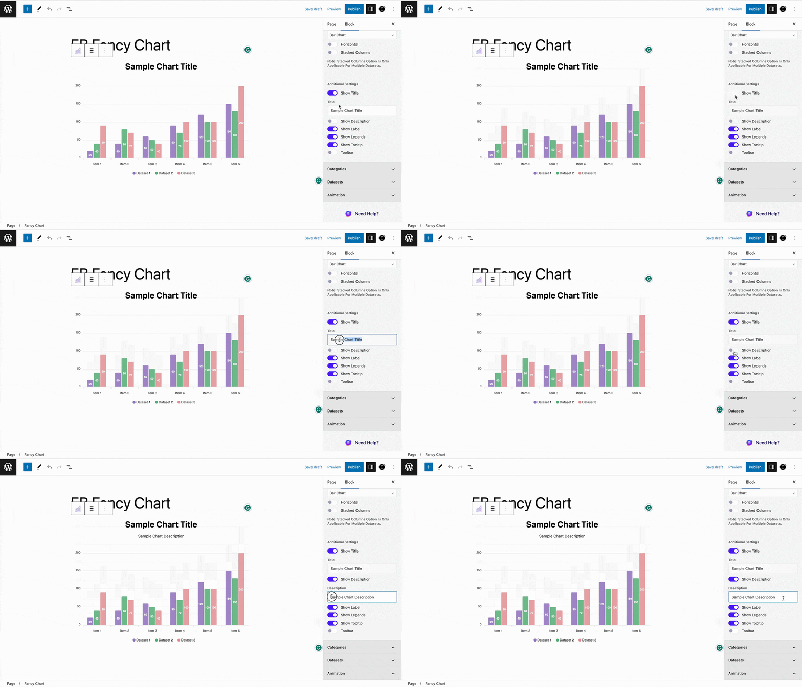
Afterward, enable or disable the ‘Show Labels’, ‘Show Legends’, ‘Show Tooltip’, and ‘Show Toolbar’ as you need. Enabling the ‘Toolbar’ option, you can let your visitors download your chart in SVG, PNG, and CSV format.
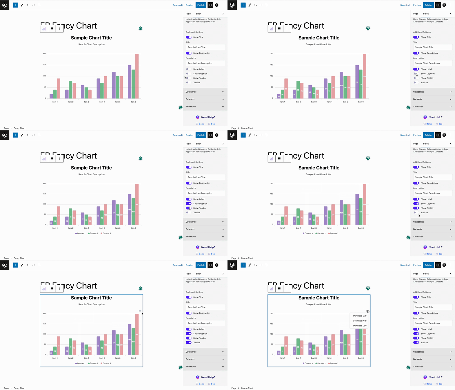
There are more customization options available in this block. For detailed guidelines, follow this documentation.
Step 5: Style The EB Fancy Chart Block
You can change the appearance of your fancy charts in WordPress the way you like. From the ‘Style’ tab you will find the options to customize your data chart appearance. Adjust the height of the data table from the ‘Chart Height’ option.
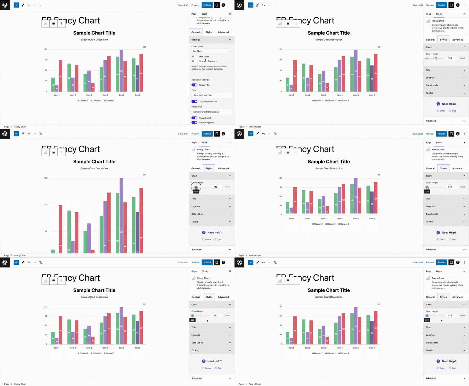
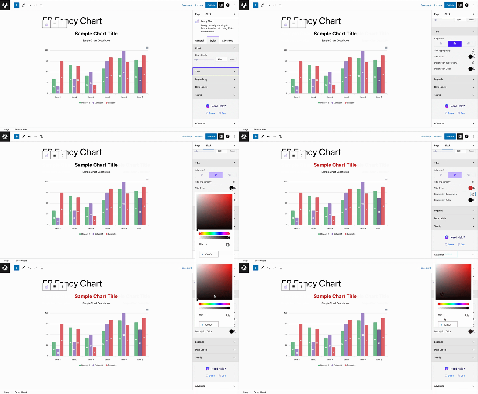
Afterward, to customize the ‘Title’ of your chart, click on the drop-down and adjust the Alignment, typography, and color from there. You can also personalize the description typography and color from there.
From the ‘Legends’ option, adjust the legend position, alignment, and typography as you see fit. Similarly, from the ‘Data Labels’ option, customize the position, typography, and color as you need.
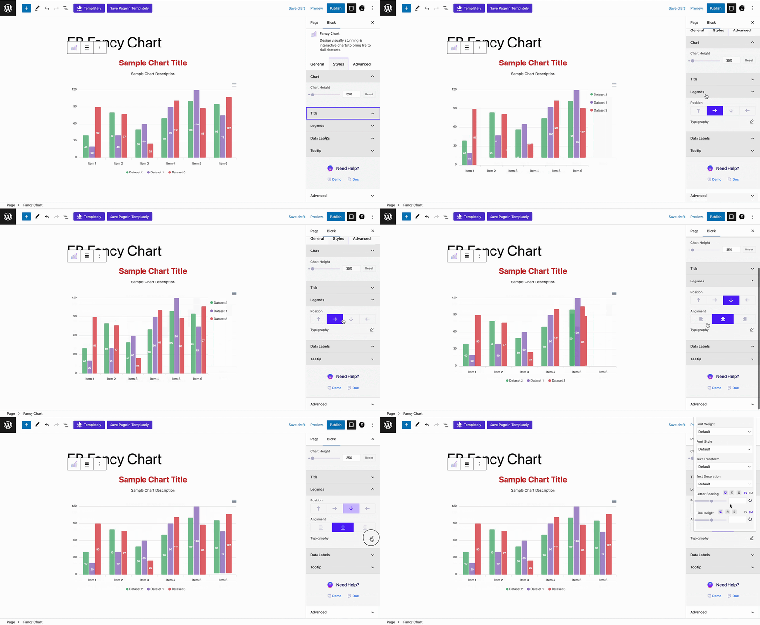
Besides, you can also adjust your ‘Data Labels’ from there. Customize the position, typography, and color as you need.
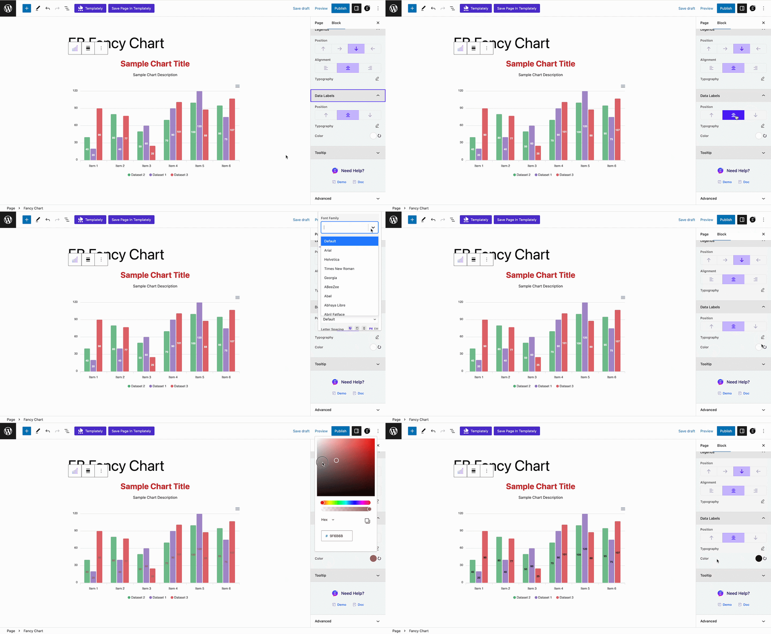
Step 6: Explore Advanced Customization Options
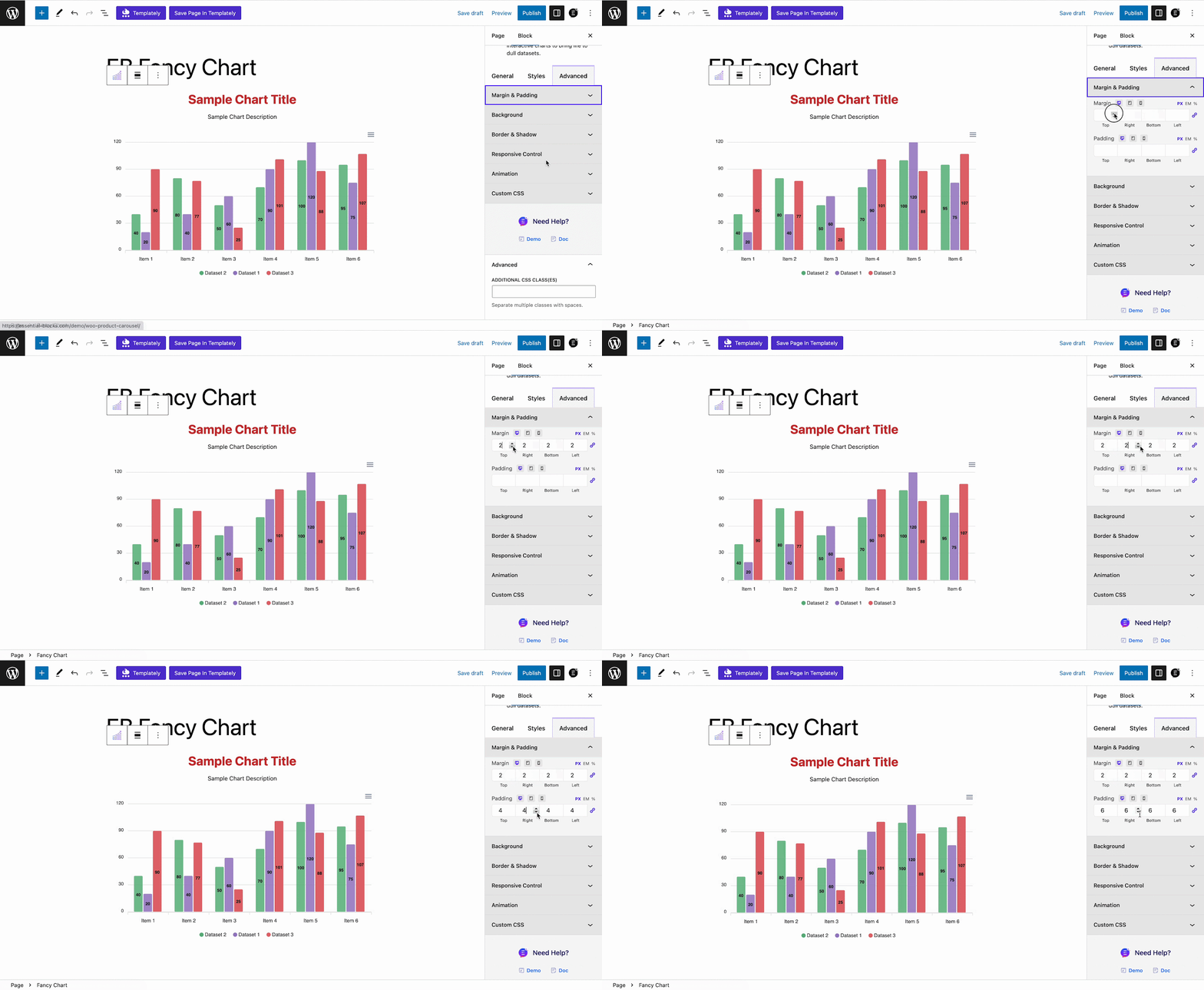
In the ‘Advanced’ tab, you will get more customization and controlling options to make more changes. Go to the ‘Advanced’ tab and adjust the ‘Margin & Padding’ for your Fancy Chart Block.
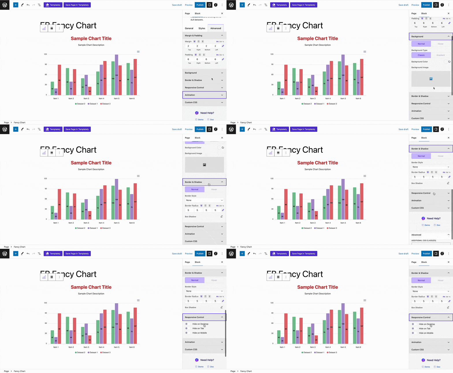
Now, customize the ‘Background’ and ‘Border & Shadow as you need. You can also enable or disable this block on a specific device from the ‘Responsive Control’ option.
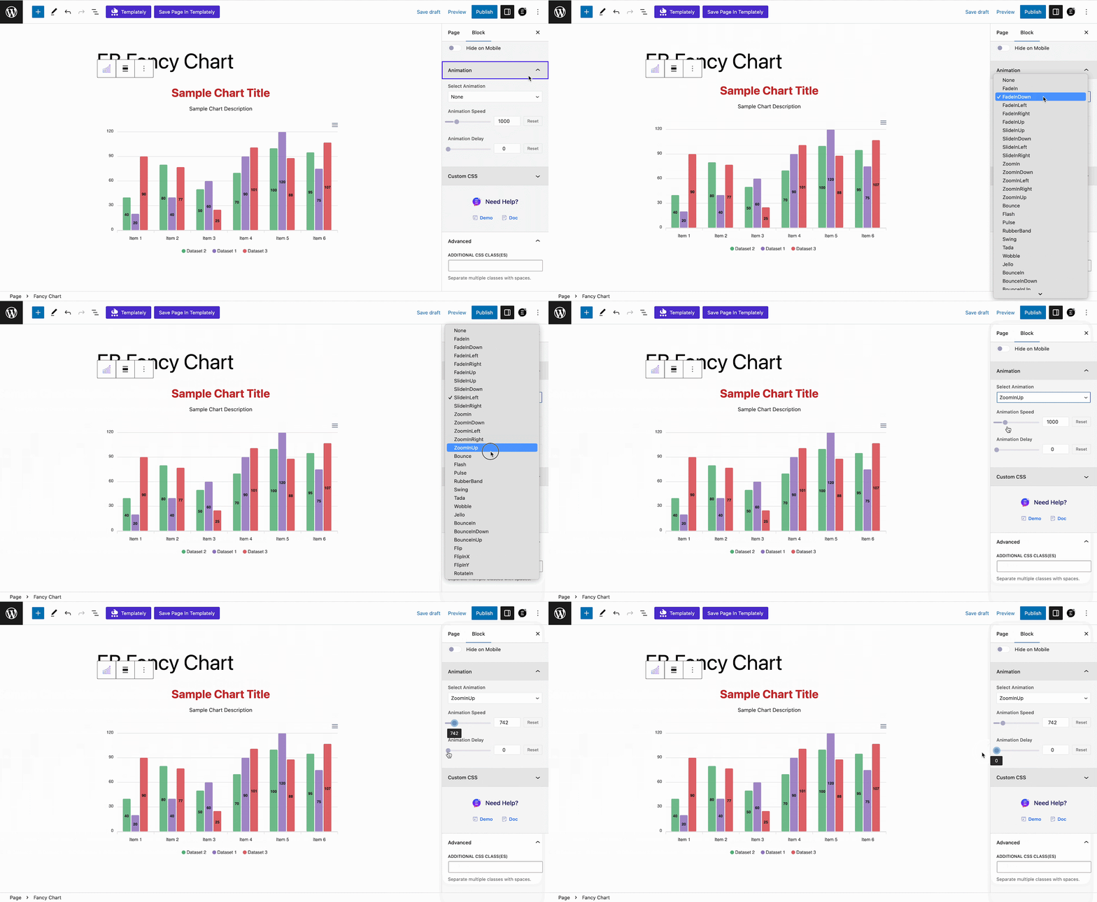
Now, you can also add animation to the Fancy Chart block as you want. Select animation and adjust the controls from there.
If you want to add any additional Custom CSS codes to the Fancy Chart block, just add them from the ‘Custom CSS’ codes option.
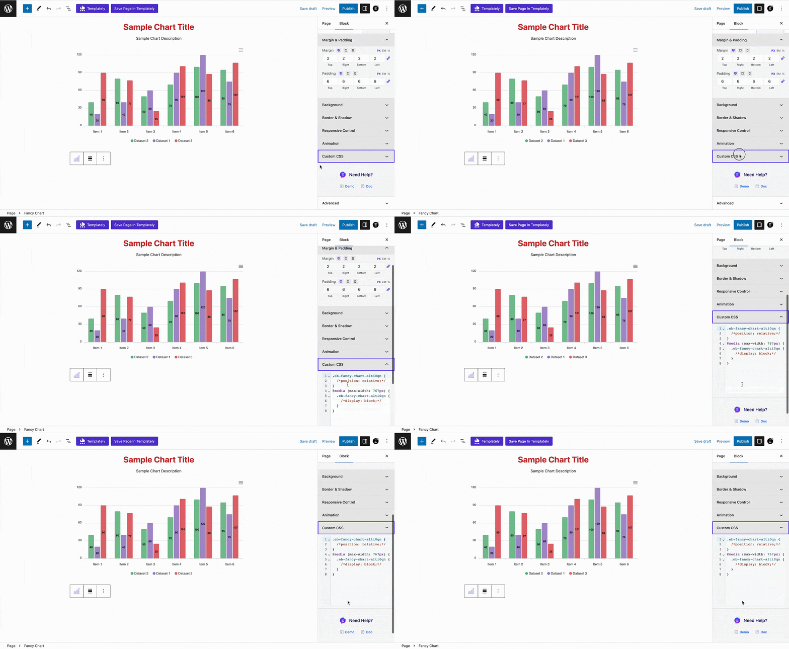
Once you are done with the customizations, it’s time to ‘Publish’ the fancy charts in WordPress. Just click on the ‘Publish’ button and the stunning EB Fancy Chart will be added to your website. Let’s have a look at how the ‘EB Fancy Chart’ will appear on your WordPress website.
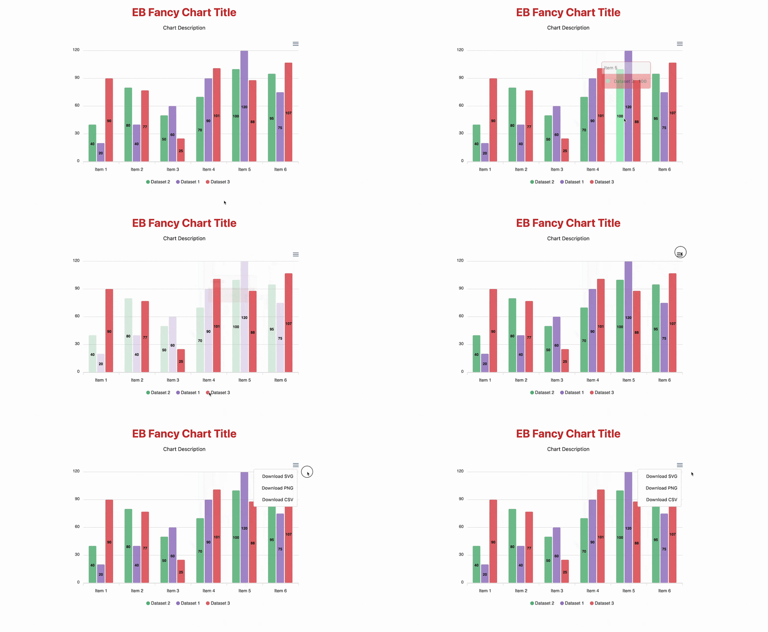
This is how you can easily add the EB Fancy Chart block to WordPress websites without any code using the Gutenberg editor.
Utilize The Power Of Visual Data With The EB Fancy Charts In WordPress Websites
The EB Fancy Chart block from Essential Blocks is a powerful block to display beautiful charts in WordPress. It helps enhance your website’s appeal, accessibility, and comprehension. It uplifts the way data is presented, transforming boring datasets into engaging, understandable, and beautiful visual representations. With its seamless customization options and easy usability, it’s an excellent choice for anyone looking to elevate their website experience and make a lasting impact on their audience.
Did you enjoy reading the blog on EB Fancy Charts? Share your thoughts and subscribe to our blogs for more blogs like this.


