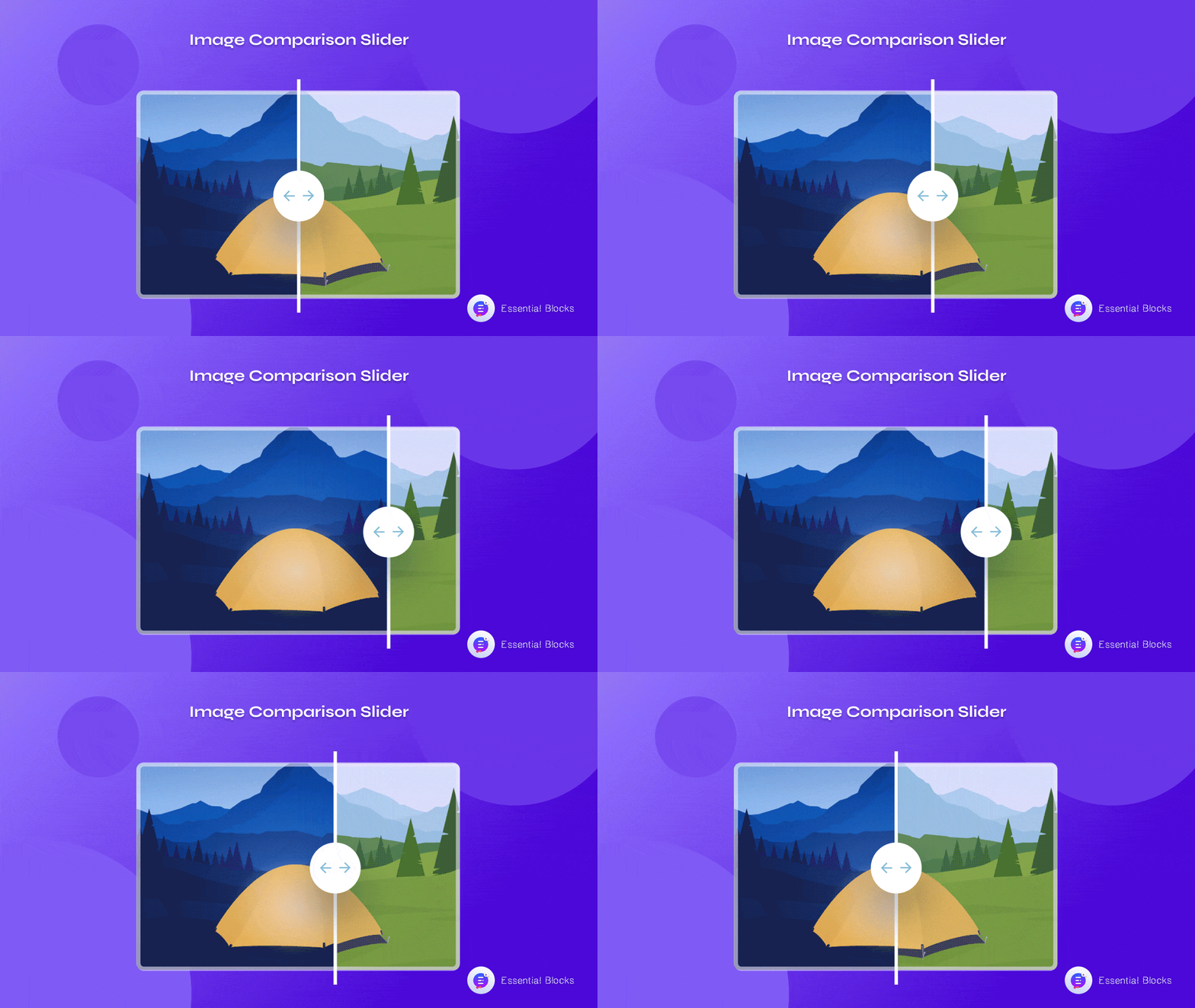
If you want to boost engagement on your website, one clever way could be by creating an Image Comparison Slider. By using such sliders on your website, you can show comparisons between different images to your website visitors, which will make your web pages look more dynamic and engaging to your target audience.

3 Ways Image Comparison Slider Benefits Your Business
The benefit of an interactive, responsive Image Slider is that it encourages website visitors to engage with your content. As site visitors can easily move the slider to see the differences between your product images, they can interact with the content on your website. Let’s delve deeper into some of the most effective use of this feature.
1. Enhance Visual Appeal Outstandingly
An image comparison slider made up of attractive, high-resolution images will undoubtedly capture the attention of its visitor, causing him or her to remain longer and maybe browse the other aspects of the website. If you can implement a dynamic yet responsive Image Slider on your website there will be a high chance that your business will skyrocket in a massive way.
2. Showcase Your Products Beautifully
“A picture is worth a thousand words,” as the old saying goes. Images may express messages more efficiently than words. So, by using an Image Comparison Slider block on your website, you can effortlessly showcase products beautifully in a more interactive way.
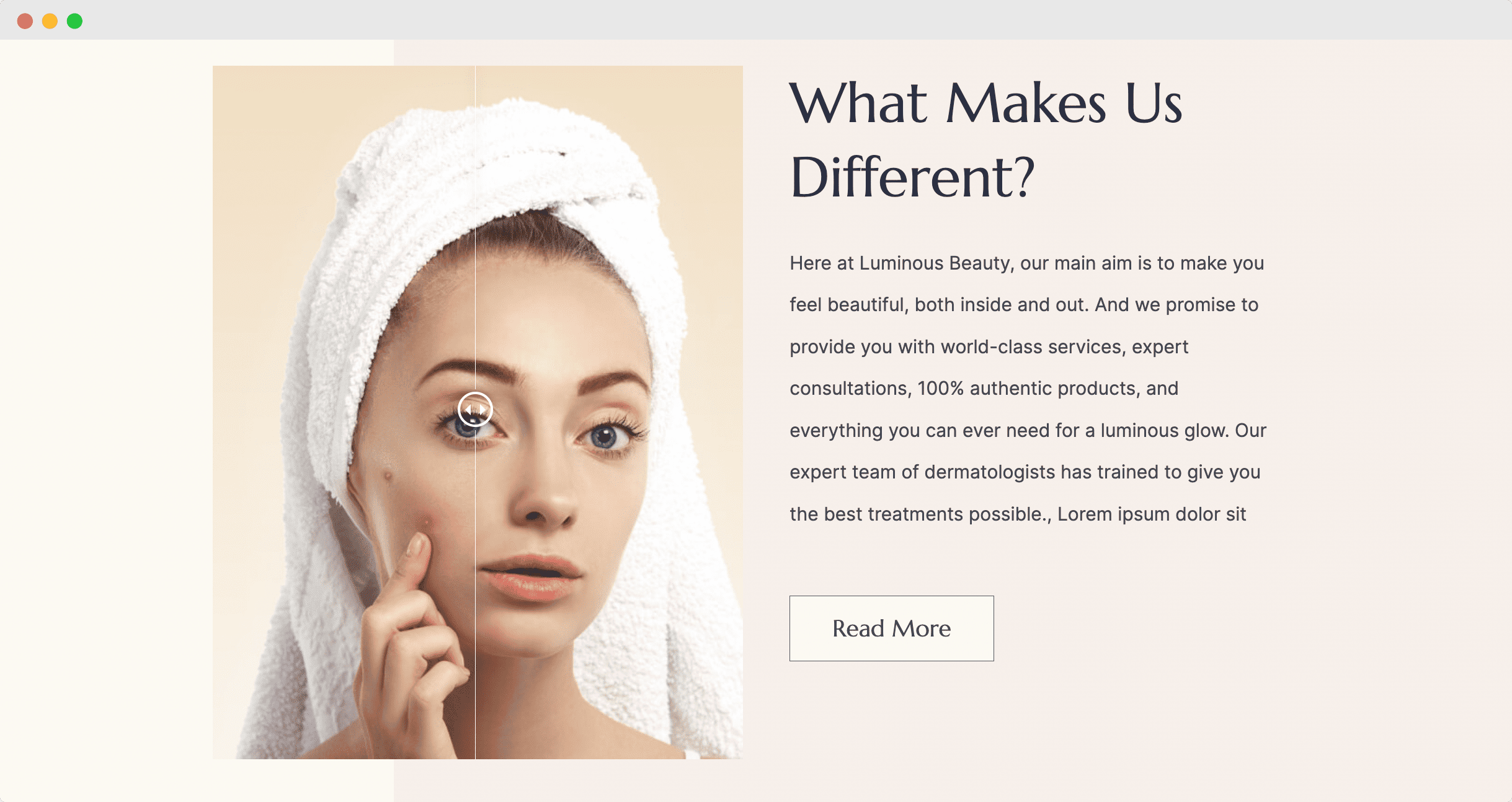
For instance, in the example below of a skincare website, you can see how using an Image Comparison Slider block in Gutenberg can help you show your potential customers the benefits of using your skincare products using ‘Before and ‘After’ images.

3. Improve User Experience
Since an image comparison slider lets your potential customers easily compare two different products, it can help them make quicker purchase decisions. This will enhance the user experience since the user will be able to spend more time on the image with the highest perceived value.
How To Add A Responsive Image Comparison Slider In Gutenberg?
Now that you know why you might want to use an image comparison slider for your website, let’s dive into the tutorial.
The easiest way to add a responsive and interactive image comparison slider is by using Essential Blocks, an advanced blocks library for Gutenberg that comes with 30+ creative blocks to help you design stunning websites without any coding in WordPress.

Using the EB Image Comparison block, you can instantly display multiple images and add a slider with them so site visitors can easily compare the differences. And it only takes a few minutes to set it all up. Below, we have added a detailed walkthrough to help you out.
Step 1: Install & Activate Essential Blocks For Gutenberg
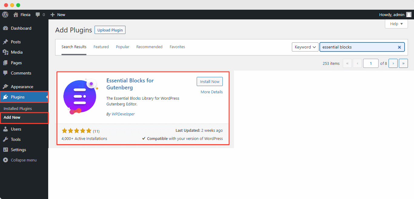
First you need to install and activate Essential Blocks for Gutenberg on your WordPress website. To do this simply navigate to Plugins–> Add New from your WordPress dashboard and search for ‘Essential Blocks’. Next, hit the ‘Install Now’ button and then click ‘Activate’ as shown below.

Step 2: Insert The EB Image Comparison Block In Gutenberg
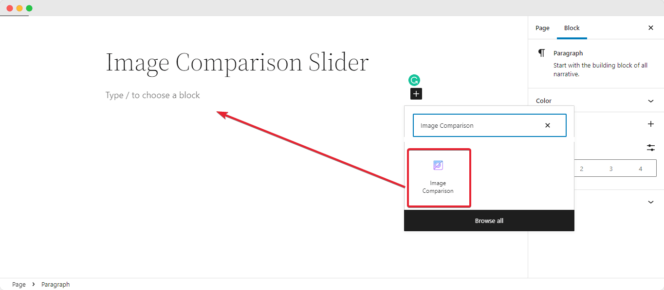
From the WordPress dashboard, navigate to Pages → Add New. Next, click on the “+” button as shown below and search for ‘Image Comparison’. Once you find the EB Image Comparsion block, simply click on the block and it will appear on the screen.

Step 3: Customize Your Image Comparison Slider
If you have dragged and dropped the block then you are good to go with extended customization. From the general option, you will have the freedom to use your preferable images. There is also “Hover” or “Move Effect” for you to choose as well as Overlay Label. Feel free to explore them all.
You can easily customize your Image Comparison slider as you like and get the expected result by following these basic steps and a little extra tweaking. For a better positioning on your website, you can also enable the full-width option from the General feature and maintain a proper outlook on any device.
Explore all the customization options for EB Image Comparison block by following our detailed documentation here.
Make A Interactive Website With Essential Block’s Image Slider
Adding an image comparison slider can be a great way to drive engagement on your website. This feature is easy to use and very eye soothing for your potential customers.
By using Essential Blocks For Gutenberg you can create a stunning Image Comparison Slider without any coding. You will be provided with tons of customization options to grab your customer’s interest instantly.
Enjoyed the tutorial? Feel free to share your feedback in the comments section because customer opinion is always preferable, subscribe to our blog for more guidelines and documentation, and join our evergreen Facebook Community for more exciting updates.


