Call To Action (CTA) buttons can direct your site visitors to do some specific action. You can easily motivate your audience to take some real actions with CTAs to generate leads and conversions. And if you want to engage your site visitors and boost your click-through-rates, then this top 5 Call To Action buttons blog is for you.
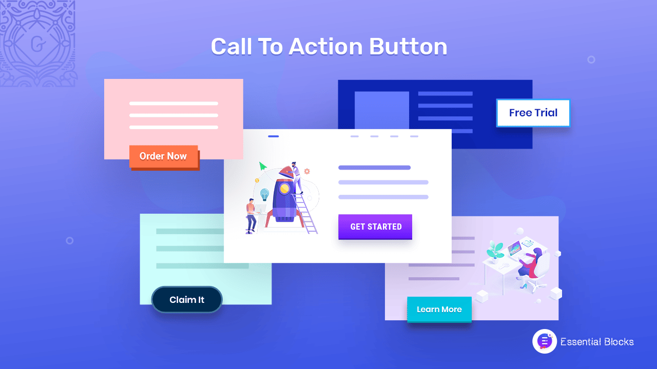
Here, you can learn which type of call to action you should use as a business owner or marketer to boost your site traffic and enhance the user experience of your website on the spot. Let’s get engaged till the end and know all the details!
Why Do You Need Call To Action Buttons On Your Website?
As a site owner, you should include an interactive CTA button that makes your visitors click on it. These buttons can help both you and your users in many ways. Let’s have a look below to know why you need CTA buttons on your site.
⭐ The call to action button can give an accurate direction for the visitors that lets them know what to do next. Users can easily check out things on your site by just clicking the CTA button. It doesn’t let them get confused or create any hassle for them to find out the most important information or service of your site.
⭐ You definitely want your visitors to become your potential client. For that, you need to grab visitors’ attention and a good call to action button can do it perfectly. The users get to know the next steps to take your service by the CTA button. Such as, on your landing page, if you highlight a ‘See Demo’ button, visitors can easily take a tour of it.
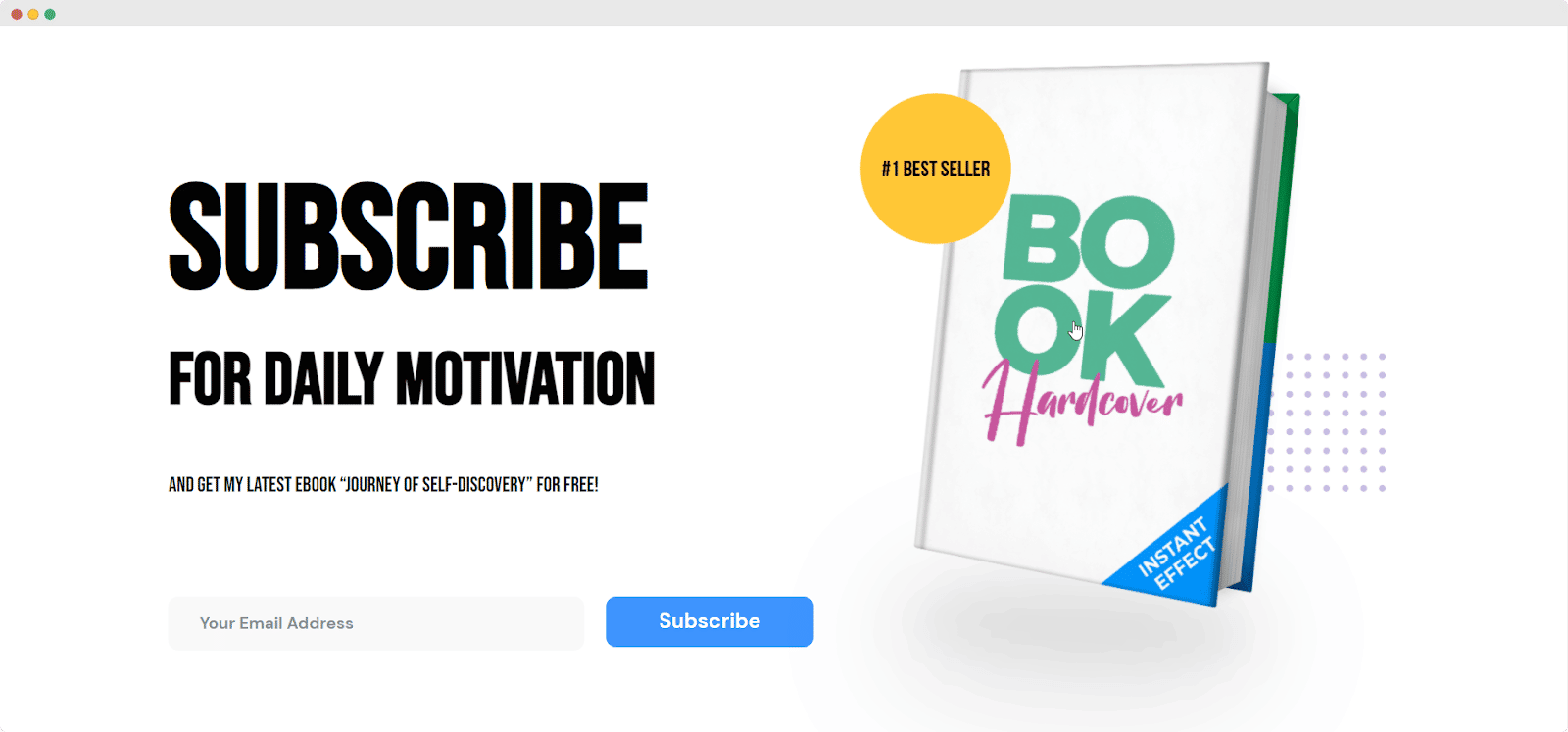
⭐ When you are running any promotional offer or discount, the CTA button can showcase it with a vibrant look that visitors can’t ignore to check out. This is the most effective marketing technique that every website owner follows.
⭐ The call to action button helps to reduce the bounce rate of your site. This is because when visitors get clear instructions and find things properly with ease, they will surely stay on your site. Otherwise, they will leave your website without taking much hassle to find their needs which is one of the reasons to increase the bounce rate.
Top Call To Action Button Examples That Visitors Want To Click
The call to action button plays one of the key roles on websites. It is because an instructive CTA button can help visitors to become potential customers. Like, if you feel the product or service is awesome you can quickly click on the ‘Get Started’ button to know the package details and everything.
Or if you want to know more about it you can visit the ‘Get All Features’ button or ‘Check Out A Demo’. So there can also be multiple call to action buttons on a page if there are multiple desired actions for the user to take. Let’s have a look below to check the top 5 call to action button examples that make you click.
1. Start Free Trial
Start Free Trial is a great and catchy call to action that offers visitors a free trial. It can convert them into potential clients or customers soon. A lot of site owners now offer this opportunity to start a free trial. You can try this out if you are confident with your service or product.
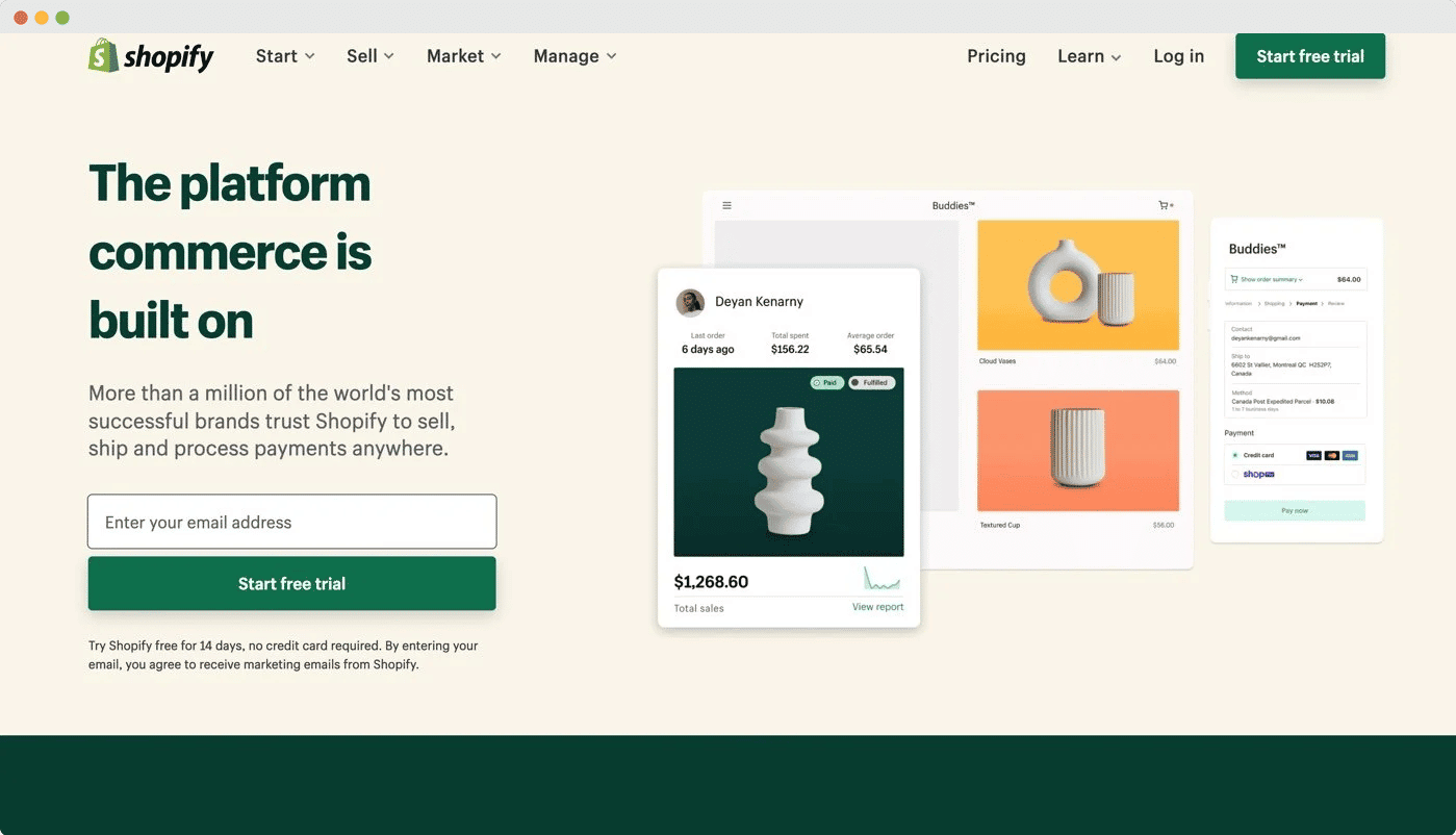
A free trial opportunity helps the visitor check out your service or product by using it. They actually feel risk-free that if they don’t get satisfied, they have a chance to get back without any loss. This offer attracts visitors a lot so they couldn’t leave your site without clicking this CTA button.
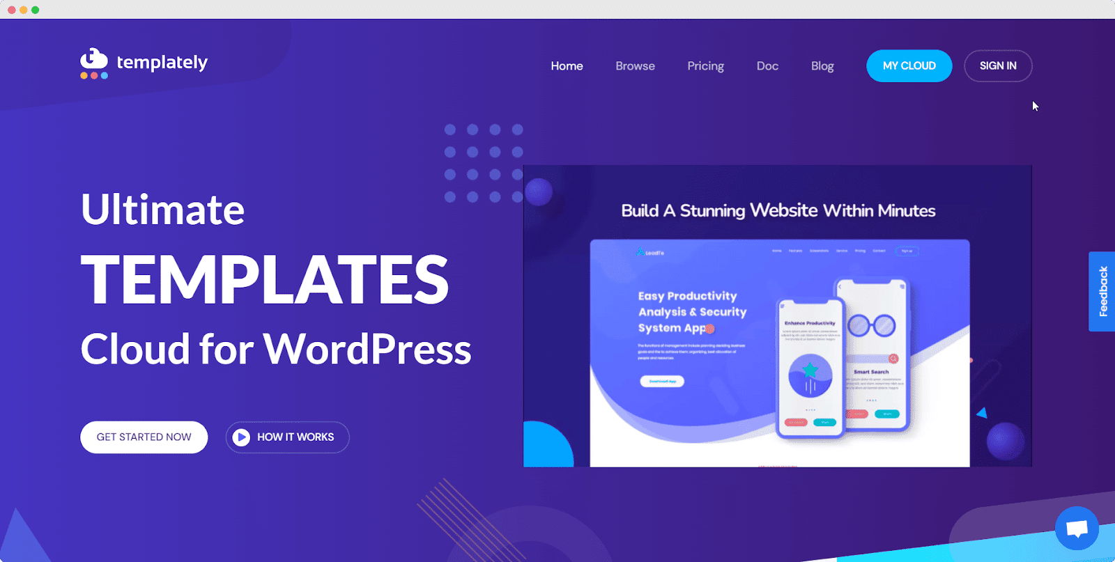
2. Get Started
Get Started is one of the most used call-to-action buttons that many popular companies used for their website. It is basically used for those sites which are providing monthly or yearly subscription-based services. It helps visitors to find the initial steps to get your service quickly.
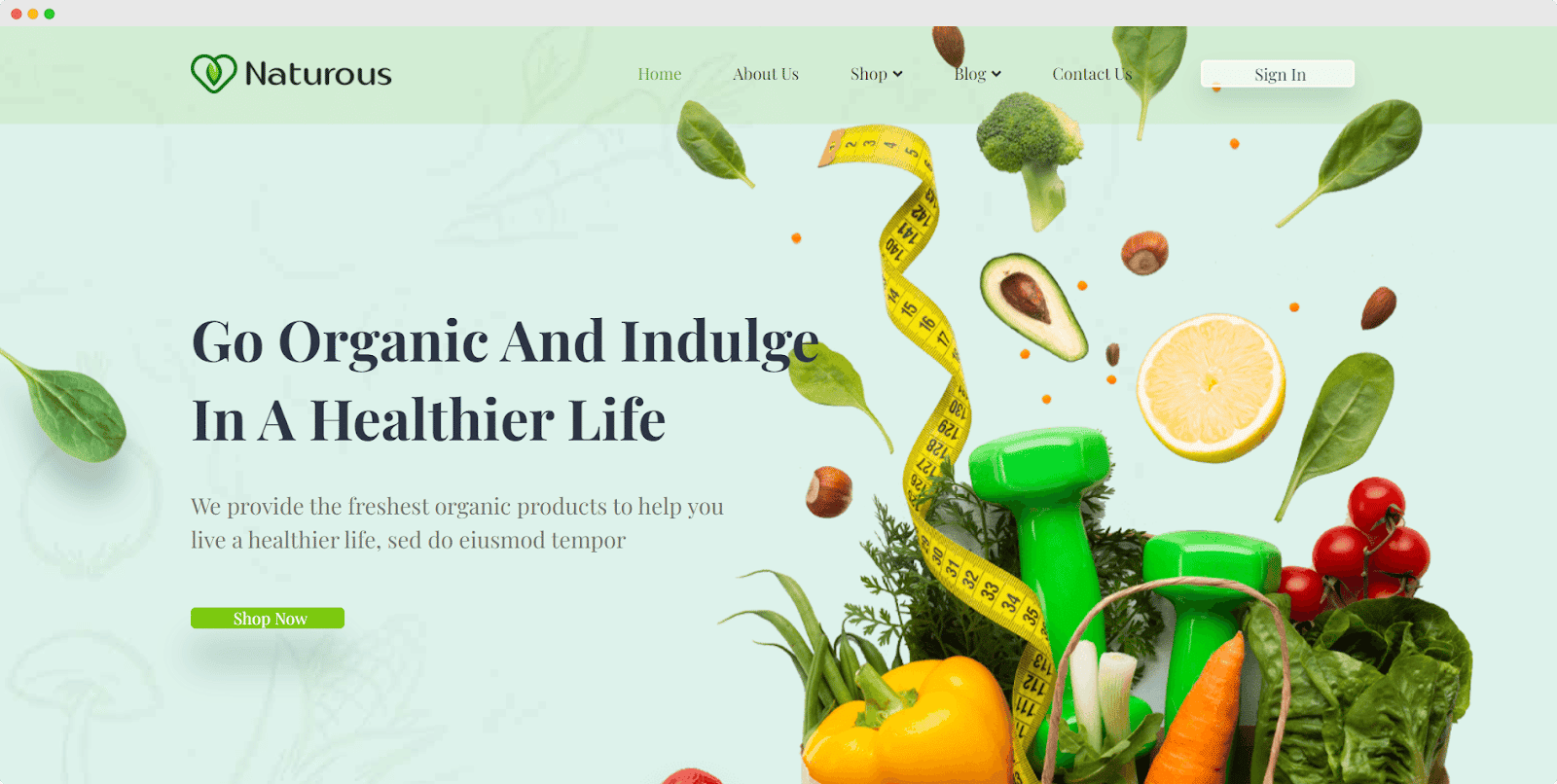
3. Order Now Or Shop Now
Order Now or Shop Now is a direct CTA for eCommerce sites that redirect your visitors to your ultimate purchasing page and help them make your potential customers. As a business owner, you can place this CTA smartly besides your content targeting your visitors so that customers can easily be influenced to click on the button.
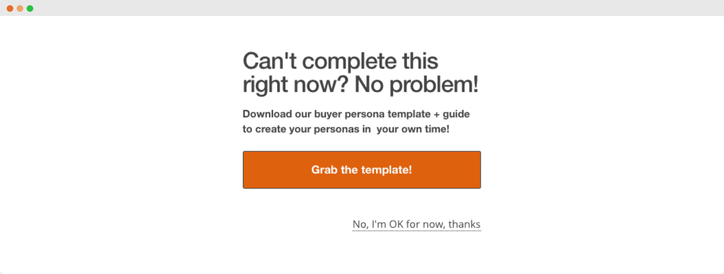
4. Claim It Now / Grab The Offer
When you want to create an urgency for your visitor, you can use the Claim It Now or Grab The Offer for your call to action button. With some catchy titles and notes where you describe your offer in an attractive way. These words sound like the offer may not be available for long. If you have a truly irresistible offer, your call to action should sell its value.
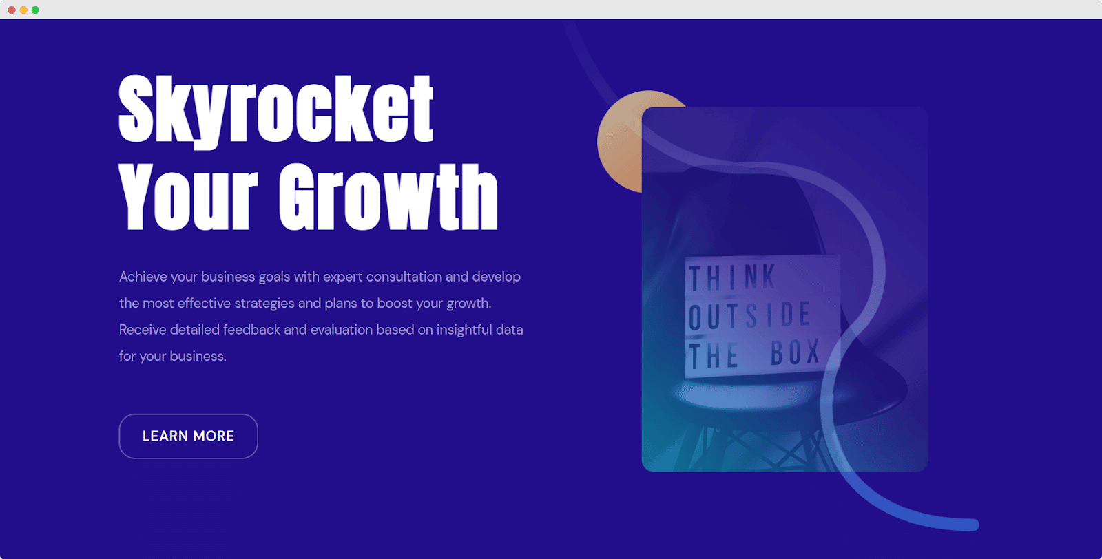
5. Learn More
A Learn More button is effective and absolutely perfect for any blogging or service-based website. Through this call to action button, visitors can be dragged into blogs or related documents and it helps to enrich site engagement.
According to HubSpot, “Personalized Calls to Action Perform 202% Better Than Basic CTAs”
Most Used Call To Action Buttons For Particular Sites
If a reader lands on a site and there is no clear call to action button, it is likely that the reader will leave the website without completing any other tasks. However, if you include interactive CTA buttons on the landing page asking a fruitful question or guiding visitors clearly, it can encourage them to continue interacting with the site.
For this, a perfect CTA is a must. The CTA depends on the type of website. This means CTA can vary from website to website. Let’s have a look below where some of the most common CTAs have been shown according to the website category.
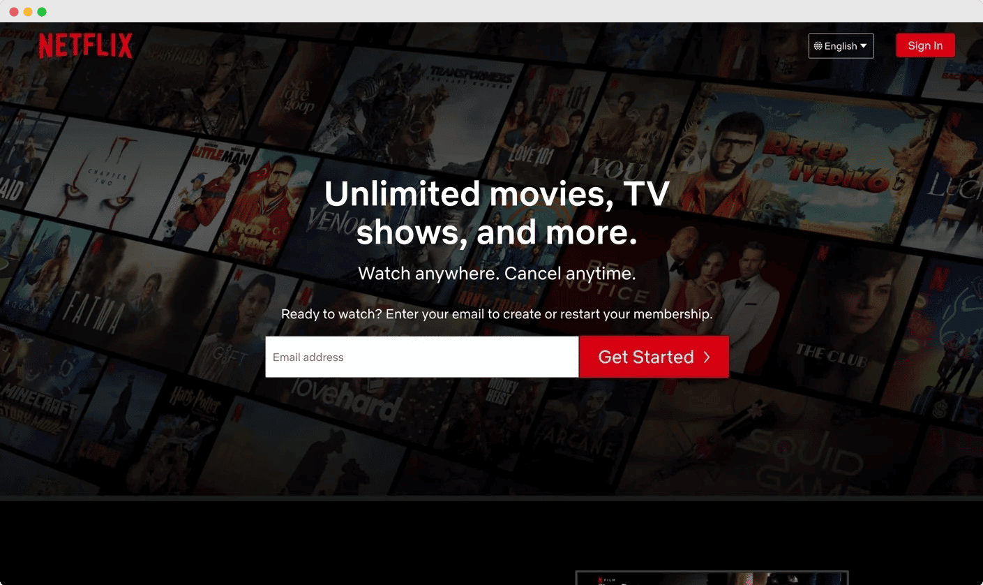
1. SaaS Solution & Software Product Based Websites
Get Started, Subscribe, Sign Up, Login, etc are mainly used in any SaaS solution website. If you are a service provider, you can add any of these related terms.
And, if you are selling or providing software items that customers can get by just downloading them, then the below CTAs are for your site. You can use any of these words such as Download, Get, Grab, Claim, etc. So that your customers can quickly get it with ease.
2. eCommerce Websites
If you are running an eCommerce business website like a food shop, dress store, ornaments, etc. You can easily pick from any of these CTA options such as Buy, Shop, Order, Reserve, Save, Add to Cart, Pick, View, etc.

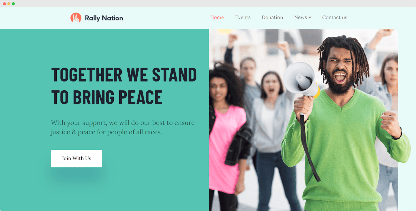
3. Social Service Sites
Any social service site which provides non-profitable services can use wordings according to its purpose. Such as Donate, Commit, Volunteer, Adopt, Give, Support, etc.
4. Community-Based Sites
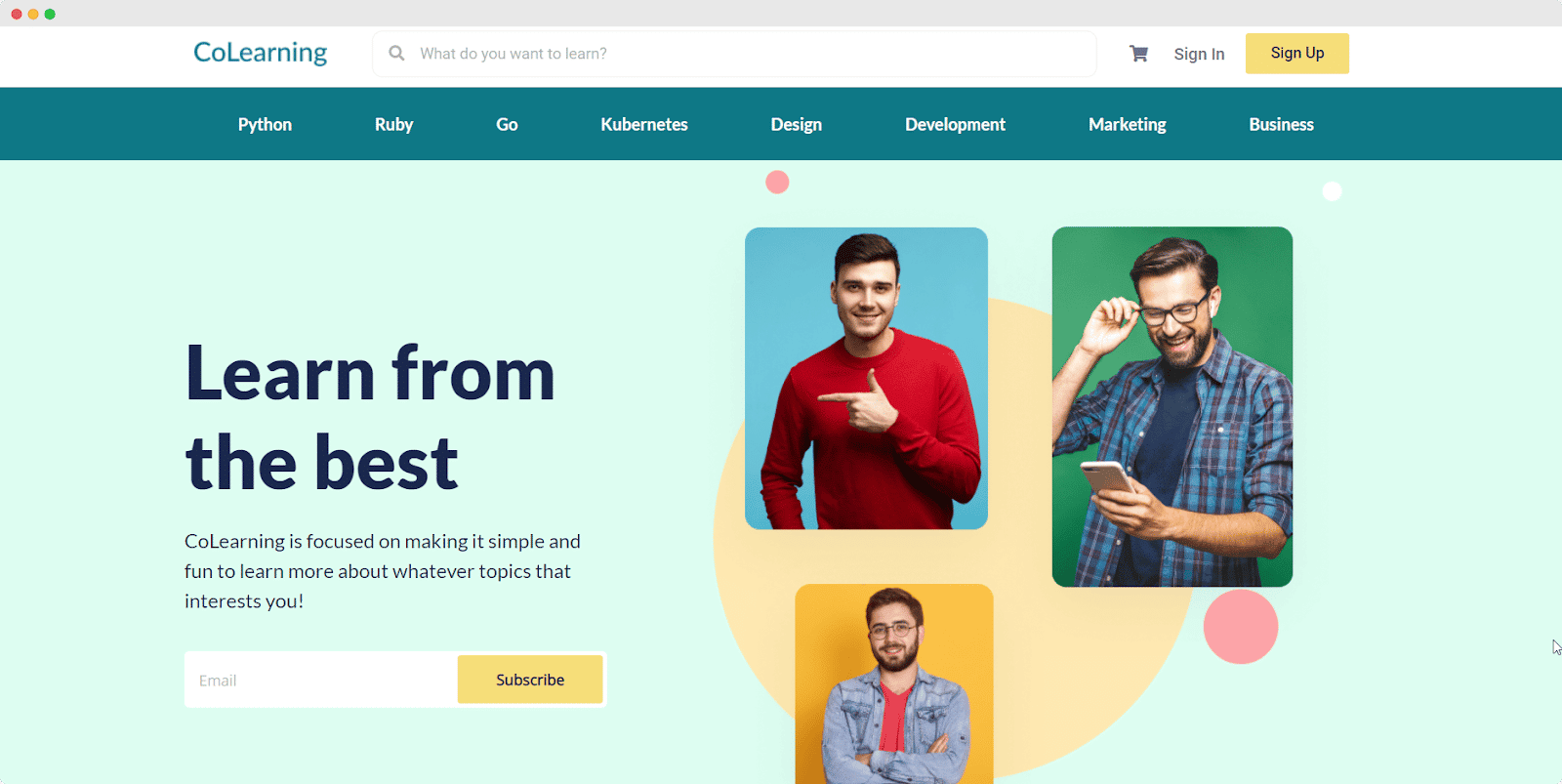
If you want to increase your online community by using your website then you can ask your visitors to Subscribe or Join. These call-to-action buttons can help you to get more subscriptions.
5. Any Blog Sites
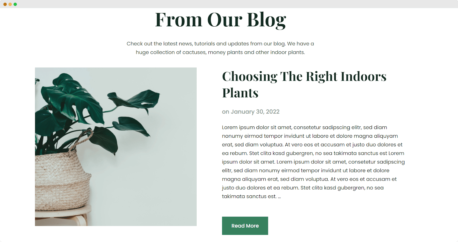
Blogging websites need subscribers as well as they need to show some more types of CTA such as Read More, Learn More, See More, etc. Instead of showcasing the whole content, you can add a CTA button including these wordings after some top portion of your blog content. Interested readers must click on information content.
Best Ways To Create An Attractive Call To Action Button
This Call to action button can be used on your website especially on your landing pages to guide visitors towards your goal conversion. The main target is to get more clicks, increase sales, etc, on your sites. For this, it is very essential to include a catchy and attractive CTA button in the right place of your website. Below tips can help you make an awesome Call to action button for your site.
📣 Strong action words can make your CTA button more attractive.
💡 Short and simple writings can make the button elegant.
🔔 Creating a sense of urgency can make the button hit more.
🎯 Action-packed texts help to make unique and catchy CTA.
👉 Button text is a bonus part of the CTA button that can attract visitors.
⚡ Include hover design on your call to action button to drag customers’ attention more
💡 Creating a button with different colors can give it a vibrant look.
⭐ Attractive button shapes can be very eye catchy to grab users’ attention.
How To Design Call To Action Buttons In Two Minutes In Gutenberg?
Creating a call to action button is very easy especially when you have a good and supportive plugin where you don’t need to worry about coding or technical knowledge.
If you are an Elementor user, then you can use the call to action widget of the Essential Addons plugin. To apply it on your site, you can check this documentation.
There is good news for Gutenberg users too. You can also create an amazing call to action button using the best Gutenberg blocks solution Essential Blocks on your WordPress website. You can check out this documentation for the walkthrough tutorial, or you can have a look below to know the easy three steps guide so that you can start creating stunning CTA quickly.
Step 1: Install Essential Blocks Plugin & Activate It
Login into your WordPress admin panel. From the dashboard, go to ‘Plugins’ and then click on ‘Add New’. In the search bar, search for Essential Blocks for Gutenberg. Install the plugin and then activate it.
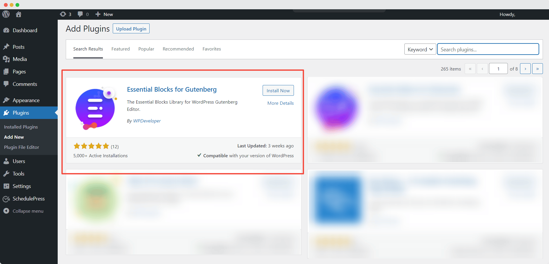
Step 2: Insert The Call To Action Block In Gutenberg
Now, from the dashboard, open a page or post where you want to use the EB Call To Action block. After opening it, click on the Toggle block inserter of the top left of the screen. You will get the Gutenberg Block Panel. Here, search for EB Call To Action.
Now, drag the block and drop it on the specific section of your content where you want to use the block. Or you can just click on the block to get it on the content section. Another way to get it is by clicking on the ‘+’ sign of the section where you want to place the block and from the search bar, find the Call To Action block.
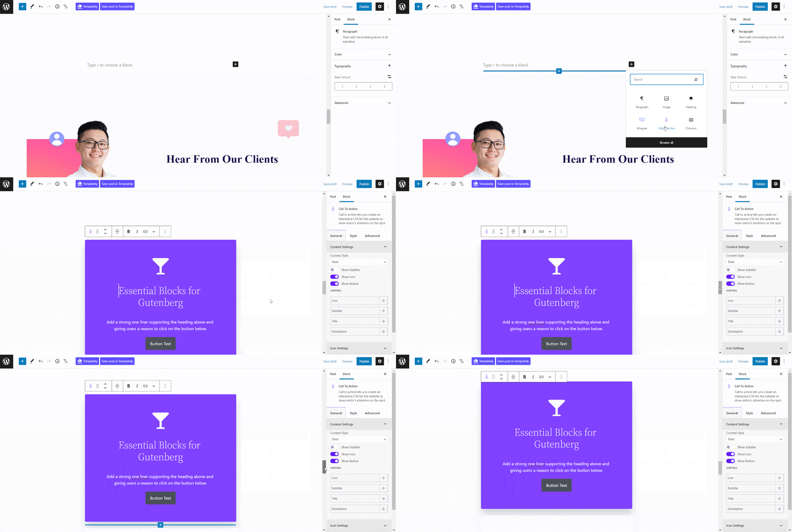
Step 3: Configure The Content Settings
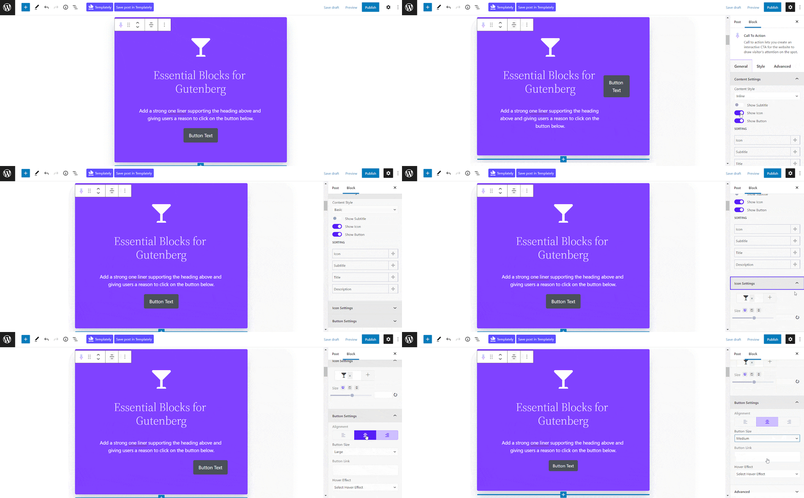
To configure the content settings, click on the block. From the Block setting panel, you can customize general settings and also style your content.
To update your written content of the call to action button, you don’t need to go to the ‘Settings’ panel. You can simply write the content directly from the block.
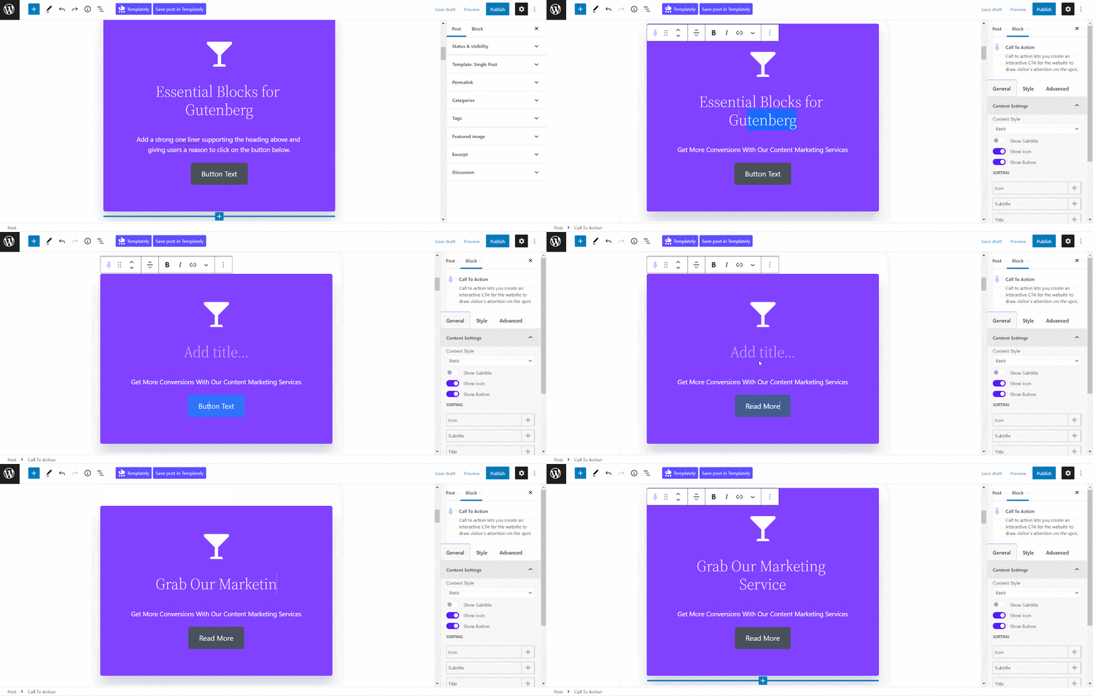
Once all your customization has been done, you can check the preview of your content. If you are satisfied, then click on the ‘PUBLISH’ button to make your content public.

Now It Is Your Time To Create An Interactive CTA!
Do you think this article is helpful for you? Do comment in the comment section below and let us know your opinion on this. If you enjoyed this post, subscribe to our blog and join our Facebook community to connect with web creators and users.


